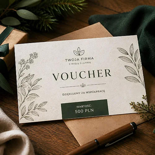
A voucher printed on kraft paper in a chain perfumery looks like an accident. The very same card in a shop selling natural cosmetics looks like a statement. Here the paper is not a background for the content - it is part of the message, and the only part the recipient takes in before reading a single word.
This blog already covers how to build a voucher and how to make sure that selling gift vouchers really works for your business. This article is about the material instead. In the vouchers printed on ecological papers version you get three families of paper - kraft, ecru with added grass fibres and decorative Flora. Each says something different and suits a different kind of brand.
- Eco paper works when it confirms something the brand already says about itself - otherwise it simply looks like a mistake in the order.
- Three families of material: kraft (warm brown, pronounced fibre), ecru with added grass (visible plant inclusions) and decorative Flora.
- On uncoated paper the colours settle deeper and come out calmer - that is a property of the material, not a flaw in the printing.
- Fewer large blocks of colour, more typography and empty space: that is how you design for texture.
- The eco version comes without lamination, and that is the point - a coating would seal away the texture you were reaching for.
Three families of paper and what you feel in your fingers
Names tell you very little until you know what the paper looks like and how it feels to hold. Here is a short guide to each of the three groups.
- Kraft papers - warm brown with a pronounced, clearly visible fibre. The rawest of the three, associated with craft and with packaging stripped of decoration. It has character, but it also has a colour of its own, and your design has to come to terms with it.
- Ecru with added grass - a light, creamy shade with visible plant inclusions. It looks gentler than kraft, and yet from the first second it is obvious this is not an ordinary white board.
- Decorative Flora papers - the most ornamental of the three families, made for brands that want a natural feel in a more elegant rather than raw form.
Since you cannot touch paper through a screen, choose by what can actually be described: by the shade and by how strongly you want the texture to show. A trade name will tell you nothing about how your logo is going to behave on it.
Which brands this version genuinely fits
Material works when it confirms what the brand already says about itself. If your communication talks about natural ingredients, local origin or reducing waste, textured paper closes the story. If there is no such thread at all, a card with grass fibres in it will simply look odd.
- A health food shop, a herbalist, a coffee roastery - kraft is the language the whole shelf already speaks here.
- Natural cosmetics, a soap workshop, a handmade brand - ecru with grass or Flora, depending on whether the brand is more raw or more decorative.
- A treatment room, a studio, a yoga space - a calm shade and plenty of light in the layout.
- A company with a real environmental policy - paper is often the simplest way to make that policy visible outside of a report.
If you take this route, it pays to hold the line across all your stationery. You will find the same material direction in business cards on ecological papers, so the voucher and the card look like one set rather than two unrelated orders.
When to let it go
There is another side to this. A brand with a strong, high-contrast identity - vivid colours, black backgrounds, chrome shine - will lose exactly what makes it distinctive once it lands on kraft paper. The same goes for technological or medical interiors where everything is white and cool: warm brown will feel like a stranger there. You can read more about which brands ecological papers really serve in a separate post. There is nothing wrong with that: paper should underline a brand, not fight it. If the ecological thread is simply not there, reach for the standard or decorative version instead of inventing a story the customer will not buy anyway.
How the printing behaves
This is the question that comes up most often, and the answer is simple: differently than on coated paper. Uncoated stock absorbs ink, so colours settle deeper and come out calmer - they shout less, run a shade warmer and are less saturated than on your screen. That is not a defect of the printing but a property of the material, worth knowing before you start designing.
The practical conclusion is simple: you design differently for this paper. Fewer large, uniform blocks of colour, because those lose the most; more typography, fine lines and empty space that lets the paper itself show through. A logo in one colour often looks better here than the full version with a gradient. We have written in more detail about what to expect from colours and detail on ecological paper.
Before you order, look at your design in black and white and check whether it still holds up. If it does, it will cope on textured paper too, because what carries it is the layout and the typography rather than the saturation of the colours.
Texture versus lamination
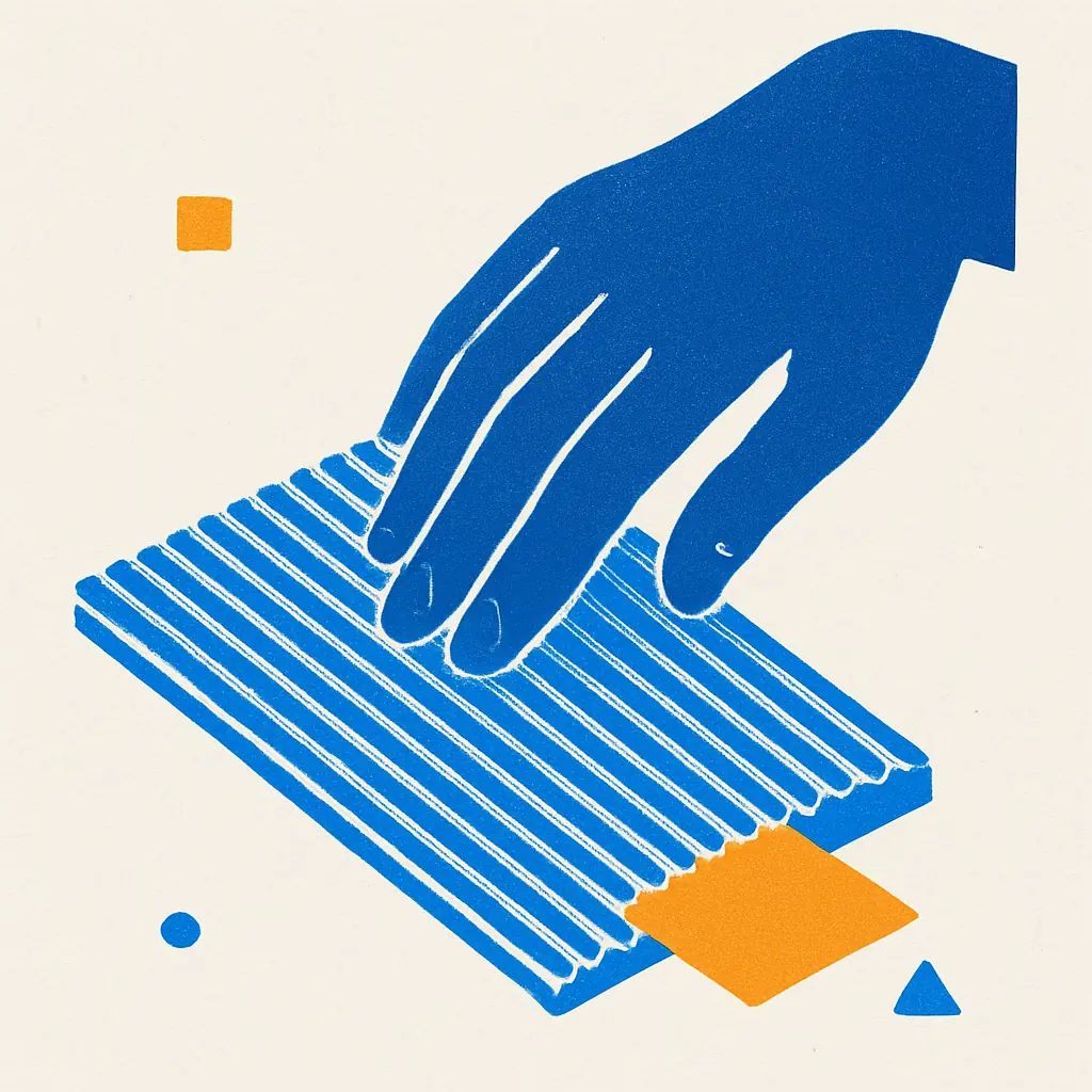
Let us say this plainly, because the question comes back with almost every order: the eco version simply has no lamination, because it would kill the texture. A laminate is a smooth layer laid over the paper - it protects the surface and evens it out, but at the same time it seals away everything that makes natural paper interesting. The fibre stops being something you can feel, the plant inclusions turn into an exhibit under glass, and the card becomes slippery in the hand.
If you are choosing the eco version so that the customer can feel the material, the absence of a coating plays for you. The paper stays as it is, and instead of lamination watch the weight of the stock - it is stiffness that decides whether the voucher survives a fortnight at the bottom of a handbag. Save lamination for versions where a saturated photograph and a smooth, protected surface are what matter.
Before you send the artwork
- Check whether the brand has a thread the paper is meant to confirm. If there is none, this is not the right version for you.
- Choose the shade and the level of texture rather than the name of the paper: warm brown, creamy ecru with inclusions, or the more decorative Flora.
- Simplify the design - cut back on large blocks of colour and lean on typography and space instead.
- Decide on single or double sided printing: the reverse is the natural place for the rules and the expiry date.
- Prepare the file following the guidance in our guide to preparing print files, and when you place the order choose whether we print straight from your file or a graphic designer prepares a preview for your approval.
The rest of the voucher and thank you card family stands right next to it for different situations: those where a saturated photograph or a prestigious decorative paper counts more. The eco version is narrow, and that is precisely what makes it strong - it works wherever the material closes the loop on what the brand says about itself. If your brand does not tell that story, the paper will not write it for you. If it does, this is probably the simplest way to make it sound credible at the very moment the customer takes the voucher in hand.