A client finishes her appointment, pays at the counter and is handed a small card. The whole scene lasts five seconds and almost nobody plans it. Yet it is exactly those five seconds that decide whether the voucher goes into a wallet, or sinks to the bottom of a handbag and resurfaces two days after it has expired.
We covered how to build voucher sales and count how many come back in our piece on gift vouchers in a service business. This article is far narrower: one moment at the counter, and what the material, the format and the layout of the text are doing right then.
- A voucher is received by touch before it is read, so the texture of the paper works at the moment of handing over.
- The format decides where the card will end up: A6 will not go into a wallet, DL and 100×100 mm will.
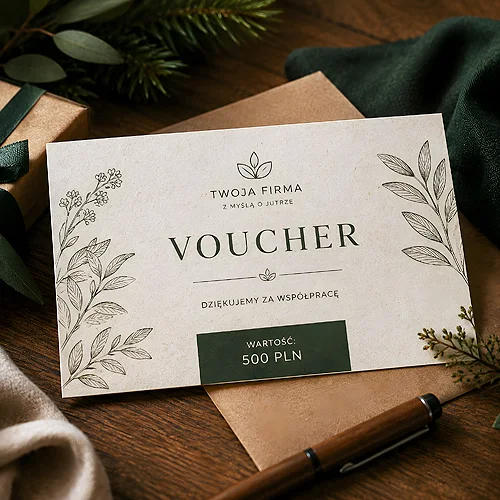
- Three things have to be visible without turning it over: who issues the voucher, what it covers and how long it is valid.
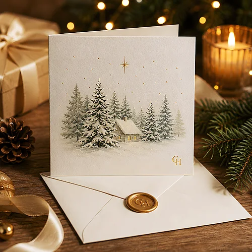
- An envelope turns the gesture into a gift, while a bare card works better as a thank you for the visit.
- A voucher handed over for no reason is remembered better than one bought in a promotion.
Five seconds at the counter
This scene has an order of its own and it is worth knowing, because you design for it rather than for a print viewed on a monitor. The client first feels the card between her fingers, then takes it in as a whole, and only at the end starts reading. Three stages, of which the first two last fractions of a second and shape the attitude to the third.
From this comes a simple quality test: if the person at the counter has to explain what the client has just been given, the design has failed. A good voucher explains itself, and all that is left for the staff is one sentence about when it is worth booking. This is also the moment when brand coherence shows most clearly - the card should look like the rest of the materials in the salon, not like a print ordered separately, in a different style and colour.
Where the card lands for the next fortnight
A voucher is rarely redeemed straight away. Usually it has a couple of weeks of life ahead of it in somebody's handbag, wallet or on the fridge door, and the format decides which of those places it gets. In the voucher and thank you card family you can choose A6, the slim DL, and the square 100×100 and 150×150 mm, and each of them behaves differently.
- A6 - a classic card, clearly visible and comfortable to write on. It will not fit in a wallet, so it ends up on the fridge, in a hallway drawer or tucked into a diary.
- DL - a slim rectangle that slides into a wallet and into a standard envelope. The best choice when you want the client to carry it with her.
- 100×100 mm - a square that also fits a wallet and looks less official than a narrow strip of card.
- 150×150 mm - a more gift-like format, handed over in an envelope, when the voucher is a present rather than a coupon.
The choice is really about where you want the voucher to sit. If you want it back in someone's hands daily, aim for the wallet. If it should remind a whole household about you, a format that stays in plain sight serves better.
Envelope or bare card
It looks like a detail, and yet it changes the character of the whole gesture. A voucher in an envelope automatically becomes a present: the client does not open it in front of you, she simply tucks it away and passes it on. A bare card works the opposite way - direct, personal and read immediately, so it suits a thank you for the visit. Both make sense, as long as the choice is deliberate: envelopes for gift vouchers you sell, bare cards for a gesture at the end of an appointment. The envelope is sourced separately - it is not part of the voucher calculator.
What has to be visible before anyone turns the card over
The front has one job: to say in a second what this is. That is why only three things belong on it.
- Who issues the voucher - the name of the salon or clinic, large enough to be read at arm's length.
- What it covers - the name of the treatment or the value of the voucher. One or the other, never both at once, because then nothing is the most important element.
- How long it is valid - the expiry date is the one element whose absence genuinely generates phone calls and misunderstandings.
Everything else goes on the reverse: the rules for redeeming, the address, the phone number, opening hours and a space to write in a name. If you also want the card to work as a longer lasting carrier of your contact details, it is worth thinking in parallel about client cards - those stay around, whereas a voucher has one life by design. We wrote about keeping both prints in one style in our piece on how to build a recognisable visual style without changing your logo.
Why texture does its work at exactly this moment
Let us go back to the order of things: touch comes before reading. A smooth, slippery card provokes no reaction at all, because that is what most paper passing through our hands all day feels like. Paper with a texture you can feel breaks that automatic response. The client keeps her fingers on it a moment longer, and that is enough for the handing over to register as a separate event, not part of paying.
This is why vouchers printed on natural papers work so well in a salon or clinic - kraft, ecru with added grass or decorative Flora. Their surface is noticeable straight away, and the warm shade suits interiors already dominated by wood, linen and daylight. That such a material need not mean giving up elegance is something we showed in our post asking whether ecological advertising can look luxurious.
Leave more empty space on the front than your first instinct suggests. On textured paper it is the unprinted surface that is the most interesting part, and it is exactly what makes the card look more expensive than it was.
A voucher that is a thank you
The most interesting use of this print is not a sales one at all. A voucher handed over for no particular reason - after a tenth visit, after a long gap, after a treatment that ran over time - works harder than any discount, because the client was not expecting it. It does not have to carry a high value; it has to be a gesture rather than a calculation.
- Decide at which moment the voucher will be handed over - the format and the need for an envelope follow from that.
- Match the format to the place where it is meant to sit: a wallet, a handbag or the fridge door.
- Set the hierarchy on the front: the name, what it covers, the expiry date.
- Move everything else to the reverse and check that there is still room to write a name in by hand.
- Choose the paper to suit the interior where the voucher is handed over, not what looks good on a screen.
A voucher is the only print in a salon that the client receives in person, into her hand, with a member of staff standing opposite. A flyer lies on the counter, a poster hangs on the wall, but a voucher is passed over. That single detail makes it worth going down to small details: a dozen millimetres of format and a texture you can feel. The rest will play out without you, somewhere at the bottom of a handbag.