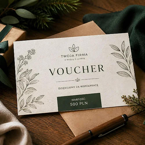
In a corporate parcel a voucher has the worst starting position of everything inside it. It is flat, light and simply looks like a piece of paper. And yet it is the thing that stays in the memory longest - provided it does not look like a till receipt printed in a hurry.
A corporate gift differs from a private one in a single respect: it is handed over by an organisation rather than by a person. The recipient therefore reads it as a message from a company and instinctively checks whether it matches what that company says about itself. This article is not about how a voucher works, but about a voucher in the role of a gift for an employee, a business partner or a corporate client - and about what the material it is printed on says about the sender.
- A voucher is a safer gift than an object, because it is the recipient who decides what to do with it.
- In a corporate context the material is part of the message and is often read more carefully than the wording.
- A company that talks about the environment and then hands over a voucher sealed under a glossy coating contradicts itself.
- The wrapping decides whether the card looks like a gift or like a proof of transaction.
- Vouchers have no printed-name option - leave room on the card for a name written in by hand.
Why a voucher can beat an object
A physical gift for two hundred people is always a compromise. Size, taste, colour, usefulness - with that many recipients somebody will always end up with something they never use. A voucher solves this elegantly, because it moves the decision to the recipient: they choose when and on what to spend it.
- No problem with size or taste - the recipient picks whatever actually suits them.
- It takes up no room - there is nothing to transport, nothing to store and nothing to justify at home.
- It cannot be a duplicate - even if somebody received a similar voucher a year earlier, it is still useful.
- It is easy to add to a set - a flat card fits into any parcel, next to a calendar or a box of sweets.
There is one catch: since a voucher has neither weight nor volume, the way it looks has to do all the work. A voucher that resembles a coupon torn out of a leaflet will not be received as a gift, however high its value. We wrote in more detail about building the design itself in our piece on how to design a voucher that catches attention.
What the paper says about the sender
In business relationships the material is read far more consciously than in retail. A recipient of a corporate gift often orders similar things themselves, so they can see straight away whether somebody made an effort. Paper is the first signal here, because it works before anyone has read a word of the greeting.
If a company builds its communication on environmental responsibility, vouchers on natural papers are the simplest way to make that declaration visible in the gift as well. Kraft speaks of rawness and a lack of ornament, ecru with added grass shows visible plant inclusions, and decorative Flora papers offer the same direction in a gentler, more ornamental form.
The contradiction a recipient spots in a second
This is where the most common jarring note appears. A company that writes about reducing waste in its report and then hands over a voucher sealed under a smooth, glossy coating sends two contradictory messages at once. The recipient does not even have to name it - they simply feel that something does not add up. We took apart the line between appearance and material in our post on how an ecological look differs from an ecological material.
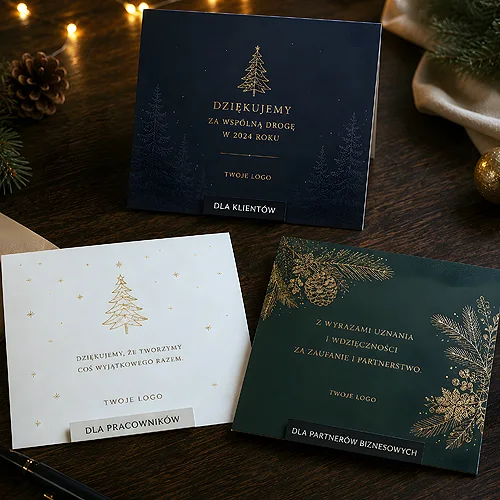
If, on the other hand, your company has no such thread and you are simply after an impression of class, there is a simpler route: vouchers on premium decorative papers. Pearlescent, metallic, felted and structured stocks make their impression through the paper alone, with no additional coating at all. That is a more honest solution than faking ecology where there is none.
How to wrap it so it does not look like a receipt
A voucher tossed loose into a box looks like a document somebody forgot to take away. The same card in simple packaging becomes a gift. This is the cheapest part of the whole order and it makes the biggest difference.
- An envelope - the simplest answer, except that the envelope is sourced separately - our board envelopes are cut for discs. A stiff envelope protects the card from being creased in transit.
- A sleeve - a sleeve on ecological paper keeps the voucher in one material direction and looks more like part of a set than a separate print.
- A paper band - a narrow strip holding the voucher together with a greetings card. Cheap, and it looks considered.
- Shared styling across the parcel - if the voucher travels with other gifts, it should match them in colour rather than stand out in style.
It is the same logic we described for ecological board packaging for discs: cardboard can carry the entire presentation, as long as it is chosen deliberately.
Leave room on the voucher for a single handwritten line. A signature or a short sentence from someone who knows the recipient turns a series print into something personal, and it costs nothing but a few minutes of somebody's time.
Named or serial
Personalisation sounds good, but the voucher calculator does not offer it - printed names are an option on invitations, certificates and place cards. Worth knowing before you plan a list of names.
A name on the print makes an impression on a short list: the board, key partners, an anniversary with a guest list confirmed well in advance. On a voucher it would mean a separate file and a separate order for every person, and a typo in a surname spoils the effect more thoroughly than having no name at all. If the names have to be printed, it is simpler to reach for certificates or invitations, where personalisation is an option in the calculator.
For larger groups a serial print with space to write the name in by hand works better. You then have one design, a reserve for the people everyone forgot about, and the option of using the rest on another occasion. That is a far more change-resistant solution, and on textured paper a handwritten line looks natural, because a pen runs well across it.
How many and where to start
- Count your list of recipients and add a reserve for the people who appear at the last minute, and they always do.
- Decide whether you need one design or two: a different tone suits an employee and a business partner.
- Choose the format to fit the packaging rather than the other way round - envelopes and sleeves dictate the size of the card.
- Settle the content of the reverse: the rules, the expiry date and how to redeem it. The fewer exceptions, the more vouchers come back.
- Start planning ahead of the season rather than in the middle of it - in December every decision is taken under pressure, and it shows in the design.
A corporate gift rarely lodges in the memory through the wording of the greeting. It lodges through whether it was obvious that somebody had thought about it. A voucher on paper that matches what the company says about itself, wrapped so that it does not look like a document, does exactly that: it shows that there was a person on the other side who gave it some thought. The rest, meaning the value of the voucher itself, is only a bonus.