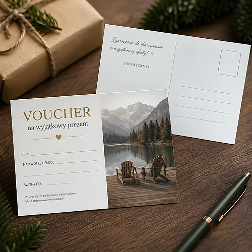
A voucher is a small piece of print with a big job: it should encourage someone to take up your offer. A discount alone is not enough - what matters just as much is how the coupon looks and whether it is easy to use. A well-designed voucher draws the eye, builds positive associations with your brand and simply works.
- A voucher must be consistent with your brand - the same colours, font and logo as the rest of your materials.
- Put the key information up front: what the offer is, how long it is valid and how to use it.
- Match the format to how you hand it over - one thing for an envelope, another for handing out at an event.
- Finishing (film, soft-touch, decorative paper) lifts the impression and sense of quality.
Start with a consistent concept, not decorations
Before you pick colours and graphics, settle one thing: the voucher should look like part of your brand, not a random coupon. The same style as your business cards, website and packaging means the customer instantly knows who the offer came from.
The rest is hierarchy. The eye should land first on what matters most - the offer headline and the value of the discount - and only then on the details. Spacing and a clear layout help with this. A voucher should be attractive, but above all understandable in three seconds.
A headline that stops the eye
The strongest element is the headline. A short, concrete phrase like "special offer" or "limited edition" tells people right away that it is worth pausing. Reinforce it with a contrasting colour so it stands out from the background.
Let graphics and icons support the message rather than drown it out. A discount on spa services? A subtle motif suggesting relaxation is enough. Less is more here - a few polished details make a better impression than a clutter of ornaments.
Colours play on emotions
The colour scheme shapes how the offer is received. Warm shades - red, orange - add energy and feel dynamic. Cool tones of blue or green build calm and trust. Choose in line with the character of your brand and who you are talking to.
Stick to two or three colours from your visual identity. A limited palette looks more mature than a rainbow of shades, and the voucher instantly reads as your brand.
What absolutely has to be on the voucher
A beautiful design will not help if the customer does not know how to use it. So make sure the information is complete - clear and with no guesswork.
- Logo and company name - so it is immediately clear who it comes from.
- Offer description - exactly what the customer gets and what they gain.
- Terms and validity date - by when and on what conditions the coupon can be used.
- Contact details - so it is easy to ask or redeem the voucher.
Clear terms mean fewer misunderstandings at redemption. If you want to gather the conditions, details and logo into a coherent whole, our guide on how to prepare files for print will help. And if anything is unclear, just get in touch - we will point you in the right direction.
Match the format to how you hand it over
Size is not only about looks - it is about convenience. The classic A6 is versatile and fits easily into a wallet or handbag. A 100 by 100 mm square looks contemporary, and the narrow DL slips into a pocket or an envelope.
If you send coupons by post, the DL format (99×210 mm) works brilliantly - it fits a standard envelope yet holds all the information. For events and points of sale, on the other hand, you can go for a larger format that simply catches more eyes.
A voucher that is easy to hand over and tuck away has a better chance of coming back to you as a completed order.
Material and finishing make a difference to the touch
The way a voucher sits in the hand says something about the quality of the brand. The basis is heavy coated paper - it holds print well and feels solid. Decorative papers, for example metallic or pearlescent, add elegance and emphasise how special the offer is. The same shelf of papers is used by Prestige vouchers - metallic STARDREAM GOLD and SILVER, pearlescent STARDREAM OPAL, felt-finish MODIGLIANI or fine-ribbed DALI. The effect comes straight from the stock.
The impression and durability are also lifted by the surface finish. On coated-stock vouchers you can pick gloss film, matte film or velvet Soft Touch. The decorative Prestige papers come without film - there the stock does the work. Such a layer not only looks good - it also protects the voucher from scuffing, so it stays in good shape for longer.
For a premium offer choose matte film or soft-touch - they look discreet and expensive. Gloss works better where you want vivid, punchy colours.
Photos and fonts - tie it all together
If you use photos, make them good quality, high in contrast and matched to the emotion of the offer. An appetising dish for a restaurant, smiling people enjoying a service - such shots persuade more easily than a dry description. What matters is that the style of the photos fits the rest of the design.
With fonts the rule is simple: two typefaces at most - one for headlines, one for body text. A serif font underlines elegance and luxury, a sans-serif suits modern, dynamic brands better. Legibility always comes before effect.
Summary
An effective voucher combines three things: a design consistent with the brand, a full set of clear information and a format matched to how it reaches the customer. Add good finishing on top and the coupon works like a small business card for your company. Ready to print? Take a look at our range of vouchers and gift cards, or add matching business cards so the whole set speaks one style.