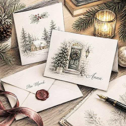
December company post can be surprisingly personal. Among invoices and catalogues an envelope arrives, and inside it a card - and it is often the card that stays on the desk the longest. Yet before the recipient reads the wishes, they look at the picture. In a split second it tells them who you are: whether people, a product or a place with a history stand behind you. Choosing a motif is not decoration, but the opening line of your company's story.
Many companies settle this question on autopilot - they grab a ready design with a Christmas tree and snow, because that is what you do. It is a pity, because a Christmas card is one of the few moments in the year when a client reaches for something from your brand on their own and looks at it without rushing. It is worth making that picture actually say something about you.
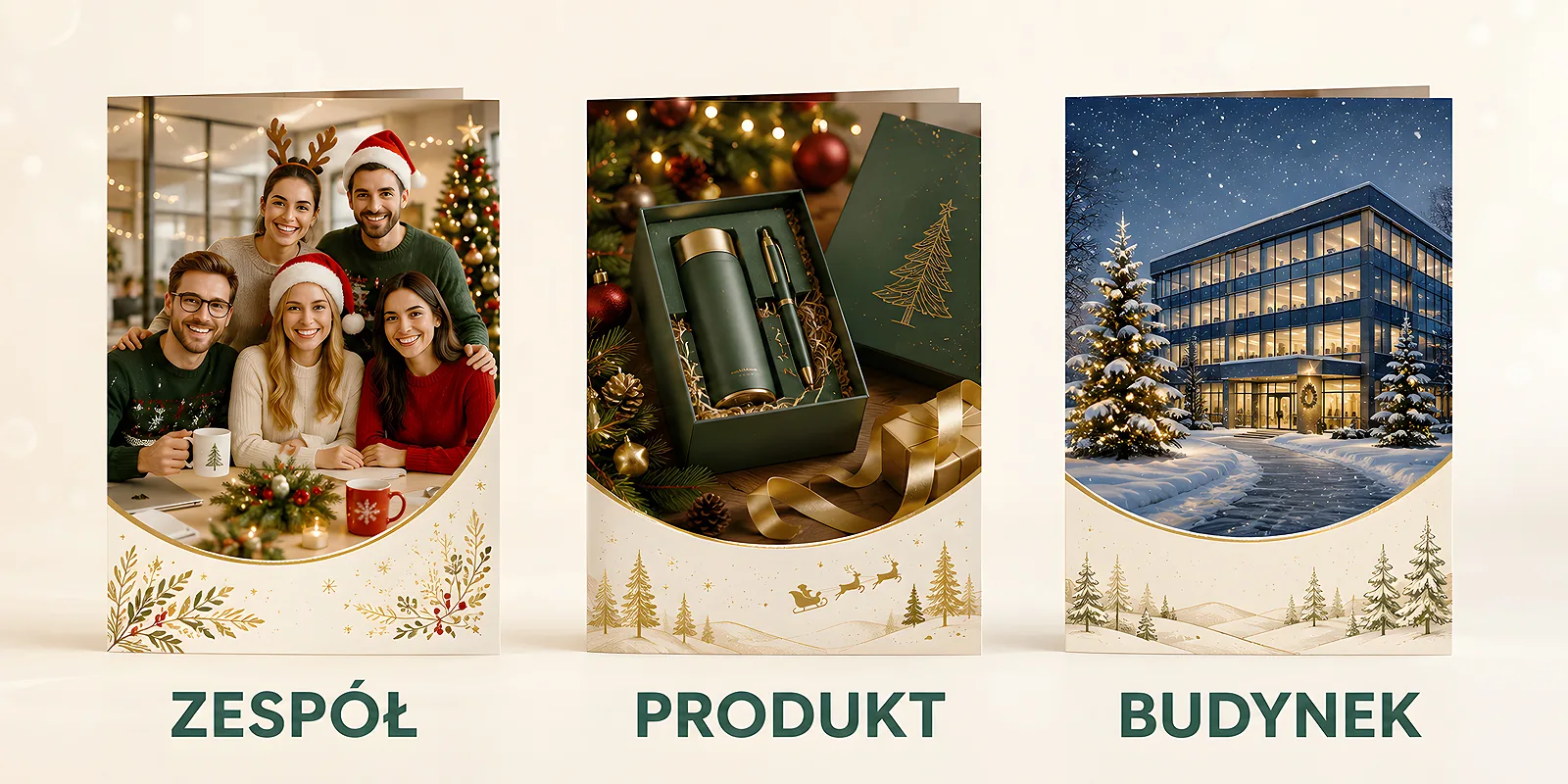
Most often the choice comes down to three motifs: people, meaning your team; the product, meaning what you make; and the building, meaning the place where you work. Each of them tells a different story and suits a different company. Below we break them down so it is easier to pick the one that is truly yours.
- The card's motif is the first thing the recipient sees - it speaks about the company before anyone reads the wishes.
- The team shows the human face of the brand and builds closeness - it works well in relationship-driven companies.
- The product is a signal of pride in your offer - it fits when the product is the heart of what you do.
- A building or place communicates stability, history and locality - it suits companies rooted in their region.
- Motifs can be combined, and what ties everything together is your brand palette, font and a subtle brand detail.
The motif speaks before anyone reads the wishes
A photo or illustration on the cover of a card works faster than text. Before the recipient focuses on the words, their eye has already read the mood and subject of the picture. That is why it is worth treating the motif like a headline - it sets the tone of the whole card and hints at what the rest will be about.
The good news is that there is no single correct answer here. There is, however, an answer matched to a specific company - its character, its industry and the relationship it wants to build. The same card with a team, which warms up the image of a small studio, may look accidental in a large corporation. So instead of asking what is prettier, it is worth asking what is yours.
The team - the human face of the company
A card with employees says it plainly: there are people behind this brand. It is the warmest of the three motifs, because it shows faces, smiles and atmosphere, rather than the result of the work alone. For a client who talks to specific people every day, such a card is like a handshake - it confirms that there are people they know on the other side.
This motif works best in companies where the relationship matters more than the catalogue: services, consulting, craft, small teams, local businesses. It is worth making the photo natural - a group of people in ordinary clothes, in their own space, looks warmer than a stiff shoot against a wall. On how to approach a card meant to build bonds in the first place, we write more in our post on why company Christmas cards are a tradition that builds relationships.
The product - pride in what you make
When the heart of your company is what you produce, the product on a card defends itself. It is a motif for brands that have something to show off and want the client to remember their offer in December too. It looks good where the product is attractive, distinctive or simply recognisable - food, handicraft, cosmetics, thoughtfully designed objects.
The important thing is not to turn the card into a flyer. A product on a Christmas card should please the eye, not sell - so it is better to show it in a festive setting, far from prices and promotional slogans. A subtle frame makes the difference: warm light, a simple composition, your brand palette in the background. We write more about this thin line between wishes and advertising in our post on cards as a subtle marketing tool.
The building and the place - stability, history, locality
The third motif is the company's premises, the street where you work, or a city skyline. A building on a card says: we have been here for years, we have our place, you can find us. It is a signal of stability and rootedness that works well in companies with tradition, family businesses and brands strongly tied to their region.
This motif has one more asset - locality. A recognisable part of the city or a distinctive facade instantly builds a sense of closeness among nearby clients. If your premises have character, it is worth showing them in a winter version: snow on the roof, warm light in the windows, an evening scene. Such a card is at once a set of wishes and a small postcard from your spot on the map.
How to choose a motif for your company
Instead of guessing, ask yourself a few simple questions. The answers usually point to the motif on their own.
- What is the heart of the company? - If it is people, choose the team. If it is what you do, go for the product. If it is the place and tradition, show the building.
- What relationship do you want to build? - A close, personal tone is helped by the team; pride in your offer by the product; a sense of confidence and continuity by the premises.
- Who will receive the card? - Regular clients you know personally will appreciate faces; new partners rather a coherent, elegant brand motif.
- What sets your industry apart? - In services people naturally win, in production and craft the product, in local companies the place.
There is no wrong answer - only one that suits you more or less. If you hesitate between two, the winner is the one closer to how you want the client to think of you after the holidays.
Motifs can be combined
The choice does not have to be exclusive. Many companies combine motifs: the team against the backdrop of their premises, the product in an employee's hands, the building with a small accent of the offer in the corner. Such a composition tells a fuller story - people, place and what you do, all in one frame.
What ties each of these variants together is visual identity: your colour palette, brand font and a subtle brand detail repeated on the cover and inside. Thanks to that, even an ordinary team photo looks like yours, rather than a random picture. On how to polish such a project, we write in our post on how to design an elegant Christmas card with your company logo.
Before you choose a motif, look at your social media profile and company website. Which image most often represents you day to day - people, product or place? The card will feel coherent and natural if it follows the same path you already use to tell your brand's story.
The card's motif is a small choice with a big meaning - in a single picture you sum up who you are. The team adds warmth, the product shows pride in your offer, the building underlines stability and locality. Once you know which story you want to tell, all that is left is to dress it in your brand colours and a consistent detail, and then put it on paper. You will find ready designs and the option of your own project in our range of Christmas cards - and let the motif be what is truly yours.