
A company Christmas card and a carol album are two different objects, but they work best when the recipient treats them as one whole. When the card and the disc look as if they came out of the same studio - the same palette, the same character of type, a recurring detail - the gift feels considered rather than gathered from random pieces. It is a small thing that says a lot about a brand: it shows the brand cared about consistency right to the end.
The good news is that matching a card's style to an album's design does not require a designer's talent or a separate project for each element. It requires one idea carried consistently across both carriers. In this post we show how to build such a coherent set - from a shared palette, through typography and a recurring detail, to the practicalities of paper and planning.
- A card and a carol album work more strongly as a coherent set than as two separate objects.
- Coherence comes from a shared palette, the same typography and one recurring detail on both elements.
- Start by setting a leading theme, and only then design the card and the disc packaging.
- It is worth keeping paper and finish in one line - a different material instantly breaks the sense of a set.
- You can also carry the same theme onto other company holiday materials, building brand recognisability.
- Plan the whole thing ahead so both elements come together calmly and fit each other.
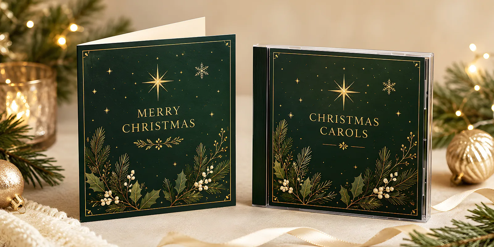
Why a coherent set works better
A recipient rarely analyses a design consciously - but immediately senses when things fit together and when they do not. A card in one style and a disc in a completely different one look like two independent gifts accidentally put in the same envelope. The same theme on both elements works the opposite way: it builds a sense that someone thought about the whole and took care of the details. It is exactly this care that stays in the memory and translates into the brand's image.
Coherence also has a practical dimension. When the card announces the disc's style and the disc completes it, the gift tells one story instead of two separate ones. The card introduces the mood and carries the wishes, the album stays for longer and returns every December. Together they create a gesture that is more than the sum of its parts. If you are looking for a starting point for the card design, it is worth beginning with the post on how to design an elegant Christmas card with a company logo.
A shared leading theme
Coherence always starts with one idea, not from fitting ready-made elements together. Instead of designing the card and the disc separately and then trying to reconcile them, first set a leading theme and derive both carriers from it. That is the simplest route to making the whole thing look planned.
Palette and typography
Choose two, at most three colours and stick to them on both elements. For the holidays, deep green and warm red work well, as does an elegant navy with a gold accent or muted white with one strong colour. Add one typeface for headings and one for body text - the same on the card and in the disc's design. The same pair of fonts does more for coherence than the prettiest illustration used only once.
A recurring detail
The simplest way to link two objects is one recurring element. It could be a branch, a star, a delicate ornament or a distinctive placement of the logo. The same detail in the corner of the card and on the album cover acts like the signature of the whole set - the eye immediately joins both elements into one whole.
Before you start designing, prepare a small guide: two colours, two fonts and one recurring symbol. Write it down and keep it at hand for every element. That way the card, the disc's design and even an extra insert are made from the same set of rules, and you do not have to make decisions from scratch each time.
How to translate the theme onto the card and the disc
The same theme spreads differently on a small card than on an album's design - and it is worth thinking about this at the design stage. A card has little space, so a sparing composition with one strong accent works well. The disc's design gives more surface on which the same idea can be developed more broadly.
- The card - the front with the leading theme and the logo, the inside for wishes. Simplicity wins here: one accent, legible text, a calm background. See the range of Christmas cards to match the format to the style.
- The front of the disc packaging - repeat the palette and detail from the card, add the album title in the same typography.
- The inside and back - a track list, short wishes or the company name in a consistent design so the whole keeps one character.
- Print on the disc - even a small motif from the card, repeated on the disc, completes the sense of a set.
You will find the full range of media and cases in the discs and packaging section - it is worth looking there early, because the format of the design affects how much room you have to develop the theme. If you want the design on screen to translate faithfully to print, use our help with preparing files.
Paper, finish and details
Coherence is not only about graphics, but also about material. A card on elegant, lightly textured paper and a disc in a cardboard case of a similar character create the sense of one line. A different material - a glossy card and a matt case - immediately breaks that effect, even if the graphics are identical.
- Choose paper of one character - if the card is cream and textured, it is worth keeping the disc's packaging in a similar mood.
- Keep finishes shared - if you go for matt or Soft Touch film on the card, carry the same finish onto the album's packaging.
- Watch the colours in print - the same colours on different papers can look slightly different; it is worth checking a proof so the set really matches.
- Think about the envelope and extras - if the card and disc travel together, a consistent envelope or sleeve ties the whole thing together.
If you treat the card and album as part of broader holiday communication, it is worth carrying the same theme onto other materials too. You can read about how such recurring gestures build a bond with the recipient in the post on company Christmas cards as a tradition that builds relationships.
How to plan a coherent set step by step
Matching the card to the album goes most easily when both elements come from one plan rather than being glued together at the end. It is worth spreading the work so that the theme is ready before you start designing either carrier.
- Set the leading theme - palette, typography and a recurring detail, written down as a small guide.
- Design the card - it is usually the smaller surface, so it is good to start with it and see how the theme works in a sparing form.
- Carry the theme onto the disc's design - develop the same idea over a larger surface, keeping all the constant elements.
- Choose paper and finishes - consistent for both elements, checked on a proof.
- Order with time to spare - so the card and disc come together calmly, and you have time to judge whether they really form a set.
Matching a card's style to a carol album's design is not a matter of a big budget, but of one good idea carried across both carriers. Set the theme, repeat it on the card and the disc, take care of shared paper - and the recipient will get a gift that looks like a considered whole. If you would like to discuss a coherent set, write to us via the contact page - we will help carry the theme through all the elements.