
A Christmas card and a disc of carols are among the few company materials a client accepts without a trace of reluctance - because they are a gesture, not an offer. Yet a logo that is too big, or an advertising slogan in the wrong place, is enough to turn a warm gift into a flyer. The art lies in making the brand present without letting it impose itself.
Subtle advertising works best precisely around the holidays. The client already knows who the nice gift came from and remembers it better than the loudest banner. Below we show how to place a logo on a card and on a disc of carols so that it recalls the company rather than drowning out the wishes.
- The holidays are a gesture, not a sale - the logo should remind of the company, not shout a slogan.
- On a card, the logo works best on the back or discreetly at the bottom - leave the front to the wishes and the graphic.
- On a disc of carols, the logo looks good near the title or in a corner of the print, in a scale similar to the rest of the description.
- Keep the size, colour and placement of the logo consistent on both elements - this builds the impression of one set.
- Instead of contact details on the front, use a discreet QR code or the website address in the footer.
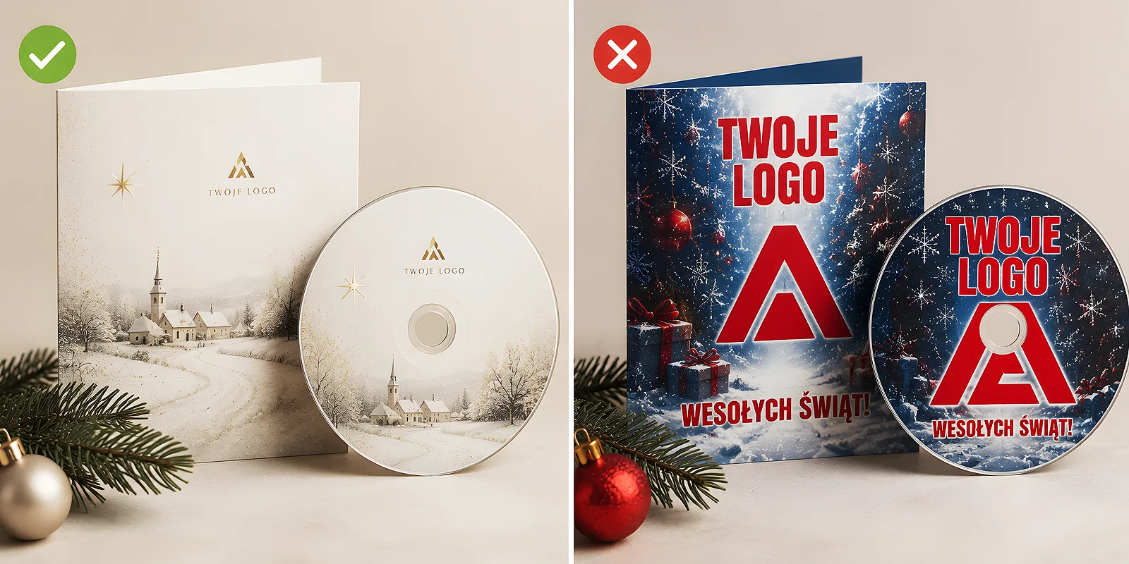
Rule number one: the holidays are a gesture, not an offer
Before you start designing, it is worth settling one thing: a festive gift is meant to build a relationship, not to sell. That changes everything in the approach to the logo. On advertising material, the mark should be first and largest. On a Christmas card it is the opposite - the wishes and the mood matter most, and the logo plays the role of a delicate signature.
A client who receives a warm gesture remembers its sender on their own. There is no need to remind them with a huge mark or a sales slogan. So when designing Christmas cards and the disc presentation, think in terms of a signature, not an advert. The same mechanism is described in our post on why a gadget's usefulness matters more than its low price - it is the impression that counts, not the insistence.
The logo on a Christmas card
A card has two sides and that gives plenty of freedom. It is best to leave the front to the graphic and the wishes, and place the company mark where it does not fight for attention with the festive mood.
Where to place the mark
The safest and most elegant spot is the back of the card or the very bottom of the inside, under the wishes. The logo then acts like a signature under a letter - it is there, but it does not get in the way. If you really want it on the front, shrink it and tuck it discreetly into a corner, in a colour tuned to the palette rather than in full company contrast.
- The back of the card - the cleanest solution, the logo as the sender's signature.
- The bottom of the inside - under the wishes, in a smaller scale, in a calm colour.
- A corner of the front - only discreetly, if the brand really must be visible right away.
Size and colour
The advertising reflex says: enlarge the logo. On a Christmas card that is a mistake. A mark at signature scale, in one of the festive palette colours or in a monochrome version, looks far classier than a logo in full company colours breaking the mood. If your mark has strong, bright colours, consider a toned-down version made especially for the holidays.
Do a simple test: cover the logo with a finger and look at the card. If without the mark it looks like warm wishes, and with it like a flyer - the logo is too big or too bright. A good festive logo is discovered only after a moment, not seen from the doorway.
The logo on a disc of carols
A disc of carols follows a similar logic, though it has less room and a different layout. Here too the point is for the mark to work with the whole print rather than dominate the title or the festive graphic.
On the disc itself, the logo looks best near the album title or in a corner of the print, in a scale close to the rest of the description. It does not have to be bigger than the disc name - it is enough that it is legible. It is worth caring about print quality, because a small mark easily loses sharpness. You will find tips on preparing the graphic in the file preparation section, and our post digipack or CD sleeve - which packaging to choose advises on the presentation itself.
The disc presentation offers even more options than the disc alone. On a digipack cover the logo can be placed discreetly on the inner side or on the bottom, so the front belongs entirely to the festive graphic. Well-chosen disc packaging makes the brand present on several levels, yet imposing itself nowhere. Discreet spots multiply with the number of panels - a Digipack 6P gives three printed ones, so the mark can move calmly onto an inner panel.
Coherence between the card and the disc
If the card and the disc reach the client together, they should look like one set. That means the logo on both elements should be treated the same way - similar size, the same colour, the same logic of placement.
- Settle on one festive version of the logo - monochrome or in a palette colour. Use it on both the card and the disc.
- Choose a consistent spot - if the logo is in the bottom right corner of the card, let the disc print keep to a corner too.
- Keep the proportions - the mark should not suddenly grow on the disc just because there is less room there.
- Add a shared detail - a recurring branch or pattern links both elements more strongly than the logo alone.
Such consistency makes the client receive the gift as considered, rather than assembled from random pieces. We write more about building such a coherent set in our post on company Christmas cards as a tradition that builds relationships.
Contact details without the pushiness
Sometimes you want the client to be able to return to the company easily after the holidays. That is understandable, but an address, a phone number and a website listed on the front of a card instantly turn it into a business card. It is better to reach for solutions that do not spoil the mood.
- A QR code in a corner - discreet, it leads to the website and does not take up space with text. We write about using it well in our post how to use QR codes on packaging, flyers and gadgets.
- Just the website address in the footer - one line under the logo is enough for the client to know where to look.
- Details on the back - put the full contact on the back of the card, where it does not compete with the wishes.
Subtle advertising on a festive gift is not the absence of the brand, but its presence in the right role - a signature, not a shout. A logo at signature scale, a consistent spot on the card and the disc, and a discreet way to make contact all make the client remember the warm gesture, and along with it the company that prepared it. And that works better than the loudest advert.