A Christmas tree, baubles, red and little stars - there is charm in it, but after a dozen cards lined up on the windowsill they all start to blur into one. If your brand goes for a modern, calm image, the most obvious festive symbols can work against you. Fortunately, a winter mood can be conveyed in many far less worn ways.
Giving up the tree does not mean giving up on the holidays. The point is that instead of reaching for the first symbol that comes to mind, you find a motif that fits the character of the company and does not look like every other card in the pile. Below we have gathered ideas for a winter design for brands that avoid kitsch but still want to send warm, festive wishes.
- Colour, texture and typography carry a festive mood too - not just a tree and baubles.
- Geometric snow, a play of light and shadow, or wishes typography alone look modern and elegant.
- Winter nature and a local motif give the card a character that mass graphics cannot.
- Coherence with the brand identity matters more than the number of festive ornaments.
- Good paper and a subtle finish do more for a card's class than a loud pattern.
Why it is worth moving away from the tree and baubles
There are several reasons. The first is purely practical: in December a recipient gets a dozen similar cards and all of them vanish into the crowd. The second is fit with the brand - a company that communicates calmly and minimally all year suddenly looks out of place in December with a lit-up tree on the cover. The third is the most important: a less obvious motif is easier to remember. A card that breaks the pattern earns a moment of attention that is hardest to win in the December rush - and it is exactly that moment which makes a recipient pause on your wishes at all.
A Christmas card is still a company's calling card and can act as a subtle advertising tool. That is why it is worth having it speak the same language as the rest of your materials. Instead of piling on random ornaments, it is good to start by asking what mood it should convey - and to choose the colours to match, which we cover more when discussing how to match a palette to a company's character.
Geometric snow and a minimalist pattern
Snow does not have to be a jolly flake straight out of a fairy tale. In a modern take it is simple geometry - thin lines, a grid of tiny dots, a repeated module, a delicate gradient of white and blue. We read such a pattern as wintry, and at the same time it looks like an element of good graphic design rather than a seasonal decoration.
Simple moves work well here:
- One repeated module - a single geometric flake or shape used rhythmically across the whole cover.
- Lines and outline instead of fills - lightness instead of a heavy, colourful blob.
- Plenty of light around the motif - empty space turns a minimal pattern into elegance, not an unfinished design.
A minimalist pattern has one more advantage: it sits beautifully next to a logo and does not compete with it for attention.
Light, shadow and wishes typography alone
Sometimes the strongest card is the one with no festive picture at all - just the word itself. A large, well-set wish can be the whole design. Typography carries mood just as an illustration does: a warm, rounded typeface sounds friendly, while a classic serif reads dignified and elegant.
Paired with typography, a light motif works well. A gentle glow, a soft gradient or a subtle shadow under the text build a wintry, evening atmosphere without a single bauble. This solution suits brands that want the card to look mature and assured. If you want such a design to remain recognisable as yours, it helps to know how to create a recognisable visual style without changing the logo.
Winter nature and a local motif
If geometry alone feels too cold, a winter atmosphere is beautifully conveyed by nature - the less obvious kind. Instead of a tree: a bare twig, frost on a leaf, a close-up of conifer needles, dry grass dusted with snow. Such motifs are calm, natural and fit brands that want to avoid literalness.
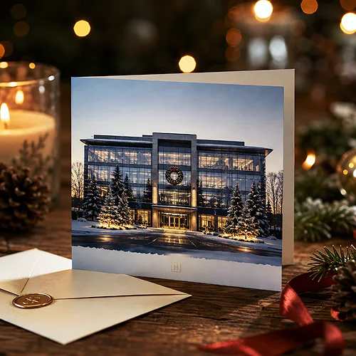
A separate, very rewarding direction is a local motif. A card with a stylised drawing of your premises, a characteristic building from the area or a winter city panorama has something no ready-made graphic can offer - it is only yours. It is a gesture the recipient remembers, because they see at once that the card did not come from the first template at hand.
How to keep a festive mood without clichés
Moving away from the tree cannot mean the card stops being festive. Mood is built by details that work subliminally - and those are worth betting on.
Instead of adding more ornaments, choose one carrier of the festive mood and take it to perfection: either colour, or texture, or typography. A card in which one element is truly refined looks better than one trying to fit everything at once.
It also helps to stick to a cool, wintry palette - white, cool greys, deep navy, muted green - and one warm accent that livens up the whole. Such a calm set says winter on its own, even without a single festive symbol.
Paper and finish instead of loud graphics
When the design is spare, the material takes over the job of making an impression. And that is good - it is paper and finish that make a minimalist card look expensive rather than poor. There is plenty of room to shine here without resorting to loud graphics.
- Thick card stock - a solid card makes an impression in the hand right away and underlines that this is no ordinary print.
- Decorative or eco paper - a clear, natural texture is a decoration in itself.
- Matte or velvety Soft Touch film - a soft, pleasant-to-touch finish that suits minimalism perfectly.
- A single warm accent colour - a small detail that lifts a calm design and gives the card a polished character.
Paper texture can be a full-fledged element of the design - we write more about it when discussing how natural paper texture changes the way print is perceived. If you are looking for ideas for a winter design, it is worth seeing how various company Christmas cards can be built on material and typography alone.
A card without a tree and baubles is not any less festive - it is often more yours instead. Geometric snow, a play of light, typography alone, winter nature or a local motif are directions that let you capture the holiday mood while standing out in a pile of similar wishes. Choose one idea, refine it and build it on good paper - and your card will stick in the memory precisely because it does not look like all the others.