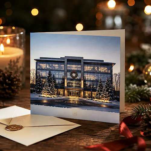
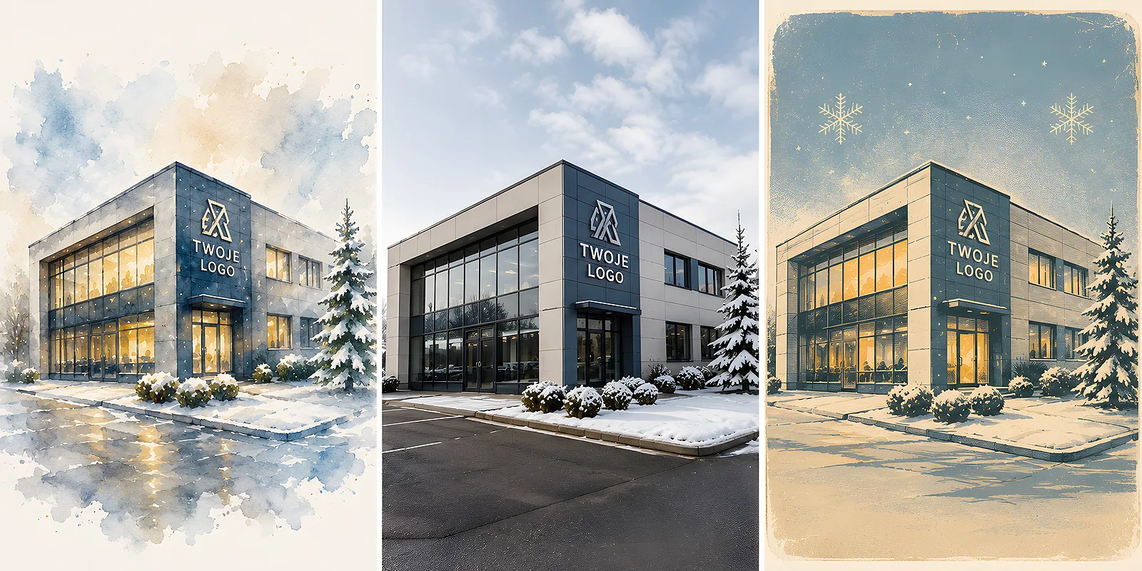
Many companies want their premises on a Christmas card - an office block, a townhouse in the centre, a plant or the place clients come to. It is a lovely idea, because the card becomes personal at once: it shows the place people associate with the brand. The only question is how to depict that building - because the same object painted in watercolour, photographed realistically and shown in a retro style tells three completely different stories.
The style of depiction is not a decoration, but the tone of the whole message. Choosing between watercolour, realism and retro, you are really deciding in what voice your company speaks to the recipient - warm and cosy, concrete and prestigious, or nostalgic and full of character. In this post we compare these three directions and suggest when each works best.
- Watercolour adds warmth and a hand-made character - the premises look cosy and less corporate.
- Realism and photography build concreteness and prestige - they show the company as it is, with attention to detail.
- The retro style adds character and nostalgia - it works great with tradition, craft and a long company history.
- The style must be matched to the industry and brand personality, not chosen because it happens to be fashionable.
- Whatever the style, one coherent direction matters - colour, paper and logo should play to the same tune.
Why the building's style says more than the building itself
The same address can be shown in dozens of ways, and each builds a different impression. A soft watercolour suggests warmth and closeness. A sharp, realistic photo speaks of reliability and scale. A retrospective graphic in muted colours evokes history and tradition. The recipient does not analyse this consciously, but feels the difference in a fraction of a second.
That is why choosing a style is worth starting not from the designer's taste, but from the question of what your brand is like. Before you decide, work out whether the company is rather elegant, friendly or bold - that single answer often suggests on its own which of the three directions will be most yours.
Watercolour - warmth and a hand-made character
Watercolour softens everything it touches. Blurred outlines, gentle colour transitions and the visible trace of the brush make even an ordinary office block look cosy and human. It is a style that takes the stiff, corporate costume off the company and says: we are close, we are warm.
It works best where the relationship with the client is personal and built on trust:
- Cafes, hotels, guesthouses and hospitality venues where atmosphere counts.
- Family businesses and local brands with a human face.
- Practices, studios and services where the client looks for warmth and calm.
- Lifestyle brands that build a mood rather than just selling a product.
Watercolour goes beautifully with a warm, muted palette - beiges, off-whites, subdued reds and greens. If you are wondering about background and accent colours, our post on whether to choose warm or cool colours will help - a well-chosen colour temperature can strengthen the watercolour effect or ruin it entirely.
Realism and photography - prestige and concreteness
At the other end stands realism: an accurate photo or a faithful drawing in which the building looks exactly as it does in reality. This style speaks of substance, solidity and scale. It shows the company as it is, without embellishment - and that in itself builds prestige and credibility.
Realism suits industries where facts and reliability count:
- Technology, finance and consulting, where the client values concreteness.
- Construction, real estate and industry, where the sheer scale of the object impresses.
- Law firms and institutions that want a serious, dignified image.
- Companies with striking, modern premises that are an asset in themselves.
Realism has one condition, though: the quality of the source. A poor photo taken on a phone against the sun will work the opposite way to what we want. It is worth ensuring a good shot, tidying up the frame and, if needed, gently refining it - adding snow on the roof, warm light in the windows, calming down the background. It is still realism, only shown from its best side.
The retro style - character and nostalgia
Retro is a style that instantly gives a company history. Muted colours, a grainy texture, lettering like on old shop signs, a composition resembling an old poster or a postcard from years ago - all of this builds a mood of nostalgia and continuity. The card says: we have been here for a long time and we know what we are doing.
This direction works great where tradition is an asset:
- Companies with a long history and round anniversaries.
- Craft, workshops and brands that emphasise handmade quality.
- Publishers, theatres, wineries and hospitality with character.
- Brands that deliberately build their image on heritage and the continuity of generations.
Retro has its trap, though: it is easy to overdo it and slip into kitsch, or into a costume that does not suit the company. A modern start-up dressed up as a pre-war workshop looks insincere. The retro style works when it refers to the brand's real history, rather than faking a past that never was.
How to match the style to your brand
Once you know the three directions, the choice comes down to an honest answer to a few questions. There is no style that is better in general - only a style that is better for your company.
- How do you want the recipient to feel? Warm and close - watercolour. Confident and solid - realism. With sentiment and respect for tradition - retro.
- What is the strength of your premises? A cosy climate calls for watercolour, impressive architecture for realism, and a historic character for retro.
- What does the rest of your identity look like? The style of the card should be an extension of the brand, not a one-off leap in a different direction.
Before you decide for good, ask the designer for the same building in two or three styles as a quick sketch. On paper the difference is often obvious at first glance, and choosing from ready proposals is far surer than choosing from imagination. It is a short step that saves later doubts.
Paper and finishing that support the style
The illustration style is half the effect - the other half is made by the paper it lands on. The same watercolour on smooth, glossy card and on paper with a tangible texture are two different cards. It is worth choosing the stock deliberately, because touch reinforces what the eye sees.
- For watercolour, decorative paper with a delicate texture fits well - it underlines the hand-made, painterly character. You can read more about how a natural paper texture becomes part of a design in a separate post.
- For realism, thick, smooth card works well, and matte or velvety Soft Touch lamination adds depth and elegance to the photo without glare.
- For retro, a slightly cream, eco or visibly structured paper sits naturally - it completes the nostalgic mood.
Whatever the style, it is worth keeping one coherent line: the background colour, the lettering of the greeting and the way the logo is shown should play to the same tune as the building illustration. How to weave in the company mark elegantly, so that it does not dominate the card, we describe in our guide on how to design an elegant Christmas card with a company logo.
Watercolour, realism and retro are not three levels of quality, but three different voices. Choose the one that sounds like your company - warm, concrete or full of character - and the premises on the card will stop being a backdrop and become the true hero of the seasonal greetings. You will find ready ideas and formats in our range of Christmas cards.