Mid-December, and the courier leaves another box at reception. Inside: a mug, a pen and a chocolate in festive paper. Nice, correct - and exactly the same as in the three other parcels that arrived the same week. Two weeks later nobody remembers which came from whom. That is not the mug's fault. It is the fault of a gift that said not a single sentence about its sender.
Every year the same trendy giveaways come back. Someone shows them at a trade fair, someone else spots them at a competitor, and suddenly half the market is handing out a version of exactly the same thing. Seasonal fashion is convenient, because it takes the decision off your plate - but it strips the gift of the very reason you give it. A corporate gift is meant to remind people of a particular company, not of December.
The alternative is not about hunting for oddity at any cost. It is about reversing the order: instead of starting with a catalogue and the question "what is trendy now", start with yourself and the question "who are we". Material, colour and form follow from the answer far more easily than you would expect.
- A trendy gadget is handed out by many companies in the same season - the gift then says nothing about the sender.
- Start with three questions about your brand: what we actually do, what tone we speak in, what we value at work.
- Brand character is carried by material, colour and texture - often more strongly than the print itself.
- A festive motif should be the frame, not the main character - otherwise it hides the brand.
- Test the idea simply: cover the logo and ask whether it is still visible that this came from you.
Why a trendy gadget says so little
A trend works like a common denominator. Since everyone sees the same novelties, everyone reaches for similar things - and in December several versions of the same idea land on a client's desk. The recipient is not judging quality at that point. They simply have no way of telling the senders apart.
There is a second side to the same coin. When a gift is picked from a list of trendy items, the decision is made without any link to the company. Nobody asks whether it fits the way the brand looks and speaks for the rest of the year. The result can be odd: an efficient, matter-of-fact technical company sends something chirpy and pastel, while a warm, craft-driven brand hands out cold plastic. The recipient will not name it, but they will feel the mismatch.
We write more about why a gift "without character" usually ends up in a drawer in our post on how to create a corporate gift that will not end up in a drawer.
Start with three questions about your own brand
Before you open any catalogue, answer three questions. A few sentences on a sheet of paper are enough - this is not meant to be a brand strategy, only a starting point for a purchasing decision.
What we actually do every day
This is about real daily work, not the slogan on your website. Is your work precision and numbers, or is it work with your hands? Do clients come to you for calm, or for speed? A company that sells reliability should give things that work faultlessly and last. A company that sells experiences can afford an object that pleases the eye more than it serves a function.
What tone we speak in
Read your own emails to clients and the copy on your site. Are they factual and lean? Warm and playful? Politely formal? The gift and the card that comes with it should carry that same tone. A joke-shaped gift from a company that writes very formally all year round sounds like a mistake - and the other way round too.
What we value at work
This usually hides the most interesting clue. If you value durability, give one thing that lasts for years instead of ten trinkets. If you value simplicity, drop the ornaments. If you value being local or caring for the environment, let it show in the paper and the packaging, not only in a sentence on the card.
Four directions, not four fixed recipes
The examples below are a way of thinking, not a list rigidly assigned to industries. A technical company can have a very warm character, and a craft workshop a very raw one. The point is to see how character translates into a choice.
- A company with a technical character - built on precision and order. Solid, well-finished things work well here: a metal pen, an engraved flash drive, a notebook with a clear grid. Few colours, a lot of care in the making.
- A craft brand - lives off material and the human hand. Thick board, decorative or eco paper, a texture you can feel and a simple one-colour print all work naturally. The less smooth perfection, the better.
- A service company - sells a relationship and the client's peace of mind. Things used daily and without drama do the job: a good notebook, a practical desk set, a card with one specific, personal sentence.
- A creative brand - can afford form. A distinctive form, a bold colour, a series of gifts in which every piece looks like part of a bigger whole.
If you are looking for an idea beyond the obvious shelf, our post on how to find an unusual promotional gift that fits your brand character will help. You will also find ready suggestions in our range of promotional gifts.
Material, colour and texture speak first
The recipient picks the gift up before reading anything. In that first second only the material is working. Rough board says something different from smooth lamination, dark matt film something different from gloss, heavy metal something different from light plastic. It is the cheapest and most effective carrier of brand character, because it works without words.
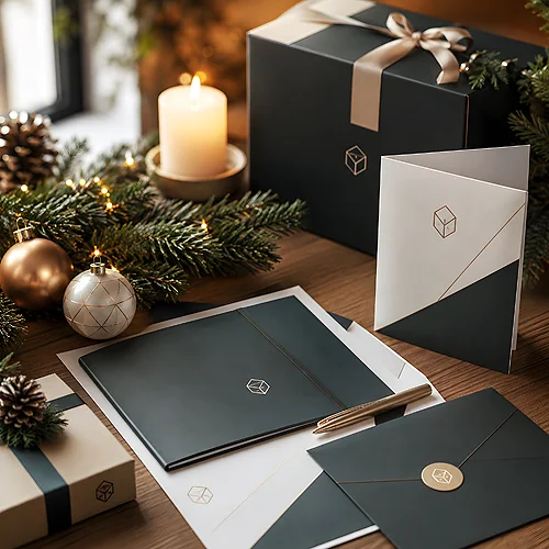
It pays to stay with the colours you use all year. If your identity rests on navy and grey, a festive red from the catalogue will turn the gift into a foreign object. Better to add a seasonal accent within your own palette: a deeper shade, a different finish, velvety Soft Touch film where there is usually plain paper. It is still your brand, only dressed for the occasion.
The covered-logo test: put the idea on the table, cover the spot where the logotype will go with your finger, and ask someone from the team whether it is still clear that this came from you. If covering it leaves an anonymous object, take a step back - it means the logo was supposed to do all the work.
When a festive motif helps, and when it gets in the way
A Christmas tree, snow and stars have one job: to say "this is a gift for this time of year". They work brilliantly as a frame - a small detail on the packaging, a pattern on the ribbon, an accent on the card. The season is then the background and the brand the foreground.
Trouble starts when the motif takes over. A gift covered entirely in festive graphics becomes seasonal decoration, put away after New Year along with the baubles. A simple rule: an item that stays for longer should look like you all year round, while the festive element is better placed on what is one-off anyway - the packaging and the Christmas card.
Consistency with the rest of your materials
A gift does not work in a vacuum. It reaches someone who knows your offer, your website, your invoice and your email signature. If the gift looks as though it came from a different company, it loses half its power - the recipient will not connect it with anything they already know.
The easiest check is a single photograph. Line up the gift, the packaging, the card, a business card and a sample of the materials you send to clients. Everything should look like parts of one set. If something stands out, the culprit is usually the colour or the typeface - and both are easy to fix before printing. We write more about building that recognisability without touching your logotype in our post on how to create a recognisable visual style without changing your company logo.
Repetition instead of chasing trends
The most underrated strategy in corporate gifting is consistency. A brand that sends a gift in the same spirit three years running - the same palette, the same type of material, a similar packaging character - builds something you cannot buy in a single season. Clients start recognising the parcel before they open it, and sometimes even look forward to it.
Repetition does not mean dullness. Each year you can change the object itself and the leading motif while keeping the constants: colour, the way you sign off, the character of the packaging. It is exactly the same logic that lets a gift work without loud advertising - we described it in our post on why promotional gifts that do not look like advertising simply work.
A Christmas gift does not have to be the surprise of the year. It has to be yours. If it grows out of what you do and how you speak to clients, it will hold its own even when the company next door sends something pricier - because a trendy gadget is forgotten by January, while a thing that fits the brand stays, together with the memory of where it came from.