This conversation happens in every company at roughly the same point in the year. One person says: it is supposed to remind them of us, so the mark has to be visible. Another replies: it is supposed to be a present, not a leaflet. Both are right - just in different situations. The whole skill lies in knowing which one you are in right now.
The size of a logo on a gift is not a matter of taste but of function. The same mark at the same size can be entirely appropriate on a gadget handed out at a trade fair and entirely inappropriate on something given to a business partner at the end of the year. Below we break it down: when a large mark helps, when it gets in the way, and what to do when you want to leave a trace of the brand without turning the gift into an advertising carrier.
- A large logo makes sense where the object's function is recognisability - trade fairs, mass campaigns, materials for internal use.
- For a gift to a business partner, a personal item or a present for an employee, a large mark usually hurts.
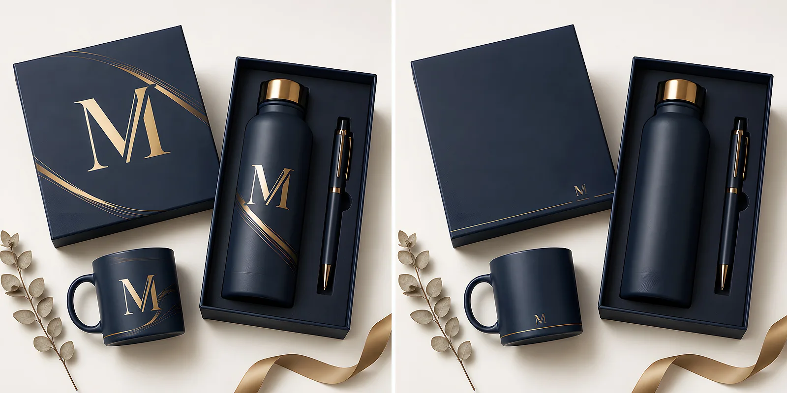
- Alternatives: the mark on the base or in a footer, engraving on a flash drive, the company colour, a pattern from the brand system instead of a logotype.
- Packaging is the best place for branding - it is seen at the moment of handing over, while the gift itself stays clean.
- A practical test: will the recipient use this in front of their own client or at home?
Where the tension comes from
A corporate gift plays two roles at once, and those roles fight each other. On one hand it is a gesture towards a specific person. On the other it is a cost someone in the company has to justify, and the simplest justification sounds like: they will remember us. Hence the reflex to make the mark as large as possible, because bigger means more remembering.
In practice it works the other way round. The more something looks like an advertisement, the smaller the chance anyone will use it - and an unused object reminds nobody of anything. We described this mechanism at length in our post on why promotional gadgets that do not look like advertising work better. In short: memory is built by use, not by how visible the mark is at the moment of handing it over.
When a large logo is fine
There are situations where a large, legible mark is not only acceptable but genuinely needed. They share one thing: the object's function is recognisability itself.
- A gadget handed out in bulk - at a trade fair, conference or event. The recipient collects a dozen things in a day and a week later cannot recall who gave what. Here the mark is the only information that survives.
- Materials for internal use - folders, meeting notebooks, station markers. Here the logo organises rather than sells.
- Objects whose job is visibility - lanyards, reflectors, event bags, things worn by the team during a campaign. The mark is the reason such an object exists.
- Materials sent inside client parcels - stickers, fillers, cards added to a shipment. The recipient expects the brand to be present there.
The common denominator is simple: nobody receives these things as a personal present, so the presence of the brand bothers no one.
When a large logo hurts
The opposite list is shorter but more important, because that is where the costliest mistakes are made - the cost is not in the money spent but in the gesture wasted.
A gift for a business partner
A present for a business partner should say: we value this cooperation. A large mark turns that sentence into: remember us for the next order. The recipient senses it immediately. On top of that, a partner often has their own brand and their own clients - putting somebody else's logotype on their desk is simply awkward.
A personal item
Anything the recipient carries with them or keeps at home calls for restraint. A wallet, a mug, something for the kitchen, a small object that enters private space. The more personal the item, the smaller the mark should be.
A present for an employee
Here a large mark makes particularly little sense, because the employee knows the logo. There is no need to remind them of it. The mark should signal belonging rather than convey information - and a small detail is enough for that.
Run a practical test: imagine the recipient pulling this out in a meeting with their own client, or putting it on a table at home. If either scene would feel awkward - the mark is too large or in the wrong place. That question settles most in-house arguments faster than an hour of discussion.
Alternatives to a huge mark
Giving up a large logotype does not mean giving up the brand. It only means the brand shows up more subtly - and often more effectively, because the object stays in use.
- The mark on the base or in a footer - a logo under a mug, on the back cover of a notebook, at the bottom of a card. Visible to whoever uses it, invisible to everyone around.
- Engraving instead of print - on a metal flash drive or pen, engraving gives a lasting effect that reads far less like advertising than a large print. Print makes sense too when the mark needs colour - it is a decision about the character of the object.
- The company colour as a brand signal - if a company has a recognisable shade, the colour of the object alone can do the work of a logotype. It is the purest form of branding there is.
- A pattern from the brand system instead of a logotype - a graphic element from the identity, a repeating motif, a distinctive detail. Someone who knows the brand will recognise it; an outsider will simply see a nice pattern.
- The mark only on the packaging or a tag - the gift stays clean and the brand appears at the moment of handing over. More on this below, because it is usually the best solution.
Remember too that the size of the mark is one decision and its content is another. How much information actually needs to sit on an object we unpack in our post on whether to use a logo, a website address or a QR code on gadgets. In short: the fewer elements, the better the whole thing looks.
Packaging as the place for branding
This solution defuses the entire argument. Packaging is seen exactly when branding makes sense - at the moment of handing over and opening. Afterwards it goes to the bin or onto a shelf, while the gift itself stays in use without a foreign mark on it.
A box with a logo, a ribbon in the company colour, a sealing sticker, a thank-you card inside, a tag on the set - all of it builds the moment when the recipient knows perfectly well who the parcel came from. Nobody forgets that. And the object inside can be completely clean, because its job is to serve, not to inform.
This logic works beyond gifts too. When a brand should be present in a space without being pushy, similar rules apply - we describe them in our post on gadgets in a reception area, an office and a point of sale.
The practical side: a mark that looks good small
Deciding to shrink a logo has technical consequences. A mark designed for large formats can fall apart when it lands on a surface the size of a fingernail - thin lines merge, small text stops being legible, gradients lose their point.
That is why it pays to keep a simplified version at hand: the symbol alone without the name, a single-colour variant, a contrasting version for dark backgrounds. This is a standard part of a well-kept brand identity and the most common reason somebody orders a larger print than they wanted at the last minute - they simply did not have the right file. How to sort this out at your end we describe in our post on organising company files and logo versions.
When preparing materials for print and marking, outlined text, a vector version and clearly stated brand colours all help. We have gathered the basics in our file preparation section - worth a look before the order starts, because corrections at that stage are the cheapest.
How to decide in five minutes
If you need to settle it quickly, three questions are enough. Is the recipient getting this as one of many, or as a gesture aimed at them? Is the object meant to serve recognisability or everyday use? Will the recipient use it in front of their own clients or at home?
The answers usually line up in one direction and the decision becomes obvious. Mass, recognisable, public - the mark can be large. Personal, functional, private - the mark moves to the base, the tag or the packaging. The rest is a matter of a good file and sensible execution.
A corporate gift does not have to shout to be remembered. People remember things they use and gestures that look considered. If the brand is to appear in that, all it needs is a well-chosen place - and usually the best place is the one the recipient looks at exactly once, at the moment of opening the parcel. Our promotional gadgets and flash drive models leave plenty of room for that, from a discreet engraving to a full print - the choice is yours. In practice that choice is built into the model: Unity is marked by engraving only, while Colour takes UV print only, on a coloured casing.