A small business rarely keeps thick binders of brand rules on a shelf. And that is fine - it does not need to. Almost every one, though, has the same small headache: sometimes the logo is navy, sometimes almost black, the flyer speaks in a different typeface than the business card, and a new designer asks about "that exact shade of blue" and nobody can answer. A brand style guide sounds like a corporate affair, but in a one- or two-page version it solves precisely these everyday frictions.
This is not about a thick document with chapters on "the brand mission". It is about a simple cheat sheet that you, your business partner, the printer and every freelancer who touches your materials can reach for. A few decisions written down once save a lot of corrections later - and make the company look coherent, even though nobody is watching over it day to day.
In this post we show what a small business mini-brandbook should actually contain, how to make it cheaply and why it is worth doing at all. No theory - just the specifics that come in handy when you order your first business cards or flyers.
- A small business does not need a thick guide - a one- or two-page mini-brandbook is enough.
- It should contain: logo versions, colours (with exact values), fonts, a few usage rules and print examples.
- The biggest value is coherence - across different orders and different contractors.
- You can put it together yourself, in free tools, in a single calm afternoon.
- Treat it as a living cheat sheet, not a document for show - it is meant to be used, not framed on a wall.
Why a small business needs its own brand guide
Imagine that over a year you order business cards from one person, flyers from another, and a trade-show banner is designed by someone else again. Without a shared reference point, each of them guesses: picks a blue by eye, drops in whatever font is at hand, enlarges the logo until it loses its proportions. The result is a set of materials that are nominally yours, yet look as if they came from three different companies.
A mini-brandbook is a single source of truth. Instead of explaining everything from scratch with each order, you send one file and can be sure the business card, letterhead and folder will play together. It is also protection for the future - when you change designer or printer, the brand does not jump around, because the rules stay the same. We write more about building this kind of coherence on a small budget in our piece on how to create a coherent visual identity for your company.
What a mini-brandbook should contain
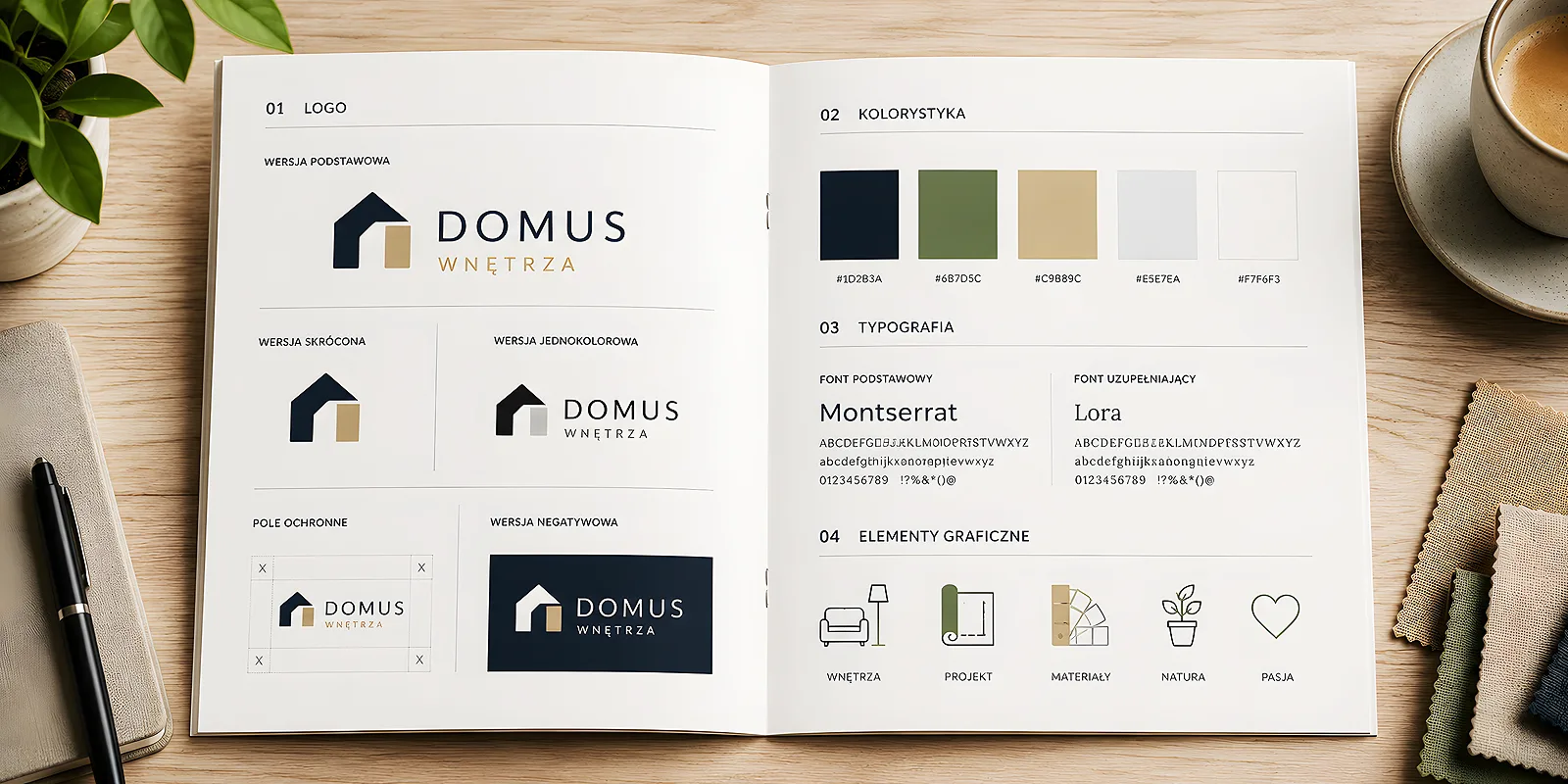
A good guide for a small business fits on one, at most a few pages. It does not need philosophical chapters - it needs the specifics you reach for in practice. Here is the core that works almost everywhere.
The logo and its versions
Show the logo in its primary version and in the ones you really use: horizontal and vertical, in colour and in a single colour (for stamps or single-colour printing), on light and dark backgrounds. Add two rules: how much clear space to leave around the mark and its smallest sensible size. That solves most mishaps with stretching and cramming the logo. How to organise the files themselves, so you always reach for the right version, we describe in our guide on how to sort out your company logo versions.
Colours
Write down two or three brand colours with exact values - otherwise the company blue will be different every time. Give values for print (CMYK) and for screen (HEX/RGB), because the same colour is written differently on paper and on a website. Mark which colour is the main one and which are accents. That way the printer and the designer hit the same shade without guessing.
Typography
Choose one typeface for headings and one for body text - and stick to them everywhere. Note the font names and fallbacks in case someone does not have them. If you are still choosing fonts, our post on how to choose a typeface that suits your brand character will help.
Usage rules and print examples
A few simple rules for yes and no: on which backgrounds the logo works and on which it disappears; what not to do (do not stretch it, do not change its colours, do not add shadows). Finally, the most important part - show examples on real materials: how the brand looks on a business card, on letterhead, on a flyer. A preview on the product says more than a whole page of rules.
Make the mini-brandbook in a format that is easy to send - a single PDF file. Attach a packed set of the logo in print and web versions. Then the answer to whether you have your logo and colours somewhere is one drag of a file, not an hour of searching through emails.
How to make it cheaply (or for free)
A mini-brandbook needs neither a budget nor expensive software. All it takes is a tool you already know and one calm afternoon.
- Gather what you have - logo files, favourite colours, fonts from your existing materials. Usually half the work is already done, just scattered.
- Put together one page - in a free online editor or in a presentation. It does not have to be flashy, it has to be clear.
- Set the colour values - add HEX and CMYK, so there is no roughly this kind of blue.
- Add examples - paste mock-ups of a business card and a flyer, so the brand is immediately visible in action.
If you work in Canva, part of this job gets done along the way - your own set of colours, fonts and templates works like a brandbook in the background. We show it in our piece on how to set up a company kit in Canva.
How it works across orders and contractors
The real value of a mini-brandbook shows only in motion. You order business cards - you send the file and can be sure the colour and font match the rest. You need letterhead - the designer does not guess the shade, but takes it from the guide. A presentation folder for a meeting comes along - and the whole set looks as if it was made together, even though you made it in three instalments with different people.
It also saves your nerves when you change contractor. The new designer gets one document instead of ten questions, and you do not explain the brand from scratch. Fewer rounds of corrections, fewer debates about whether it is the right blue, a faster start.
One page or something more
For most small businesses, one well-made page does the job for a long time. An expanded document makes sense as the brand grows: more people create materials, social media joins in, along with signs, car or shop-window branding. Then it is worth adding rules for those carriers - but still in an evolutionary way, adding more pages to what already works rather than starting over.
The rule is simple: the guide should be as big as you actually use it. Not a page more. A living one-page document that everyone consults beats a beautiful treatise that sits in a folder and nobody opens.
Does a small business need a brand style guide? If by a guide we mean a thick corporate volume - no. If we mean one or two pages listing logo versions, colours, fonts and a few rules - yes, very much so. It is the cheapest insurance for coherence you can buy. Make it once, keep it at hand and send it to everyone who creates your materials - and the company will start to look bigger and better organised than its budget would suggest.