Before anyone plays your disc, they first pick it up. And it is that very first moment - the weight, the texture, the way it opens - that builds the first impression of what is inside. Packaging is not an add-on to a disc. It is its cover, its calling card and the first sentence of the conversation your brand has with the recipient.
The choice between paper packaging and a classic plastic case is not just a matter of taste or habit. It is a decision that communicates the character of the product and the values of the brand before a single word is said. Both options have their strengths, and both can work beautifully - if you choose them deliberately for the situation. Below we break it down so you know when to reach for paper and when for plastic.
- Packaging is the first contact with the product - it builds the sense of value before the disc is even played.
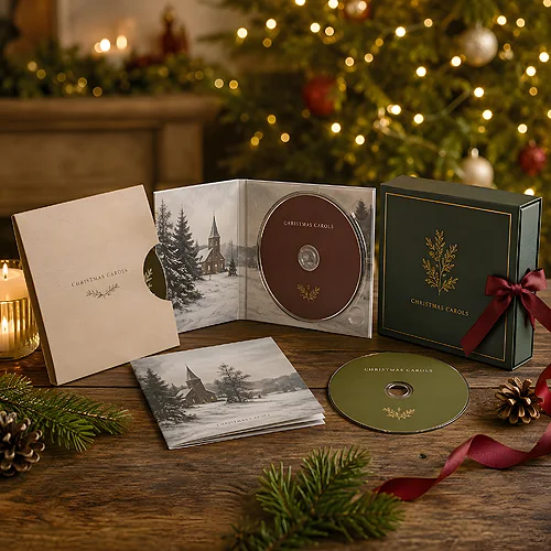
- Paper (a sleeve, a digipak) is light, pleasant to the touch, offers a large printing surface and builds an eco and premium image.
- A plastic case gives rigid protection, a traditional feel and a replaceable front - it works well in a collection and for long-term storage.
- The packaging form communicates the brand's character - paper speaks of closeness and nature, plastic of durability and order.
- When handed over, paper feels like a gift, plastic like a solid, catalogue-style product.
- There is no single right answer - what matters is matching the form to the goal, the recipient and the situation.
Packaging as the first impression
The sense of value forms in a few seconds and largely before we reach the contents. Before anyone hears the music or looks at the photos on the disc, they hold the carrier itself in its packaging. It is the packaging that decides whether the product feels like a considered gift or an ordinary add-on tossed in at the end.
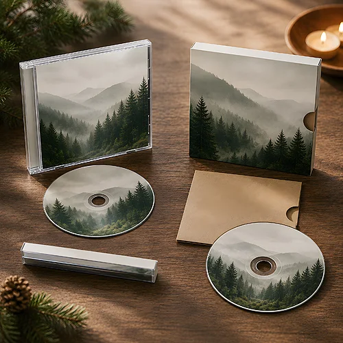
That is why it is worth thinking of packaging like a book cover. It does not say everything yet, but it sets expectations. The same album in a raw paper sleeve and in a glossy plastic case tells two different stories - one about craft and closeness, the other about order and catalogue-style solidity. Both can be good, as long as they are deliberate. We wrote more about how the cover itself becomes a medium of communication in our post on the cover of a disc as an advertising surface.
Paper packaging - lightness, touch and surface
Paper forms, from a simple sleeve to a fold-out digipak, have become a byword for a considered product in recent years. Not without reason - paper has a few qualities that are hard to fake with plastic.
- Pleasant to the touch - matte, lightly textured cardboard is nice in the hand and instantly signals care. The hand senses quality faster than the eye can judge it.
- A large printing surface - a fold-out digipak gives plenty of room for graphics, photos, text and a logo. It is almost a small brochure in which you can tell the story of a brand or an album.
- Low weight - paper is light, so the parcel is lighter, which genuinely eases the shipping of larger batches.
- An eco and premium image - a natural material is associated with care for the environment and with craft. Well-chosen paper can look more expensive than it costs.
Paper works brilliantly wherever emotion and first impression matter - in gifts, image materials, limited editions. If you want such a form, it is worth looking at digipaks, and for shorter texts at the digipak 4p variant, which offers four panels of content while keeping a compact form.
If you care about a premium feel, go for a matte finish, and for a natural, rough surface reach for Kraftliner in the EKO versions, such as the 4P EKO digipak. A smooth gloss easily reads as mass production, while lightly rough, natural cardboard does exactly the opposite - it raises perceived value without a single extra element.
A plastic case - protection, tradition and replaceability
The classic case is not disappearing for no reason. It has advantages paper cannot replace, and it is still the natural choice in many situations.
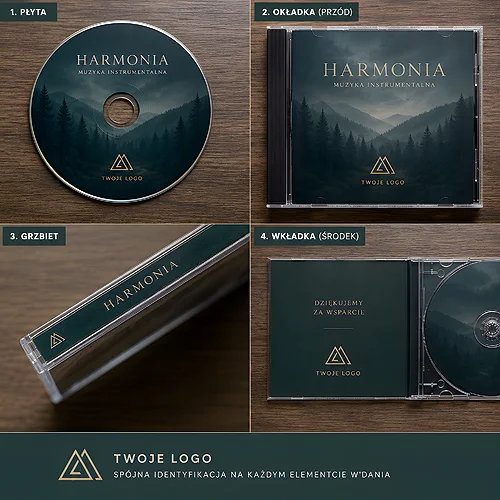
- Rigid protection - a hard shell protects the carrier well during transport and everyday use. The disc stays safe even after years on a shelf.
- A traditional, expected feel - for many people a case is simply the natural form of a disc. It does not surprise, needs no explanation, fits the familiar pattern.
- A replaceable front and insert - the cover can be taken out, swapped or updated without replacing the whole packaging. That is handy for series and updates.
- Stability in a collection - uniform spines line up evenly on a shelf, and the rigid form withstands frequent taking out and putting back.
Plastic wins where the disc is meant to serve for a long time, to be part of a collection or to go into an archive - that is the job of CD-Box cases with covers and slimmer SLIM cases. Its solidity and predictability are strengths, not flaws - they simply play in a different repertoire than paper.
How the form communicates brand value
The packaging material is a message in itself. Paper says: we are close to nature, we care about detail, we treat this as something personal. Plastic says: we are solid, orderly, built to last. Neither of these narratives is better - what matters is which one you want to tell and to whom.
A premium brand building its image around craft and emotion naturally leans towards paper. The publisher of a large collection meant to sit on a shelf for years will more often appreciate plastic. It is worth making this decision part of a conscious strategy rather than an accident - just like the choice of music, which we wrote about in the context of a music album in the image campaign of a premium brand.
The moment of handing over - what the recipient feels
The most telling moment is when the recipient picks up the disc. That is when the packaging form translates into a concrete feeling - and here paper and plastic diverge most clearly.
Paper packaging, especially a fold-out digipak, feels like a gift. You open it with a gesture, the texture invites touch, and the lightness adds a certain subtlety. It is a form that builds closeness and warmth - well suited wherever the disc is meant to be a gesture, not just a carrier.
A plastic case works differently - solidly, concretely, in a catalogue-like way. The recipient feels a durable product in the hand, one that will last for years. It is an impression of order and certainty, less emotional but very practical. For collections and editions meant for long use, that is exactly the point.
How to choose - a short decision guide
Instead of seeking one correct answer, go through a few questions. The answers will settle into a natural choice.
- What is the purpose of the disc? - a gift and image lean towards paper, a collection and archive towards plastic.
- How long is it meant to serve? - a one-off, strong accent is paper, years of storage is plastic.
- How much do you want to say on the packaging? - lots of text and photos is a strength of fold-out paper, minimalism and order is plastic.
- What should the recipient feel? - emotion and closeness come from paper, a sense of solidity from plastic.
- How does it reach the recipient? - mass shipping likes light paper, shelf sales and collections like a rigid case.
If you are only just shaping the project and want to compare the options, a good starting point is a review of discs and packaging, and for questions about materials the section on materials and papers will help. One thing matters most: the packaging form is not neutral. Paper and plastic are two different languages - choose the one your brand speaks most naturally, and the product will gain a coherence the recipient will feel before anything is even played.