Imagine receiving a disc or a flash drive with not a single word of description. You are holding a medium that contains something - but what? Photos? Documents? A film? From which event, which year, in which version? An unlabelled medium is a puzzle the recipient has to solve before they can even start using it. And yet a few lines on the print and the insert are enough to make that uncertainty disappear.
A good description works like a book cover - in a few seconds it tells you what is inside, who it is for and where to start. It is a small thing that changes how the whole is received: a professionally described disc or flash drive inspires trust, while an unlabelled one lands in the "I will check it someday" drawer. Below we show what is worth placing on the print and the insert so the recipient knows at once what to expect.
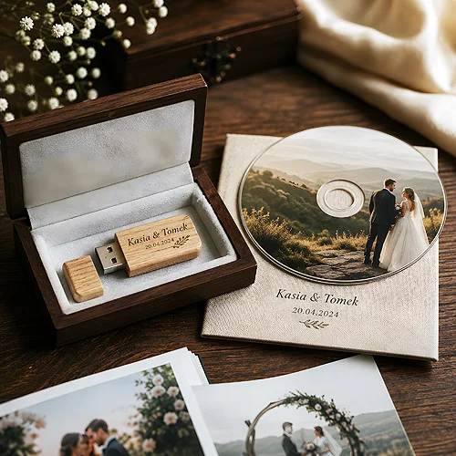
- On the print, put what identifies the medium: a title, a short "what is inside", a date or a version.
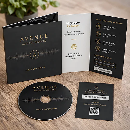
- The insert or label is the place for a fuller contents list and a short opening instruction.
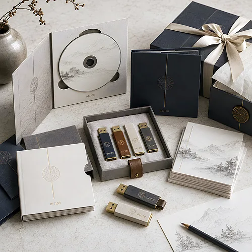
- Marking the version or edition prevents mix-ups when there are several media.
- Guide the recipient on "where to start" - a single starter file or a folder marked as first.
- The description should be consistent with the brand: the same colours, logo and font as the rest of the materials.
- A legible print means a large, high-contrast font and space planned in already at the design stage.
What to place on the medium itself
The print on the disc or the flash drive casing is the first thing the recipient sees. It has little room, so every element has to count. It is not about fitting everything in - it is about fitting what identifies the medium at a glance.
It is worth including a few basics:
- Title - a short name that says what the contents concern, for example the name of an event, project or company.
- What is inside - one or two words of clarification: photos, presentation, materials, film.
- Date or version - the year, month or edition number, so successive media can be told apart.
- Brand - a logo or the sender's name, so the recipient knows who the material came from.
The rest - the full list, the instruction, the details - can go on the insert. The print is meant to be a legible calling card of the contents, not their full catalogue. If you are planning a print on a disc, it is worth thinking about the technique and the space for text right away; printed discs designed so the title and description are clearly visible, rather than pushed to the edge, come in handy here.
Test legibility at arm's length. Put the print design on the desk and look at it from a sitting position. If the title can be read without leaning over the medium, the font is just right. If you have to squint - enlarge the text and increase the contrast before you send anything to print.
The insert and label - the place for a contents list
The print says "what this is", while the insert says "what exactly is inside and how to open it". This is where you have room for a fuller description that takes the recipient by the hand. Especially with a flash drive holding many folders or a disc with varied material, the insert makes a huge difference.
A good insert usually contains three things: a contents list, a note on who the material is intended for, and a short opening instruction. For disc packaging we print them as booklets for digipaks and ecopacks. The list need not be meticulous - a list of the main folders or sections with a one-sentence description is enough. The opening instruction tends to be underrated, yet it can spare the recipient frustration: telling them which file to start with or which program to open the contents with turns "I do not know what to do with this" into "I know exactly where to start".
Guiding the recipient from the first step
The most common mistake is assuming the recipient will figure it out themselves. Sometimes they do, but far more often they open the medium, see a dozen folders and have no idea where to click first. That is why it is worth deliberately pointing to a starting point. It could be a file named so it is immediately clear it comes first - for example "start here" - or a short note on the insert: "open the Presentation folder, the main file is inside". With a flash drive, a single guiding file in the root directory that explains the rest works well. This is the same approach we describe in our post on how to design the contents of a flash drive so the recipient wants to open it - the description and the organisation of the contents work together.
Marking the version and edition
When there is only one medium, things are simple. The trouble begins when there are several identical discs or flash drives - different versions of a project, successive months, updates of the material. Without a version marking, the recipient (and you) quickly lose track of which disc is current.
That is why it is worth marking versions consistently. The simplest approach is a date or a number, placed both on the print and on the insert. This helps on two levels:
- The recipient knows they are holding the latest version, not an old copy from before the corrections.
- The sender can check at a glance which medium they sent to whom and when.
- The archive stays orderly - successive editions form a logical sequence instead of a pile of identical discs.
If the material tends to be updated, it is worth leaving a fixed spot for the version in the design - one that is easy to swap out with the next run, without redesigning the whole thing.
Consistency with the brand and aesthetics
Describing a medium is not only a function, but also an image. A disc or flash drive with a print in the brand's colours, with the logo and the same font as the rest of the materials, looks like a considered part of the whole rather than a last-minute add-on. To the recipient it signals that the sender cares about detail - and that signal carries over to how the contents are received.
It is worth keeping a few constants: the colour palette, the logo, one typeface for titles and one for body text. If the medium is part of a larger set - a presentation, an offer, a keepsake - the description should echo the rest. Packaging elegantly raises the whole thing too: a digipack with a well-designed cover gives more room for a description and makes the whole feel like a proper release rather than a loose disc. We write about how to use that surface in our piece on how a disc cover is an advertising surface - here aesthetics and communication go hand in hand.
Format and space for the description - plan it in advance
The best description is useless if there is no room for it. That is why space for text is worth planning at the design stage, rather than squeezing it in at the last moment wherever a bit of empty area happens to be left. A print on a disc has different constraints than a small flash drive casing, and the insert gives the most freedom - match the medium and packaging to how much you want to convey. If the description has to fit on the carrier itself, the most room is on the PCC in credit card format - the whole card surface is printed.
A few practical rules make life easier:
- Hierarchy - the title largest, the list and details smaller. The eye should know where to start.
- Breathing room - do not cram text to the edges, a little empty space improves legibility.
- Contrast - dark text on a light background or the other way around, with no text lost in the graphics.
- Consistent format - if you make a series of media, keep the same layout so they are recognisable.
Finally, it is worth checking the file before sending it to print - the right bleeds, resolution and fonts converted to outlines save surprises. The tips on preparing files will help. A well-described medium is a small thing that makes a difference: the recipient does not have to guess, does not put the medium off for later, but knows at once what they received, who it is for and where to start. And that is exactly what turns an ordinary disc or flash drive into material people actually reach for.