A branded USB drive impresses for a second. Then the recipient plugs it into a computer - and the real test begins. If they see chaos with file names like scan_final_v3, they close the window and drop the drive into a drawer. If they see order and an invitation inside, they stay longer. The drive itself is just the packaging - what matters is what you put on it and HOW you arrange it.
- The drive catches the eye, but the contents decide whether anyone browses them.
- A clear folder structure and a "start here" file lead the recipient by the hand.
- Value over advertising - a guide, catalogue, film or samples work better than a lone PDF flyer.
- Friendly file names, a personal touch and a few formats make the difference.
- Less is more - an overloaded drive discourages just as much as an empty one.
Why the drive alone is not enough
A promotional USB drive has one great strength - it stays with the recipient physically, in a pocket or a bag. But its power ends the moment it is plugged in. From then on, neither the colour of the casing nor its shape matters - only the first impression on the screen.
Imagine you receive a drive from a company you are considering. You plug it in and see a dozen files with no order, named in a way only their author understands. The natural reaction is to close the window. Now the opposite - a clean folder opens, and inside there is one file named "Start here". You click it and already know what to do next. That second scenario is no accident - it is design.
The drive invites us inside. The contents decide whether we stay longer.
A folder structure that leads by the hand
The first thing the recipient sees after plugging in is the main directory. That is your shop window. If every file spills out at once, they feel lost. So organise the materials into a few clearly named folders - for example "Catalogue", "Guides", "Video", "For printing".
The rule is simple: at any moment the recipient should know where they are and what they will find inside. Two, at most three levels of depth are plenty. A deeper folder tree is a maze no one wants to leave with a smile.
Think about the order too. Name the folders you want shown first so they appear at the top - the eye travels down from the first entry. Keep the most important materials within one click and tuck the extras deeper. It is the same logic as a well-arranged shop window: first what should draw the eye, then the rest.
Before you load the drive, ask someone from outside to open it without your guidance. If they soon ask "where do I click?", the structure needs simplifying.
The "start here" file
Even the best arranged folders gain when you guide the recipient from the first second. So place one welcoming file in the main directory - "Start here" or a clear index. It is a short document, ideally a PDF, that greets, explains in two sentences what is on the drive, and suggests where to begin.
Such a file works as a signpost and a personal welcome in one. Instead of leaving a person alone with the contents, you tell them plainly: "We are glad you are here, this is what we prepared". It is a small detail that turns the whole thing from "a bunch of files" into "a thoughtful package".
If you are handing the drive to one particular person, add their name or a short line referring to your conversation. That personal touch costs a minute of work, and the recipient feels straight away that this was not a mass mailing. It is exactly these small gestures that get a drive browsed rather than set aside.
Value instead of advertising alone
The biggest mistake is treating the drive like just another flyer. If the only thing inside is a promotional folder and a price list, the recipient feels they were handed the drive purely to be sold something. Yet they already hold it - it is worth giving something in return.
Content that is useful in itself works best:
- A guide or e-book - concrete knowledge from your field that someone will reach for again.
- A product catalogue - well organised, with good photos and descriptions.
- A film - a short video shows more than a page of text and builds trust.
- Samples and downloadable materials - templates, checklists and patterns ready to use at once.
Sales materials can be there too - but let them accompany the value, not replace it. A recipient who finds something for themselves will remember far more easily who they got it from. If you are looking for a drive that will carry such a set well, check the classic branded USB drive in the Twister version or the whole category of promotional USB drives.
Friendly file names and a few formats
File names are easy to forget, yet they build the impression of order. Swap working labels like ver_final_2 for readable, human titles: "Catalogue 2026", "Guide - preparing files for print", "Film about us". From the name alone the recipient should know what they are opening.
It is also worth thinking about different formats. Not everyone wants to read - one person prefers to watch a film, another to print a guide. A PDF for reading and printing, video for a quick message, and if you share working materials, include them in a format the recipient will actually open. A few forms of the same content raise the chance that everyone finds something for themselves.
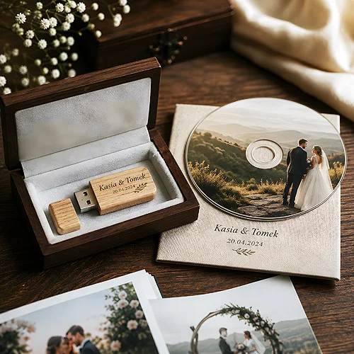
A USB drive pairs beautifully with printed packaging. In the calculator on every model page you pick the packaging: a plain white box, an elegant presentation box or a film pouch with an insert - and a short welcome note inside reinforces what the recipient finds on the drive.
Aesthetics in the details and moderation
Order shows even in the small things. Consistent naming, a uniform graphic style across the PDFs, a drive icon matched to the brand - all of it tells the recipient they are dealing with a company that cares about detail. And if it cares about a drive, it will probably care about the cooperation too. The same detail works on the outside as well: with the Colour the body is picked from several shades, so the drive can carry the brand colour before the recipient even plugs it in.
Finally, the most important rule: moderation. An overloaded drive with everything on it discourages just as much as an empty one. Better to give a few truly good materials than dozens of random files. Choose what is valuable, lay it out clearly and let the recipient feel you prepared this package especially for them.
The result? A drive people want to browse to the end, not shelve in a drawer. If you are planning it as part of a bigger campaign, take a look at the piece on when a product catalogue on a USB drive makes sense, and at the tips on how to use a promotional USB drive at trade fairs and conferences. A good drive plus well arranged contents is a duo that truly stays in memory.