
A gift set is judged at a glance. The recipient does not look at the box, the card and the gift separately - they see one whole and decide within seconds whether they are holding something considered, or a collection of things gathered in a hurry. One element from a completely different world is enough for the sense of elegance to fall apart in front of them.
This is good and bad news at the same time. Bad, because even a carefully chosen gift can look ordinary when it sits in a random box next to a card kept in a different style. Good, because coherence is not a matter of budget. It is a matter of a few decisions made at the start and repeated consistently across every element of the set.
Below we show what really ties a corporate festive set into one whole, how to arrange its layers and where things usually go wrong. If you are only starting to plan the contents, it is worth reading our post on how to design a corporate gift set - you will find a broader look at choosing the elements there.
- A set is judged as a whole - the weakest element drags down the impression made by all the others.
- Coherence comes from four things: a palette of two or at most three colours, one lead material, a repeated graphic motif and the same paper across printed pieces.
- Choose one finish and repeat it everywhere - matt or gloss film, but consistently, not alternating.
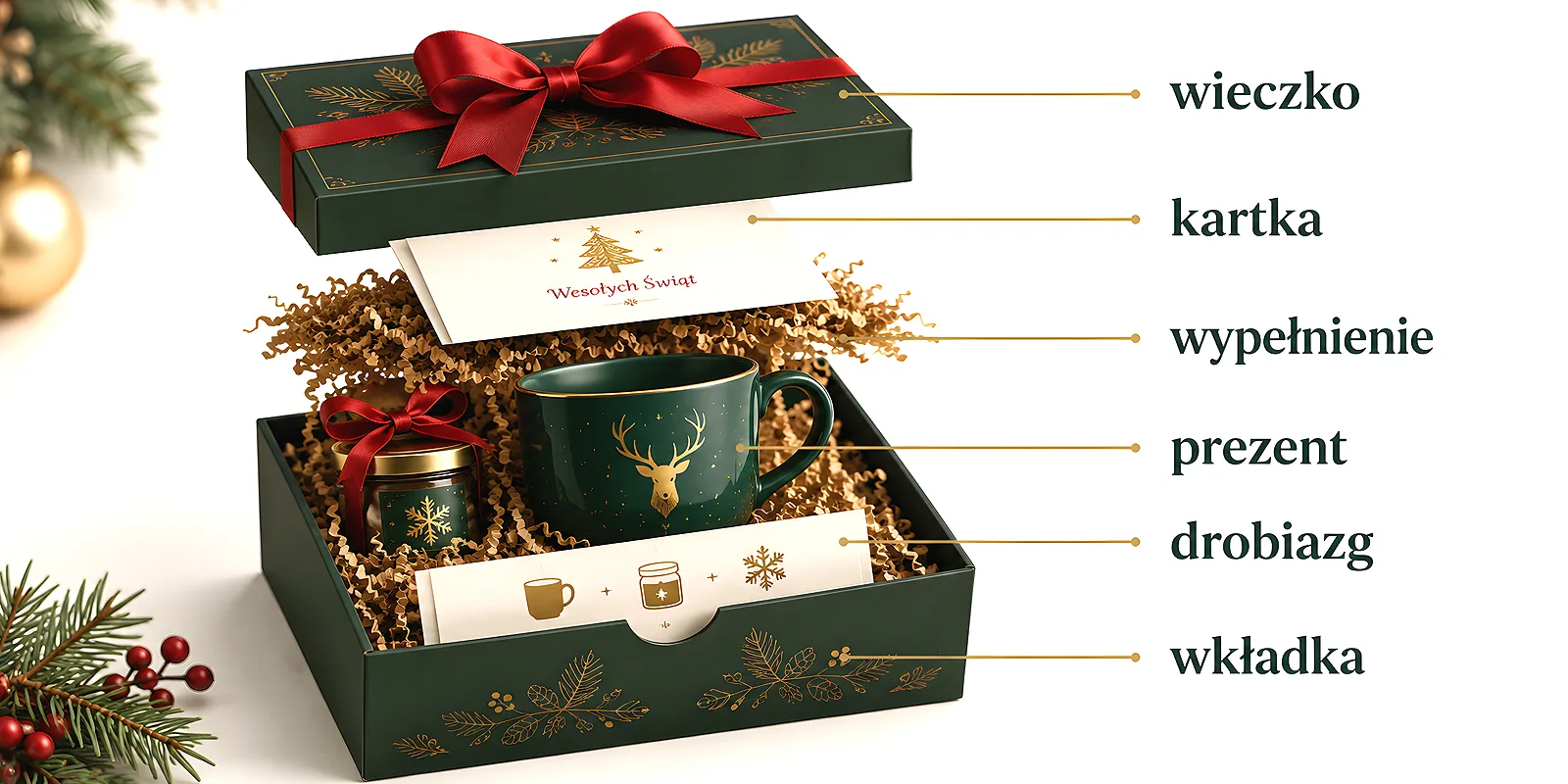
- The layers have their own order: box, filling, card on top, main gift, small extra at the end.
- The packaging stays with the recipient longer than the contents - treat it as a full element of the set, not as transport.
A set is judged as a whole
When we hand over a single item, the recipient looks at that item. When we hand over a set, the recipient looks at the relations between the elements: whether the colour of the card works with the colour of the box, whether the logo on the sticker is the same size as on the insert, whether the paper inside is of similar quality to the one on top. The brain does this automatically and very quickly.
That is why a set works differently from a single gift. A single gift stands on its own. A set holds together only as well as its weakest element. If an elegant box contains a card printed on thin paper in a completely different tone, it is that card that will define the impression of the whole - not the box we saved the least on.
The conclusion is simple and convenient in practice: it is better to plan a more modest set that keeps one line than a richer one glued together from random items. The same principle comes back when choosing the contents, which we wrote about in the post on personalised gift sets combining print, music and promotional items.
Four things that tie a set together
Coherence does not come from everything being pretty. It comes from repetition. Set a few constants at the beginning and stick to them with every next element - that is the whole secret.
Palette: two, at most three colours
Limiting the palette brings the most order. Choose a base colour, one supporting colour and possibly one accent. Bottle green with warm beige, navy with cream, deep red with grey - such pairs work because the eye immediately sees intent. When there are five colours, every element looks like it came from a different set, even if each one is lovely on its own.
One lead material
Choose a material that comes back in several places: decorative paper, eco paper with a noticeable texture, thick board, ribbon with a single weave. The same material on the filling, the band and the insert acts like a signature - without a word it says the whole thing was made together.
A graphic motif that returns
This is not about the logo repeated on every surface. It is about one recognisable detail: a branch, a line, a small pattern, a distinctive arrangement of type. The same motif in the corner of the card, on the sticker sealing the box and on the insert ties the set together more strongly than a company mark repeated five times in five sizes. Repeating the motif on the box closure is easiest with round stickers, since you match the diameter to the size of the lid.
The same paper in the card and the insert
The most commonly skipped element, and one felt instantly. If the greeting card is on thick, matt paper and the insert describing the contents is on thin office stock, the recipient will feel the difference with their fingers before they notice it with their eyes. The same paper in both printed pieces costs one decision and makes an enormous difference.
Before you order anything, write down four lines: two colours, one material, one motif, one finish. That is your guide to the set. Every time you add an element, check it against this list - if it does not match any of the points, it probably should not be in the box.
Finish: one decision, repeated
The print finish has one job in a set - to be the same everywhere. Matt film gives a calm, muted character and handles touch well. Gloss film lifts the colours and looks livelier. Soft Touch velvet film gives a softness in the hand that recipients remember. Each of them is good. The problem starts when the card is matt, the sticker is gloss and the insert has no finish at all - then the set looks like a collection of prints from three separate orders.
Shape works the same way. Rounded corners come as the ready shape of a loyalty card - if one goes into the set, let its size and proportions come back on the insert and the business card. The same applies to board thickness and format - one common denominator instead of four variants.
The layers of a set and the order of discovery
A set is not only its contents, but also a script. The recipient uncovers it in layers, and that order shapes the impression more than we tend to think.
- The box - the first impression, before anything is even opened. It should be matched in size to the contents.
- The filling - tissue, paper wool or an insert shaped to fit. It holds things in place and builds the moment of discovery.
- The greeting card on top - it should be read first, because it sets the tone for everything else.
- The main gift - the element the whole set is built around.
- A small extra at the end - a little addition discovered last, leaving a pleasant close.
The insert that tells the story of the contents
A short insert describing what is in the box does more than we expect. It explains why exactly these items ended up inside and turns a collection of objects into a story. A few sentences and a list of elements are enough - no marketing tone, just plain language. The insert also gives room for whatever will not fit on the greeting card.
The packaging stays longer than the contents
This is worth remembering when planning the budget for a set. The chocolate will be eaten, the calendar will come off the wall in January, and a solid box with a company motif very often ends up in a drawer and keeps serving. It is the cheapest advertising there is - it works for months, with no extra effort on our side.
So when choosing packaging, think of it as an element of the set rather than as transport. Our catalogue covers packaging for discs and media - a gift box is chosen separately. Even a simple box with a well-chosen sticker sealing it and a band in the brand colour looks like a considered solution. You will find more on choosing packaging without inflating costs in our post on packaging for premium products. And if the set is going to travel to the recipient by post, remember that a shipping carton and a gift box play entirely different roles - we covered this in our post on the differences between shipping and gift packaging.
Common mistakes
- Mixing styles - a modern, minimal card next to a rustic box. Separately both are good, together they clash at first glance.
- A box that is too big - the contents shift in transport, and after opening the recipient mostly sees empty space. Better to match the format to what will actually be inside.
- A gift lying loose - without filling, even the nicest item looks as if someone tossed it in while rushing.
- A card pushed to the bottom - wishes found at the very end lose their whole role. The card should be the first thing seen once the lid comes off.
- A logo in five sizes - a mark repeated in different sizes and colour versions creates clutter, not recognition.
- Adding elements at the last minute - every addition made outside the plan needs checking against the list of constants, otherwise it breaks the composition.
A checklist before ordering
Before you place the order for the whole set, go through these points one by one. It takes a few minutes and saves disappointment once the cartons arrive.
- Do all the elements fit within two, at most three colours?
- Does one graphic motif return on at least three elements?
- Are the card and the insert on the same paper?
- Is the print finish identical across all elements?
- Is the box matched in size, and does the content have filling?
- Is the greeting card sitting on top?
- Have you ordered a few spare sets for emergencies?
It is also worth ordering one set as a trial and assembling it fully before you order the whole run. Only then do you see the things a screen will not show: whether the lid closes smoothly, whether the festive card gets lost inside, whether the proportions make sense. That single test set is the best-spent part of the entire budget.
Coherence in a set does not require a large outlay or a designer on staff. It requires a few decisions made at the start and consistency with every next element. Set the palette, choose one material, repeat one motif, keep one finish - and the set will start looking considered on its own. The recipient will not name it out loud, but they will feel the difference the moment they lift the lid.