Artificial intelligence is flooding the internet with Christmas graphics - you type in a few words and moments later you have a snowy forest or a bauble on a red background. The temptation to build a company card solely on such an image is huge. The problem is that AI alone is rarely enough when a card is meant to truly look like your company. The best result comes from combining three tools: photography as the base, a designer who keeps the whole thing in check, and artificial intelligence that multiplies variants and suggests ideas.
In this post we show a practical workflow, that is, step by step who does what. You will see where AI really speeds up the work, where a human must have the final say, and how, along the way, not to lose coherence with the brand or stumble on preparing the file for print.
- Photography gives truth and concreteness - a real place, product or people that no generator will invent.
- The designer plays the role of director - combining elements and watching over composition, brand and legibility.
- AI is great at multiplying variants of background, mood and colour - it speeds up the search for a good direction.
- A human decides on the choice, coherence with the brand and the final details - AI suggests, it does not decide.
- A graphic from the screen has to be prepared for print - colours and resolution follow their own rules.
Three tools, three different roles
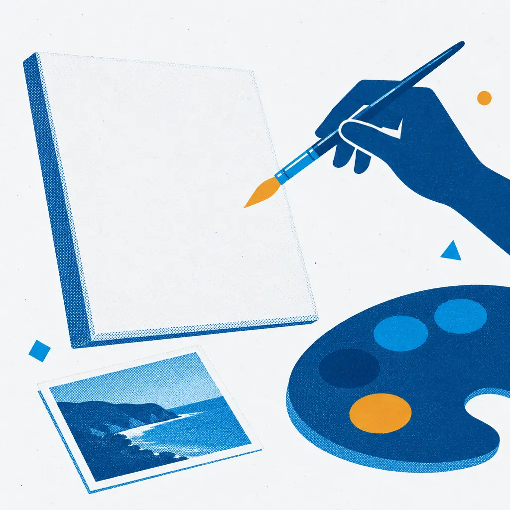
The easiest way is to think of it like a film set. Photography is the actor who brings truth to the scene - a real building, product or team. Artificial intelligence is the props and set department that instantly supplies new backgrounds, moods and colour versions. And the designer is the director who arranges it all into one sensible whole and makes sure that in the end it becomes your company's card, not a random collage.
When each tool does what it is best at, the result is far better than any of them alone. AI on its own can be striking, but detached from the brand. Photography on its own can be true, but raw. A designer on their own can be excellent, but slower when ten directions need testing. Together they complement each other perfectly.
Photography as the foundation
A photo brings something a generator cannot fake: truth. Real premises, a real product, actual people - these are elements the recipient will recognise and connect with your brand. A card based on photography says: this is really us, not a pretty image pulled from the web.
What is worth photographing as the base of a Christmas illustration:
- The company premises - the building, the entrance or a characteristic detail associated with the brand.
- The product or the result of your work - if that is the heart of the company.
- The team - people build warmth and show that real individuals stand behind the brand.
The better the source, the less work later. A sharp, well-framed photo in reasonable light is the foundation on which the designer and AI can build freely. A weak, dark shot taken in a hurry will limit every next step.
The designer - director of the whole
It is the designer who decides how to combine the photograph with the generated background, where to place the logo, how to lead the greeting and what finally goes on the card. They watch over composition, legibility and keeping the whole in the brand's tone. No generator takes over this role - and probably will not for a long time. You can read more about what AI really can and cannot do in our post on whether artificial intelligence will replace the designer.
The designer is also a quality filter. AI can generate an image with small errors - oddly arranged elements, distorted details, text that pretends to be letters but is not. A specialist's eye catches such things before they reach print, and either fixes them or rejects that variant.
AI - a generator of variants and mood
This is where artificial intelligence shows its full potential. Instead of painting ten background versions by hand, the designer can generate plenty of proposals in a short time: a different winter landscape, a different mood of light, a different density of snow, a different palette. It is a great tool for finding a direction before a decision is made.
The secret lies in how you ask for it. A general instruction gives a general result, while a precise description gives an on-target proposal. How to phrase such instructions to get better designs, we describe in our guide on how to write instructions for AI. This is especially useful with colours - AI can show the same motif in many colour variants within moments, which makes matching it to the brand easier. We write separately about multiplying colour versions in our post on how to use AI to create colour variants.
Do not have AI generate the logo or the text of the greeting. Generators can distort letters and the company mark beyond recognition. Paste the logo from the original file, and set the greeting in the design using a real font. Leave to artificial intelligence what it is best at: the background, the mood and colour variants.
Where AI helps, and where a human decides
The healthiest division of work is simple: AI proposes, a human chooses and is responsible for coherence. It is worth keeping to it deliberately, because it is easy to hand the generator too much and lose control over the result.
Where AI really helps:
- Quick sketches and variants of background and scenery.
- Testing different moods and times of day without painting by hand.
- Multiplying colour versions of the same composition.
- Suggesting ideas when there is no direction to start from.
What stays on the human side:
- Choosing the best variant and deciding what goes on the card.
- Placing the logo, setting the greeting and caring for legibility.
- Coherence with the brand - colours, tone, character.
- Checking the details, fixing AI errors and preparing the file for print.
Keeping coherence with the brand
The biggest trap of working with AI is a striking image that has nothing to do with your company. The generator does not know your palette, does not know what your logo looks like, and will happily suggest colours completely off-brand. That is why coherence has to be imposed deliberately.
Set a few constants at the start: two or three colours from your identity, one way of showing the logo, and a tone that suits the company. Judge every AI variant through this sieve - if the image is pretty but in foreign colours, either rework it or reject it. The card should look like an extension of the brand, not like a graphic that landed under your logo by chance. If you want to tidy up the choice of colours to match the character of the company, our post on why colours on print differ from those on the monitor will help - the same phenomenon applies to AI-generated graphics.
Preparing for print
The last step is often underrated, yet it can undo all the work. An AI graphic is created on the screen, in RGB colours and often in a resolution that looks great on a monitor but falls apart on paper. Before the file goes to print, it has to be prepared for that print.
- Resolution - the image must be large and sharp enough not to look blurry or grainy once printed. A small file from a generator often needs enlarging or regenerating at better quality.
- Colours - what glows on the screen can be darker and less saturated on paper. It is worth assuming this difference in advance and, if needed, correcting the palette.
- Format and bleed - the graphic has to fit the chosen card format, with a margin for trimming at the edges.
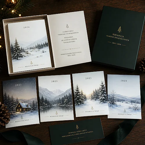
This is the domain of the designer and the print house - and that is exactly why it is worth having AI be a tool in the process rather than its sole author. Artificial intelligence gives speed and plenty of ideas, photography gives truth, and a human ties it into a card that looks like your company and comes out well on paper. You will find ready formats and ideas for company greetings in our range of Christmas cards.