At a trade fair everyone collects roughly the same thing: a handful of folded leaflets that turn into a creased layer at the bottom of a bag by the evening. A postcard behaves differently from the moment it is handed over - it is stiff, it carries one image and nobody has to unfold it. That is often enough for it to survive the journey home.
This article is about one specific situation: handing print over by hand. A trade fair stand, a shop counter, an industry meeting, a moment at the till. Those are completely different conditions from a letterbox or a reception rack, because there is eye contact between you and the recipient, and roughly three seconds in which the decision is made: pocket it or put it down. In that situation a postcard can be surprisingly strong, provided you design it for exactly that.
- A stiff card comes home from a fair intact, a folded leaflet usually does not.
- One offer per card. The recipient has three seconds, not three minutes.
- DL fits an envelope and a jacket pocket, A6 looks like a card and carries a photograph better.
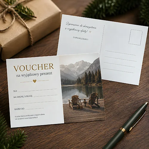
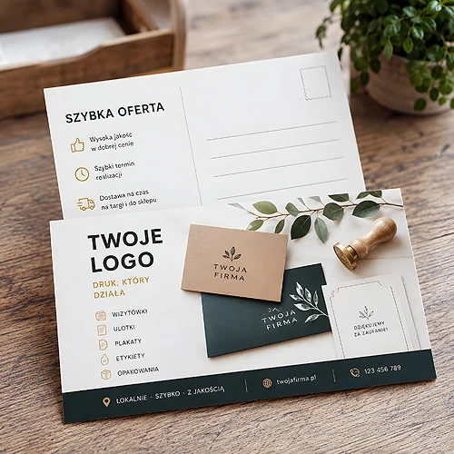
- Advertising postcards are always double sided, so the reverse has to be designed rather than left blank.
- Two versions are worth having: one for the end customer and one for a trade partner.
Why a stiff card survives a day in a bag
A folded leaflet has the advantage of capacity and the disadvantage of form: to read anything from it, you have to open it out. On the move, from one stand to the next, nobody does. The sheet lands in a bag with ten others, gets creased at the corners and goes into the bin in one movement that evening, because by then it cannot be told apart from the rest.
A postcard plays differently, because it has three physical qualities that work in its favour here:
- Stiffness - firm coated board or elegant Arktika board hold their shape among other papers and do not curl.
- A single plane - everything is visible at once, with nothing to unfold. The recipient has to do nothing with their hands.
- The card format - it reads as something you keep rather than something you skim and put aside.
Then there is lamination: gloss, matt or Soft Touch. When print is handed over directly it has a specific job - it protects the edges and keeps the card from picking up fingerprints after the tenth person. Soft Touch also changes how the card feels in the hand, and touch is the one sense that genuinely works at the moment of handing something over. We wrote about how the place of distribution changes what a print must cope with in our piece on matching a leaflet to where it is handed out.
One offer per card
This is the rule that governs everything else. A postcard has less room than a folded leaflet, and that is its greatest advantage as long as you make use of it. A card with a single message works; a card with the full company offer turns into a dense table that nobody reads standing up.
Choose one thing: one product, one service, one promotion or one event. Everything else is background. If you have five things to say, it is better to print two or three designs and hand over whichever suits the conversation than to cram everything onto one card.
Three seconds at the stand
The recipient looks at the card while you are still standing next to them, and in that time they have to grasp two things: what you do and whether it is for them. A company name on its own answers neither question. A short sentence about what you do answers both. You will find more on organising the message in our piece on how to divide up the content so the customer does not give up.
A6 or DL when handing print over
Both formats make sense, but in this situation they differ more than the dimensions alone would suggest.
- DL - a slim rectangle. It fits a standard envelope, a jacket pocket and the side compartment of a bag. This is the format for somebody who collects materials and wants to keep them tidy. It looks more like an elegant offer than like a card.
- A6 - the classic postal card. It gives more room for a photograph and works harder visually when it sits on a counter next to the till. It also reads instantly as a postcard, so it is easier to hand over as a small keepsake rather than as advertising.
The criterion is simple: if the card is meant to go into a folder or a pocket, choose DL. If it is meant to lie somewhere visible and work through the image, choose A6. The paper comes next: firm coated board for photography, Arktika board for a calmer and more subdued character. We took the rules for choosing stock apart in our piece on how to choose paper for a leaflet, a business card and a catalogue.
What goes on the front and what on the reverse
When a card is handed over, the split is natural, because the recipient sees one side first and only turns it over later, often once they are home.
The front has one job: to hold the eye and say what this is about. One strong photograph or one clear motif, a short sentence, a logo at a sensible size. The reverse works later, once the card is lying on a desk: the specifics, contact details, a web address and a QR code as a bridge to the full version of the offer. The code only works, though, if it leads to a specific page rather than to the home page - otherwise the recipient ends up where they would have landed anyway.
Leave a light, unprinted area the size of a business card on the reverse. At a stand people very often add something by hand: a name, a discount phrase, the time of a meeting. A card with a note like that stops being mass print and comes home from the fair far more often.
How many to take to a fair
Count from the bottom up, not from the top down. The starting point is the number of conversations you can realistically have at the stand in a day, not the number of people walking the hall. Handing a card to everyone who passes is the fastest way to end up with an empty box and no phone calls.
A more sensible tactic: hand the card over at the end of a conversation, as the thing that remains afterwards. Consumption is then lower and the effect noticeably higher. It is worth having a reserve for the next event, but not at the cost of a design that will have dated by then - if the offer changes every quarter, smaller batches more often are the wiser route.
Two versions and the order of work
At a fair you meet two completely different people: the end customer and the trade partner. The same card rarely works on both. The customer wants to know what they will get; the partner wants to know where the margin is and what working together looks like. Two designs in one job make little organisational difference, and the conversation becomes far more concrete at once.
- Settle on one offer per card and write it down in a single sentence.
- Choose the format: DL for pockets and folders, A6 for counters and photography.
- Design both sides from the start, because a postcard is always double sided.
- Match the paper and lamination to what the card has to survive inside a bag.
- Make a second design for partners if you meet both groups.
- Add a bleed, meaning a strip of background that runs past the trim line - without it a photograph spread across the whole card can leave a white sliver along the edge after cutting. The details are in our file preparation guide.
If the cards travel to an event with the rest of your materials, a folder is worth considering, so a partner can carry the whole set back to the office. But a postcard also holds its own alone, as the only print from the stand that looks the same in the evening as in the morning.