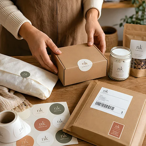
A sticker looks like the simplest item in the whole order - a piece of printed paper with adhesive. Right up until a rectangular label refuses to lie flat on a curved jar, and a beautiful leaf-shaped outline eats so much room that the product name no longer fits. The shape of a sticker is a practical decision, not a decorative one.
Three forms cover most real needs: the rectangle (with the square as a special case), the circle, and a shape cut along the outline of the design. Each manages space differently, behaves differently on the surface of a product and works differently on a shelf.
Below we take them apart: what each one gives you, when one replaces another with nothing lost, and when an outline genuinely changes how a product is perceived - versus when it is just extra complication in the file and at the moment of sticking.
- Rectangle - the most room for content at the same area; the natural choice wherever something has to be written.
- Circle - soft and decorative, excellent as a closing seal and a brand mark, but less generous with text.
- Die-cut outline - a shape that follows the design; it makes a difference when the outline itself carries meaning.
- The shape has to suit the surface: flat, curved, domed and rough are four different situations.
- A flatbed cutter shapes the outline without a cutting die, so an unusual shape is within reach on a short run too.
- The more cut-out the shape, the more the margins matter - text right at the edge looks accidental.
We read shape faster than content
The eye recognises form before it manages to read a single word. A small circle on a jar lid says "handmade, made in a small batch" before the customer reads the name. A rectangle with a clear frame says "the information is here". A cut-out silhouette says "someone gave this separate thought". That is the first layer of the message and it is worth choosing deliberately.
The second layer is purely practical: shape decides how much content fits legibly and how the sticker behaves on the product. These two layers sometimes clash - and then practicality almost always wins. A sticker that cannot be read, or that lifts at a corner, spoils the impression more effectively than the prettiest shape builds it.
The rectangle - the best host for space
Rectangles and squares have one advantage nobody can argue with: at the same area they hold the most legible text. Lines sit evenly, margins are predictable and the layout needs no acrobatics.
- Content - ingredients, date, directions for use, contact details, a code - everything meant to be read fits here most comfortably.
- Application - two straight edges are easy to align with the edge of a carton or a box, so the whole run looks even even when applied by hand.
- Repeatability - rectangles sit neatly next to one another on the sheet, which simplifies work on larger batches.
- Versatility - the same design can usually be scaled to another size without rebuilding the layout.
When the rectangle starts to get in the way
Corners are its weak point. On a domed or strongly curved surface it is the corner that lifts first and collects dirt. A sharp corner is also easier to catch with a finger while unpacking, and once turned up it rarely goes back down. On such surfaces most of these troubles disappear once you swap the rectangle for a round sticker or simply pick a smaller format. If you are curious how escaping the rectangle looks in other printed pieces, see our post on whether a leaflet has to be rectangular.
The circle - seal, mark, closure
A circle behaves quite differently. It has no corners, so it settles well on lids, rounded sides and anywhere a rectangle would fight the curvature. It also carries strong associations: a seal, a quality mark, a brand emblem.
- Closing packaging - a round sticker over the join of a bag or a box closes it and instantly raises the sense of order.
- Brand mark - a logo in a circle reads as an emblem rather than an information label.
- Lids and bases - a disc on a round surface looks natural, because it repeats that surface's shape.
- The limitation - the areas near the edge of a circle are hard to fill with text, so longer copy has to be broken into narrow lines or dropped.
The practical rule goes: circle for the mark and a short line, rectangle for information. Many brands use both at once - round stickers as a seal closing the packaging and square or rectangular stickers with ingredients and details on the back.
The outline - when it truly makes a difference
Cutting along the shape makes sense when the outline itself carries information. The silhouette of a product, a company mark with a distinctive shape, an illustration pretending to be a stuck-on object - in these cases the outline is part of the message, not an ornament.
Classically, every unusual outline needs a cutting die, a tool made for one single design. On a large run its cost spreads across thousands of units; on fifty it becomes the main item on the bill. A flatbed cutter cuts the outline straight from the sheet, so a short run of unusually shaped stickers has stopped being an extravagance reserved for big brands.
- Worth it when the shape is recognisable on its own - a logo, a mascot, the silhouette of a product.
- Worth it when the sticker is meant to live beyond the packaging, on a laptop or a water bottle; a cut shape simply looks better there.
- Probably not when the outline only ripples gently around a rectangular block of text - the effect is barely visible and the file is harder.
- Probably not when the shape has thin spurs or sharp spikes - they are easy to bend and tear off while peeling from the backing.
Print the design on plain paper at the target size, cut it out with scissors and hold it against the product. In three minutes you will see what a screen never shows: whether the shape suits the curvature, whether the text runs off towards the edge and whether the sticker covers something important.
The surface decides what fits
A sticker does not live in a vacuum, it lives on a specific object. Before you settle on a shape, check what it is going to land on - that usually shortens the list of candidates faster than any aesthetic deliberation.
- Flat and smooth - board, flat glass, film. Any shape works here, including an outline with a more elaborate contour.
- Curved - a jar, a bottle, a candle. The smaller the diameter, the narrower the sticker should be so it does not wrinkle; circles and narrow rectangles win.
- Domed or uneven - lids, gusseted bags, textile surfaces. Corners lift fastest, so it is better to choose a circle or a smaller rectangle.
- Rough - recycled or unbleached paper and board. A smaller sticker with a compact shape holds better than a large sheet with thin spurs.
The order of choosing
If you are torn between the three forms, work through these questions in order. Usually after the third one a single sensible candidate is left.
- What has to be legible - list the obligatory content. If the list is long, the rectangle is practically decided.
- What it lands on - measure the space on the product together with its curvature, not on a flat front view.
- Whether the shape means anything - if the outline carries content, a die cut makes sense; if not, a rectangle or a circle does the same with less work.
- How it will be applied - by hand and in a hurry? A simple shape with clear edges forgives far more.
- Check a test print - on paper, at the target size, held against the real product.
Shape is one of those decisions that cost little preparation yet show from the first second. If you want to put your whole company labelling in order rather than just one label, our post on stickers and labels in a company will help. When deciding how much ornament a label can take, it is worth looking at our comparison of a minimalist versus a richly decorated label. Our stickers section has two ready shapes - square and rectangular and round; a shape cut along the outline is quoted individually. The rules for bleed and cutting lines are in file preparation.
You choose a rectangle when something has to be read, a circle when something has to be closed or marked, and an outline when the shape itself has something to say. Start with the product and the content, and the form stops being guesswork.