A corporate Christmas parcel usually gets one moment to make an impression: the moment someone unties the ribbon at their desk, between one meeting and the next. If there are three random items inside, all that remains is a polite thank-you and a drawer. But if the card, the music disc and the small gift work together, the recipient immediately senses that someone gave it real thought - and that is a completely different conversation about your company.
The most common mistake with Christmas sets is that every element gets chosen separately and at a different time. The card comes from the marketing team, the gadget is picked from whatever is left in storage, and the disc is added at the end because there was still some budget. The result is predictable: three decent items that do not talk to each other.
Below we show the opposite route - a set designed as a whole from the very start. Three elements, each with a different job, one shared graphic theme, and packaging that ties it all together. This recipe works just as well for a dozen parcels for your closest clients as it does for a larger mailing to your whole contact base.
- The three elements have three different jobs: the card carries the words and the relationship, the music disc carries the mood, and the small gift carries everyday usefulness.
- Coherence comes from one graphic theme, a shared palette and a recurring detail on the disc artwork, the card and the packaging.
- Packaging is not an add-on - it is what turns three items into one gift.
- Plan the order of discovery: first the card with the words, then whatever lies beneath it.
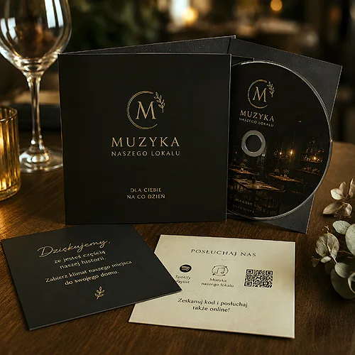
- The simpler version is a card plus a disc - that alone forms a set, as long as both pieces look like family.
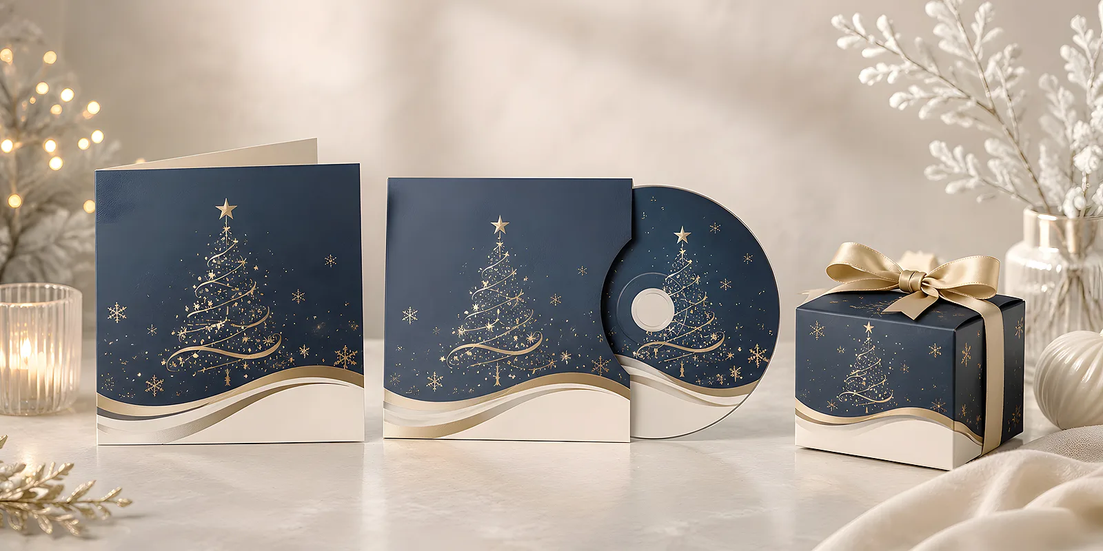
Three elements, three different jobs
A good set is not about adding as much as possible. It is about making sure each element does something the others cannot. Once you write it out, you can see straight away whether the set makes sense or is simply getting bigger.
The card: words and relationship
The card is the only element that speaks directly. It holds the recipient's name, thanks for a specific year of working together and the signature of the person the client actually talks to. No gadget replaces that. It is worth taking seriously: good board, a clear design and one handwritten sentence can do more than the rest of the parcel combined. If you are looking for ready formats, take a look at our Christmas and New Year cards.
The music disc: mood and staying power
Music brings something to the set that cannot be packed any other way - atmosphere. A disc played in the office, in the car or at a reception desk reminds people of the sender again and again, long after the wrapping paper has gone. It is also the only element that works in the background and asks nothing of the recipient beyond pressing play. You will find more on this idea in our post on a corporate music disc as a Christmas gift for business partners.
The small gift: everyday usefulness
The third element simply has to be useful. A notebook, a pen, a keyring, a flash drive - something that sits on the desk and gets used without a second thought. One rule applies here: one well-made object beats three that end up in a drawer. You will find an overview of the options in our promotional gifts section.
One theme that ties it all together
This is the moment where the set either becomes a gift or stays a collection of items. Coherence does not come from putting a logo on everything. It comes from repeating the same idea across every element.
Palette and typography
Pick two, at most three colours and stick to them consistently: on the card, on the disc print, on the packaging and on the belly band. Add one typeface for headings and one for body text. If your company has identity colours, start from them, but in winter it is worth warming them up - deep green, navy, warm white and muted beige feel festive without tipping into kitsch.
A recurring detail
The simplest way to create a sense of a complete set is one graphic element that comes back everywhere. It could be a delicate pattern, the outline of a branch, a simple graphic mark or the tagline of the year. The same motif in the corner of the card, on the disc face and on the sticker sealing the box acts like the signature of the whole set. We describe this approach in more depth in our post on how to design a corporate gift set elegantly and coherently.
Before you order anything, set three constants: two colours, one typeface and one recurring detail. Write them down in one place and treat them as your guide for every element of the set. That way even a last-minute addition will fit in rather than break things up.
Disc artwork and card as one family
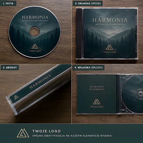
A disc has the advantage that its artwork is effectively a small publication: the disc face, the cover, the back with the track list. That is plenty of room for the same theme that runs across the card. If you design both together rather than separately, the recipient will see them as two sides of the same story. Keep the disc print in the same palette as the card, and set the track list in the same typeface as the greetings. You will find the production details in our description of printed CDs and DVDs.
Choosing the repertoire is a separate topic worth a moment of thought - an album for background listening at a reception desk sounds quite different from a set of carols for a family evening. We gathered practical pointers in our post on a corporate Christmas music disc as an addition to a partner gift.
Packaging and the order of discovery
Packaging does far more in a set than people expect. It is what turns three separate items into one gift, and it decides what the recipient sees first. A box, an ecopack, a decorative envelope or a simple patterned belly band - the form can be modest, what matters is that it is shared.
It is worth planning the order of discovery deliberately:
- The card on top - it explains who is saying thank you and what for. Without it, the rest is anonymous.
- The disc underneath - a visible cover signals right away that there is more inside than a standard gadget.
- The small gift last - the object that stays on the desk and keeps reminding people of the whole set day to day.
If you are sending sets by post, remember to secure the inside simply so the elements do not shift in transit. A parcel that arrives arranged exactly as it was packed makes a completely different impression from one that has to be reassembled first.
A simpler version and a fuller one
Not every business partner has to receive the same thing. One shared graphic theme lets you build several tiers of a set without designing everything from scratch.
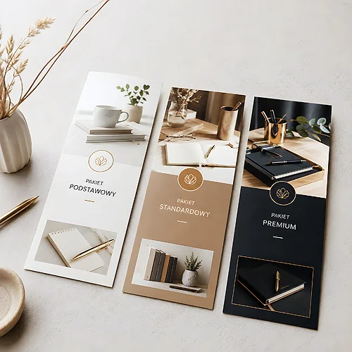
- The basic version - a card plus a disc in a decorative envelope. Light, cheap to post and still looking like a considered set, because both elements come from the same family.
- The full version - a card, a disc and one good everyday object in a box with a belly band. This is the variant for the clients you worked with most closely.
- The extended version - add a second small item or a voucher, and give the packaging a filler and a ribbon. It is worth keeping this one to a narrow group of recipients.
You will find more ideas on combining print, music and gadgets into one set in our post on personalised gift sets.
What to watch so the set does not look random
The sense of randomness usually comes from a handful of recurring details. It is worth checking them before you place the order.
- Keep one palette - a bright gadget in a completely different colour breaks the whole set more than any difference in quality.
- Use the logo sparingly - once, discreetly, is enough. Repeated on every object it turns a gift into advertising material.
- Settle on one tone of voice - if the card is warm and personal, the disc description should not read like an internal memo.
- Match the proportions - elements of a similar standard look better together than one very refined piece and two random ones.
- Check the set as a whole - before ordering a series, assemble one complete set and look at it from a distance. Anything that stands out becomes obvious within seconds.
Why music lasts the longest
A card gets read once, sometimes left on a windowsill until January. A gift blends into daily routine and stops being noticed after a week. A music disc has a different rhythm - it comes back whenever someone feels like reaching for it. Played in the background during work, on the road or at a company reception, it replays not only the sound but also the context in which it arrived.
That is why a well-considered album can outlive the festive season by many months. If the artwork holds up, the disc stays on the shelf instead of ending up in a box of promotional material. And when the same series returns each year in a new edition, it starts working like a small company tradition that recipients simply look forward to.
A complete Christmas set needs neither a large budget nor a complicated design. It needs one idea carried consistently through the card, the disc, the gift and the packaging. Set the theme, give each element its job, plan the order of discovery - and the parcel will tell the recipient everything that will not fit into a greeting.