A single CD often ends up in a drawer along with other loose discs. But the same disc as part of a series - the third of five, with a visible number on the spine and a theme that calls for completing the collection - suddenly becomes something you want to have as a full set. The difference lies not in the music or the content itself, but in how the whole thing is designed.
The collection effect is one of the oldest and most effective mechanisms of attachment. If you are releasing several discs - company compilations for successive seasons, a themed series, a publishing cycle - it is worth designing them from the start so they form a coherent family. Below we show how to do it: from the leading theme, through numbering and spines, to packaging that begs not to be thrown away.
- Set one leading theme - a shared layout, typography and graphic element that repeats on every disc in the series.
- Differentiate the successive parts by colour or number, keeping a recognisable design skeleton.
- Look after the packaging spines - they build the collection effect when the discs stand side by side on a shelf.
- Number the parts visibly and consistently, so a missing item stands out at once.
- Choose packaging worth keeping - good cardboard, a coherent finish and a place for the whole series.
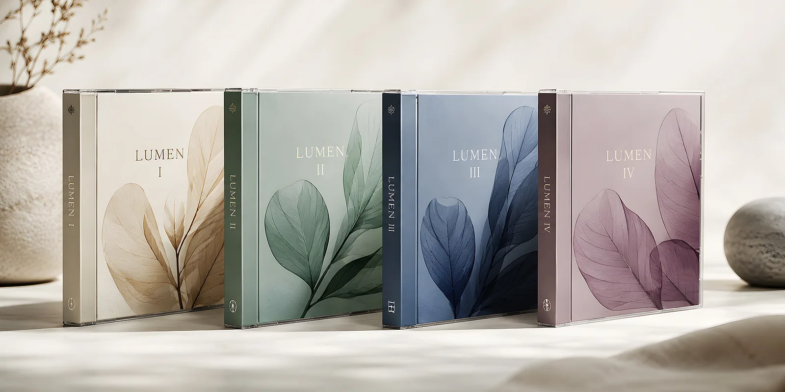
The leading theme - the skeleton of the whole series
A collection works when it is plain to see that the successive discs belong to one family. This effect comes from a leading theme - a set of constant elements that repeat on every item. You set it once, at the start, and stick to it consistently.
A leading theme does not mean all the discs have to look identical. It is about a recognisable skeleton in which only some elements change. Think of it like the covers of books from one publishing series - a different title, the same layout and logo.
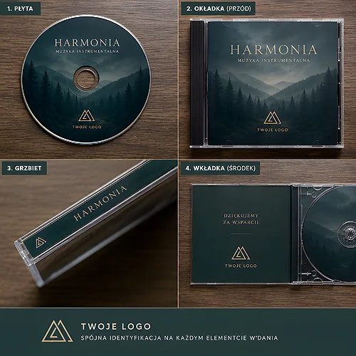
- A shared layout - the same placement of the title, number and logo on every disc and cover.
- One typography - the same typeface for headings and body text throughout the series.
- A recurring graphic element - a frame, symbol, texture or a distinctive detail that is the signature of the collection.
- A coherent print on the disc - the disc itself is part of the design too, so its finish should match the cover.
Once the skeleton is ready, designing further parts becomes quick and predictable. You do not start from scratch - you swap the title, number and accent, and the rest stays in place. This saves time and guarantees that the tenth disc will match the first.
How to differentiate the successive parts
Since the skeleton is shared, you need a way to tell the individual items apart. The differentiation has to be clear enough to know from a distance which disc you are holding, yet subtle enough not to break the coherence of the series.
Colour as a signal of the part
The most common and effective way is colour. Each part of the series gets its lead shade - the first navy, the second burgundy, the third bottle green - while keeping an identical layout. Placed together they form a palette that is pleasing to the eye, and separately they are easy to tell apart. If you want to choose such a set of shades deliberately, the post on how to choose colours in advertising projects is helpful - the same rules apply when building a palette for a whole collection.
Alternatively you can differentiate by number, a themed illustration or the season. What matters is picking one main method and sticking to it across the whole series - mixing several methods at once quickly creates a mess rather than order.
Design a "series template" straight away with empty fields for the title, number and colour. That way each new part takes minutes and never falls out of the visual rhythm. Also record the exact colour values and typefaces used - you will come back to them in a year, when you make the next instalment.
The spine - the hero of the collection effect
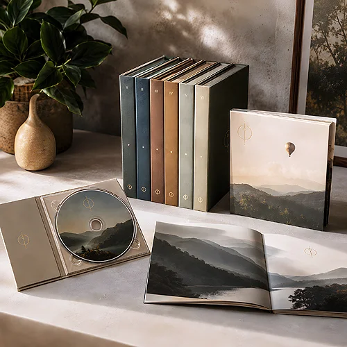
There is one place that decides whether a series looks like a collection when the discs stand side by side: the spine of the packaging. It is the most often overlooked, yet the most important element when designing a series. On a shelf you see the discs precisely from the spine side - and it is the spines that line up into a coherent, orderly whole or into a random row.
Design the spines so they form a logical sequence. Place on each the part number, the series title and a shared graphic element in the same spot. When the successive spine colours line up next to each other, an effect arises that itself hints something is missing if one item is absent. This is exactly the mechanism that prompts people to complete the collection.
It is even worth considering that the spines placed together can form one larger pattern or inscription - that is advanced work, but it makes a huge impression and practically guarantees no one throws the packaging away.
Numbering and the logic of the series
Numbering is an unassuming detail that triggers in the recipient the need for a complete set. A visible number - "part 3 of 8" - immediately signals that a larger whole exists and that one can own an incomplete fragment of it. It is a subtle but strong nudge to gather everything.
- Number visibly - the number on the cover, on the spine and on the disc itself, so it is legible from every angle.
- Show the whole series - a "3/8" notation or a list of the remaining titles gives a sense of how much is left to collect.
- Keep one convention - if you start with Arabic numerals, do not switch mid-way to Roman ones or to season names.
- Plan room for growth - if the series may expand, leave space in the design for more numbers without rebuilding the whole thing.
Well-managed numbering makes the series live a life of its own. Each new part reminds of the previous ones, and the collection grows in the recipient's eyes as a coherent project, not a set of loose releases.
Packaging worth keeping
All the effort put into the design goes to waste if the successive parts end up in random packaging with nothing in common. A collection is built on packaging that is worth keeping in its own right - solid, tidy and coherent with the rest of the series.
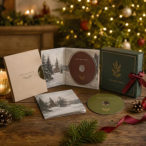
Cardboard digipack packaging works brilliantly here, giving a large surface to design on, sitting pleasantly in the hand and looking like part of a thought-through edition rather than a disposable medium. If you are hesitating between different finish types, the post comparing a digipack and a CD sleeve will help - for a collector's series the arguments usually favour the stronger, cardboard solution. A cardboard sleeve binds several parts together - cases and sleeves slide over finished packaging and join two or three digipacks into a single set.
- Set the leading theme - layout, typography and an element shared by the whole series.
- Design the differentiation system - colour or number distinguishing successive parts.
- Refine the spines - they build the collection effect on the shelf.
- Add visible numbering - with information about the size of the whole series.
- Choose durable packaging - something the client will want to keep and display.
If you want to see which print and finish variants are available for such a project, take a look at the discs and packaging section. A series designed as a collection stops being a set of individual discs and becomes something the recipient wants to own in full, add to and show off - and that is the best thing that can happen to your release.