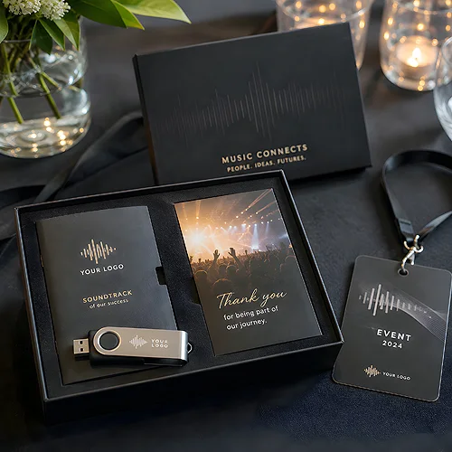
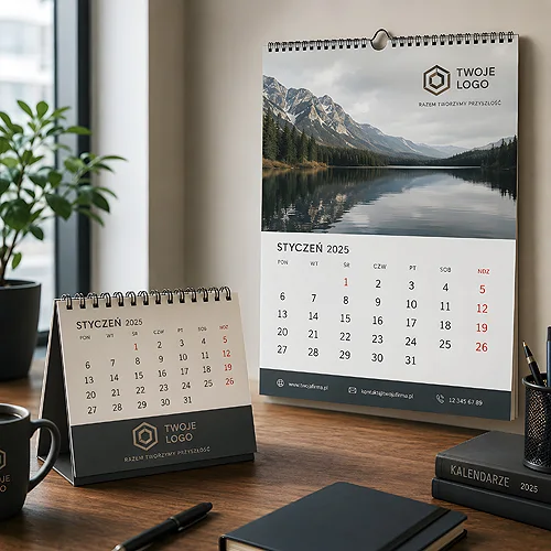
A single object pleases for a moment. A set of a few well-chosen little items tells a small story - that someone thought about it, picked things out, put a whole together with a purpose. Interestingly, such a pack need not cost more than one striking gadget. The trick is to assemble it thoughtfully: choose elements that play together and tie them with one theme.
It is not about tossing random trinkets from the warehouse into a box. A well-thought-out pack has rhythm - one object for the hand, one for the desk, something that stays for longer. Below we show how to put such a set together step by step, so it looks considered rather than gathered at the last minute.
- A few small, useful gadgets in one set make a bigger impression than a single pricier item.
- Choose elements with different roles: something for the hand, something for the desk, something that stays for longer.
- Coherence comes from one theme - a shared palette, a repeated logo and an organising element, for example a sticker or a card.
- Start with the recipient and the occasion, and only then pick the objects - not the other way round.
- Packaging and finishing the whole can do more for the impression than adding yet another gadget.
Why a set works better than a single gadget
The recipient judges a single object in a second: useful or not. A set works differently - it is already a small gesture that says someone cared. Even if the individual elements are inexpensive, the very fact that they form a considered whole lifts how they are received. It is a bit like a gift: what counts is not only the contents, but also that someone chose and wrapped them.
A set has one more advantage - it raises the chance that at least one element meets the recipient's need. One person will find the notepad handy, another the pen, another the laptop stickers. By spreading small things across several objects, you also spread the risk that the whole ends up in a drawer. If you are weighing a single pricier gift against a set, you will find more in our post on whether to go premium or for several small gadgets.
Start with the recipient and the occasion
Before you choose anything, answer two questions: who will receive it and on what occasion. These decide the choice of elements. A trade-show set for a random passer-by looks different from a welcome pack for a new client or a thank-you for a long-standing partner. Only from this knowledge does a sensible list of objects follow.
Different roles, one set
A well-assembled pack has an internal division of roles. You do not want three objects doing the same thing - you want each to serve a different function and enter the recipient's life by a different route.
- Something for the hand - an object used daily, reached for without thinking. A classic promotional pen is a safe foundation for any set.
- Something for the desk - a notepad, a coaster or another little thing that stays in sight and reminds of the brand throughout the working day.
- Something that stays for longer - a more durable element, for example a promotional flash drive that accompanies the recipient for months and regularly returns to use.
- Something the recipient spreads themselves - stickers that end up on a laptop or a bottle and show the logo to a wider audience.
Stick to the rule of three: one object for everyday use, one for the desk, one that stays for longer. Three well-chosen things look like a considered set, not a random handful of trinkets. More elements do not mean better - only pricier.
The coherence that ties it all together
What sets a considered pack apart from a collection of random gadgets is coherence. When elements speak one language - colour, logo, print style - the eye immediately sees them as one whole. Without it, even good objects look gathered from different drawers.
- A shared palette - keep to two, at most three brand colours across all elements. A different logo colour on each object instantly breaks the sense of a set.
- A repeated logo - the same mark, the same print form everywhere. It is the thread linking the little things into a whole.
- An organising element - a small thank-you card, a logo sticker sealing the box, or a voucher for the next purchase. Such an addition gives the set a frame and rounds it off.
How to choose this shared style so it does not shout advertising is described in our post on gadgets that do not look like advertising. A subtle, coherent theme works better than a logo repeated on every centimetre.
How to stay within budget
A pack of a few little things need not be pricier than a single gadget - the key is deliberate choice and order scale. Here is how to approach it without inflating costs.
- Set the frame - decide how many objects the set should hold and roughly what character it should have. Three good elements usually suffice.
- Bet on cheap but useful - everyday little things give the best impression-to-cost ratio. The effect comes from the selection, not the price of a single piece.
- Order in one place - when all elements are made together, it is easier to keep the print coherent and simplify logistics.
- Do not overpay for packaging - a simple, tasteful box or sleeve with a logo does the job. What counts is order and coherence, not opulence.
It is also worth remembering that small sets work well in modest quantities - you do not have to order thousands of pieces for the campaign to make sense. When such a small order pays off is explained in our post on promotional gadgets ordered in small quantities.
Finishing and presentation
The last stage decides the first impression. The same three objects tossed loose into an envelope and the same three arranged in a tasteful box are two different gifts. Finishing the whole often does more for how it is received than adding yet another gadget.
Make sure the elements lie in order rather than shifting during transport. Add a small card with a short, human note - not an advertising slogan, but a sentence that sounds as if a person wrote it. Seal the box with a logo sticker. These are little things, but they are what make the set look prepared with a specific person in mind.
A considered set instead of a random handful
An affordable promotional pack is not a matter of budget, but of an idea. Start with the recipient and the occasion, choose a few objects with different roles, tie them with one theme and take care of a neat finish. That is how you create a set that looks like a considered gift, not a handful of trinkets given out blindly - and one that stays in the memory longer than many a pricier gadget. If you want to browse elements for your set, take a look at our offer, and for a larger campaign simply get in touch - we will help you put together a coherent whole.