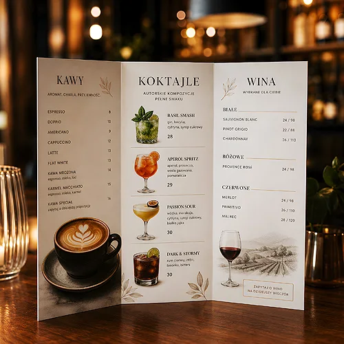
A tasting menu is more than a list of dishes in the order they are served. It is the script of the evening that the guest holds in their hands - a preview of the flavours to come, the rhythm of the dinner and the first signal that the evening will be special. Before the waiter sets down the first plate, the card is already building the mood and hinting at what to expect. That is why its design deserves as much attention as the kitchen itself.
A good tasting card does not shout - it guides. It reveals dishes gradually, doses out information and leaves room for the guest's imagination. Below we show how to design a menu that is not just a list, but part of the experience - from structure and typography, through paper and finishes, to the details that make the guest take the card home as a keepsake.
- A tasting menu is the script of the evening - its structure should lead the guest dish by dish.
- Less is more: plenty of white space, restrained typography and a thoughtful hierarchy build elegance.
- Paper and film (texture, weight, soft touch) work on the senses even before the food.
- Dish descriptions should awaken appetite and curiosity, not just list ingredients.
- Coherence with the rest of the evening's stationery reinforces the impression of a polished event.
A structure that leads through the evening
A tasting menu differs from an ordinary card in that the guest does not choose - they surrender to being guided. Your task is to arrange the order so that the card reads like a well-composed story: with an opening, a build-up and a finale. That narrative begins on paper, before the first dish even appears.
- Clear reveals - divide the menu into successive dishes so each has its own space. A crowded list kills the sense of ceremony.
- Rhythm and pauses - mark the turning points, for example the move from starters to the main course or the announcement of dessert. This builds anticipation.
- Numbering or eye guidance - subtle order markers help the guest sense which stage of the evening they are at.
- Room for pairing - if you offer a selection of wines or drinks with the dishes, plan a separate, visually coherent layer for it.
A well-managed hierarchy means the guest knows at once where to look and what to expect. If you want to fine-tune the way the eye travels across the card, take a look at our post on how to design a menu so the guest quickly finds the key information - the same readability rules apply to tasting cards.
Typography and space - elegance lies in restraint
Nothing builds a sense of class like space. A tasting menu is the moment to resist the temptation to fill the whole card. Generous margins, calm typography and one well-chosen typeface do more for the mood than ornate frames and backgrounds.
Choosing typefaces
Pick at most two typefaces: one for dish names, one for descriptions. An elegant serif for headings works well with a classic dinner, while a subtle sans-serif for descriptions keeps things readable. Avoid mixing many styles - the calmer it is, the more upscale the card looks. Also take care with letter size, because a tasting menu is often read in dimmed light.
Before you send the design to print, run a test print of one card and read it in the same lighting you have in the dining room. A menu that looks great on a bright screen can vanish by candlelight. This one test saves you disappointment during the event.
Paper and finishes that work on the senses
The guest picks up the tasting card and holds it longer than an ordinary menu. That makes the material and finish genuinely matter - before they taste the first dish, they already feel the weight of the paper and the texture under their fingers. That touch is part of the experience.
- Weight and texture - thicker, slightly rough paper immediately suggests the evening is special. A thin, smooth sheet feels like an ordinary flyer.
- Refinements - soft-touch velvet film gives a warm, tactile surface under the fingers, matt film calms dark backgrounds and gloss film brings photo colours to life. One of them is enough to make the card look instantly more serious.
- Format and folding - a long, slender DL card looks different from a classic A4 rectangle. A folded menu adds a moment of reveal that suits a tasting dinner.
- Muted colours - dark backgrounds with light print, or cream paper with graphite text, build the mood better than strong colours.
You can browse the formats and papers of both variants at folded menus and non-folding menus before you settle on the final look. If you are planning a menu the guest is meant to take with them, a sturdier non-folding card on 350 g coated stock works well.
Dish descriptions that spark the imagination
On a tasting card, words work just as hard as graphics. A dish description is not the place for a dry list of ingredients - it is a preview of the flavour meant to awaken curiosity before the plate reaches the table. A few well-chosen words can make the guest wait for a dish with greater attention.
- Start with the main character - highlight the key ingredient or technique that gives the dish its character. That is what should stay in memory.
- Add context, not an encyclopedia - a brief mention of a product's origin or an inspiration builds a story, but do not weary the guest with detail.
- Mind the rhythm of the sentences - short, appetising phrases read better than long lists. A menu is to be savoured, not studied.
- Keep one tone - if the rest of the evening is intimate and warm, the descriptions should be too. A consistent tone builds credibility.
Remember that the description should complement the kitchen, not replace it. The best tasting cards leave room for surprise - they hint at the direction without giving everything away, so each dish can still catch the guest off guard.
Coherence with the atmosphere of the whole event
A tasting menu does not exist in a vacuum. It works most powerfully when it is part of a larger whole - the same theme that returns on the place cards, the invitation or the wine list. When every piece of stationery speaks the same language, the guest feels they have arrived at an event planned with an eye for detail.
If the evening is a formal one, it is worth thinking of the tasting card as one of the characters in the table setting. For inspiration on combining readability with elegance, see our post on how a wedding menu becomes part of the table decoration - many of those principles carry straight over to tasting dinners. And when you are planning the whole set of the evening's stationery, it is worth starting by browsing the offer in the section for hospitality venues, so you can set a shared style right away.
A good tasting menu is not an ornament, but part of the experience. Designed with feeling - a thoughtful structure, calm typography, good paper and descriptions that awaken the appetite - it becomes an element the guest remembers as strongly as the flavours. And sometimes they take it home, so the evening stays with them a little longer.