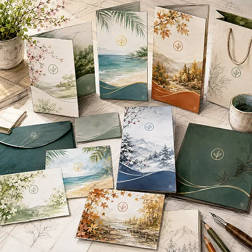
A rack of postcards by the till is one of the few kinds of merchandise that either sell themselves or do not sell at all. The difference rarely lies in the price. It lies in what is on the front, how many designs there are, and whether the tourist feels they are buying a piece of the place they are standing in.
This text is for somebody who earns money from postcards: for a souvenir shop, a kiosk, a tourist information point, a museum, a mountain hostel, a farm stay or a marina. Here a postcard is merchandise rather than advertising material.
Postcards with custom printing are always double-sided, in A6 or the slender DL format, on stiff coated paper or elegant Arktika board, with the option of lamination. In retail these decisions look completely different from company print.
- What leaves the rack is a recognisable motif of the place, not an artistic abstraction.
- A series beats a single design: with three designs a buyer takes three, with one they take one.
- The name of the town and a short description on the reverse raise the keepsake value.
- A6 is the classic card, DL looks slimmer and sits differently in the rack.
- Lamination protects merchandise handled by hundreds of hands and copes with damp seaside air.
- The print run is planned before the season, not in July in front of an empty rack.
What actually leaves the rack
A tourist buys a postcard out of one of two impulses: they want to send proof that they were here, or they want to take an image of the place home. Both lead to the same conclusion - what sells best is a view the buyer saw with their own eyes a moment earlier.
A recognisable motif beats everything else. A specific bridge, a tower, a beach with its distinctive rock, a market square at the hour when it looks its best. Artistic abstraction and photographs that leave you unsure where we actually are stay on the rack until the end of the season, even though they are often the prettier ones.
The second shelf is humour and local wording. A line in dialect, a joke about the weather, a phrase typical of the place - this sells to people who already have their views and are looking for something for a friend. The third shelf tends to be the smallest and the most niche: archive photographs, old views of the same street. There is no point forcing this into a ranking; just remember the proportion: most of the rack is views, one third is everything else.
A series rather than a single design
This is the most important mechanism here, and the one most often overlooked. A buyer standing in front of one design takes one piece, because one is enough. A buyer standing in front of six takes three: one for themselves, one for their grandmother, one for a colleague from work.
It is not only about choice. A rack filled with a single design does not look like an offer, it looks like a leftover. Several designs side by side create the impression of a collection, a collection invites comparison, and comparison ends with somebody taking more than one piece.
How to build a series
The easiest way is to think of it as a story about the place told through several shots.
- The wide view - what you can see from the best known vantage point, the frame anybody will recognise.
- A detail - a shutter, a shop sign, fishing boats at the quay, a wayside shrine. A photograph for somebody who stayed here longer than a day.
- A season or a time of day - the same view at dawn and in winter works as a separate design and stretches the season beyond July.
- A design with text - the name of the town treated graphically, a phrase, a joke. This is what somebody reaches for when they are not after a view.
- An occasional design - an event, an anniversary, the start of the ski season. A shorter run that refreshes the rack.
A consistent style across the whole series matters: the same typography and the same way of captioning make the designs look like one family rather than a random assortment. The same principle applies to other local materials, which we wrote about in our post on what works in local advertising.
The reverse is half the product
A postcard is always double-sided, and in retail the reverse does more than you would expect. The classic layout divides it into an address area and space for a message, and that is usually enough. There is, however, one more strip that decides its value as a keepsake.
The name of the town printed legibly and a short description of what is in the photograph turn a postcard from an image into a keepsake with a caption. Years later that caption keeps the card out of the bin during a clear-out. Two or three sentences are quite enough: what the place is, what makes it distinctive, possibly the year the photograph was taken.
It is worth keeping an eye on the proportions here. A reverse filled with description takes away the space for a message. The description should be a strip, not a paragraph.
When ordering a series, print the design number in small type on the reverse. When you reprint after the season you know at once which designs sold and which stayed. That small detail saves a lot of guesswork when planning the next run.
Format, paper and lamination from the shelf's point of view
A6 is the classic card, recognised without thinking, and it fills a typical rotating rack best. DL is slimmer and stands out in a rack full of A6, and with a panoramic photograph it gives an effect A6 cannot match. A combination often makes sense: the core of the series in A6 and two panoramic designs in DL.
The paper sets the character. Stiff coated paper gives a sharp, saturated photograph and is the natural choice for views. Arktika board is more restrained and pleasanter to the touch, which works well for typographic and archive designs.
In retail, lamination is not a decoration but protection for merchandise. A postcard on a rack passes through hundreds of hands, goes back into its slot and rubs against its neighbours, and in a seaside shop there is damp air on top of that. A coated surface takes all of this without marks. Gloss deepens the colours of a photograph, matt calms them down and copes better with fingerprints, and Soft Touch gives a velvety feel. With the stickers sold alongside, the substrate does that job - white self-adhesive vinyl copes with damp and rubbing far better than paper.
The run, the season and reprinting
The biggest cost in this category is not the printing, it is bad timing. The run is planned before the season, when there is time to pick the photographs and put the series together calmly, and not in July when the rack is bare and you are standing behind the counter.
- Gather photographs out of season - ideally from several times of year, so that you have something to choose from.
- Decide how many designs - enough for the rack to look full from the first day.
- Split the run across the designs - more for the views, less for the niche ones.
- Order one job with several designs - instead of several separate ones spread over time.
- Record sales by design - it is the only reliable basis for planning the next season.
One large run gives a better unit cost, because the preparation is spread across more pieces. It has a drawback, though: it freezes the decision about designs before the season tests them. Reprinting during the season costs more per piece, but it covers only the designs that are genuinely selling. A sensible compromise is a solid core run before the season and a smaller reprint of the bestsellers, planned in advance rather than in a panic.
One small decision remains, and it can change the value of a basket: a postcard sold with an envelope or without. An envelope raises the value of the set and makes the card feel like a small gift rather than just something to post. Without an envelope the postcard keeps its classic role and moves faster at the till. How to choose the other carriers in a shop like this is covered in our post on a leaflet, a poster or a business card, and the whole category is waiting under postcards.