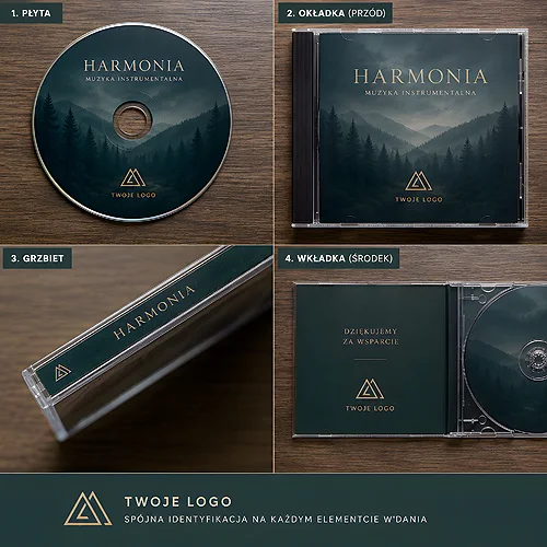
After a CT scan, an MRI or an ultrasound, a patient often walks out of the lab with one small thing in hand - a disc with the recording of the examination. That disc later reaches the referring doctor, goes into a folder of medical records, sometimes travels to another facility. If it is branded, with a logo and contact details, it becomes a quiet ambassador of your practice that returns to the patient exactly when they are paying attention to it. Below we show how to prepare such a print and how to choose the packaging so the whole thing is neat, legible and professional.
- A branded CD with your facility logo tidies up the records and builds a consistent image.
- The print essentials: the logo, facility details and space for the examination description, date and patient data.
- Legibility comes before decoration - this is a medical medium, not a flyer.
- Packaging (an envelope, a sleeve or a digipack) protects the disc and lifts how the facility is perceived.
Why a branded disc makes sense in a medical facility
In a diagnostic lab, a clinic or a hospital, imaging examinations are everyday work. X-rays, ultrasounds, computed tomography and magnetic resonance are usually saved in a format handed to the patient on a medium. A plain, silver disc with no description looks accidental and is easy to lose. A disc with a logo instantly communicates where the examination came from.
This is not only about aesthetics. A branded medium brings order: the referring doctor sees at a glance which facility performed the study and how to get in touch with it. A patient who looks for a previous result six months later has it signed and recognisable. And the facility gains a consistent, professional image - the same one on the referral, in the office and on the disc the patient takes home.
A branded disc is the cheapest way for the facility's identity to return to the patient at exactly the moment they open their own records.
What should appear on the print
The print on a medical disc follows its own rules. It has to be attractive, but above all functional - because next to the logo it must fit whatever allows a specific examination to be identified quickly. It helps to separate two layers: the fixed one (identifying the facility) and the variable one (data of the specific examination and patient).
Fixed layer - identifying the facility
- The facility logo in good quality and correct colours.
- The full name and contact details: address, phone number, website.
- Optionally a short note about the type of lab (for example, a diagnostic imaging lab).
Variable layer - examination description
- A clearly marked space to enter the patient's data.
- A field for the date of the examination and its type (X-ray, ultrasound, CT, MRI).
- Room for a short description or reference number, if the facility uses one.
The description fields can be planned as light lines or gently outlined boxes on a plain background. That way the staff fills in the data quickly and legibly, and the disc does not turn into an unsigned platter that no one can identify.
Plan the space for the description in a light, matte area away from the central hole. A light background and a matte surface let you write on the disc with an ordinary marker, and the note stays readable.
Legibility above all
A medical disc is not an advertising poster. A few simple rules keep the print clear even in a single-colour version or with plain printing. It is worth sticking to proven choices rather than eye-catching ones.
- High contrast between text and background - dark type on a light field reads best.
- A simple, sans-serif typeface and a sensible letter size so the data is visible without effort.
- The logo placed so it does not clash with the central hole or with the description fields.
- Restrained colours - one or two brand shades are enough, and fewer colours mean better legibility.
If you want to prepare the file yourself, our guide on preparing print files will help - you will find there the rules on resolution, colours and margins. We wrote more about how to align the disc print with the rest of your visual identity in the post on designing a disc print and cover consistent with your identity.
Print or replication - what to choose
The way the graphics are applied to the disc depends on how many media you need and how often you order them. For most facilities that hand out discs on an ongoing basis, a disc with a print works well - graphics printed directly on the surface, convenient for smaller and mid-sized batches and for refreshing the design.
For genuinely large, repeatable volumes it is worth considering replicated discs, where the graphics and content are created in the production process. This is a solution for facilities ordering large series of identical media. In both cases the rules on legibility and space for the description stay the same.
Packaging - protection and first impression
The disc itself is only half the story. Packaging protects the medium from scratches and dust, and at the same time completes the impression of professionalism. There are several options to choose from, differing in the level of protection and aesthetics.
- Paper envelope - light, economical, easy to write on. It works well with high disc turnover and can repeat the facility logo - we offer paper and poly envelopes for discs.
- Sleeve - stiffer protection and convenient storage when you want something more durable than an envelope - SLIM cases and CD-Box cases with printed covers do that job.
- Digipack - a printed cardboard package that makes the best impression and carries the brand most strongly. It fits where the disc is part of the facility's image.
If you care about the most representative version, it is worth looking at a digipack - a cardboard case that can be fully printed in line with the disc. This solution combines solid protection with aesthetics that stay in the patient's memory.
Match the packaging to how you hand out the discs. With high daily turnover, go for convenient envelopes with a logo, and keep the digipack version for examinations where you want the most representative impression of the facility.
What to keep in mind when ordering
Before you place an order, it is worth gathering a few things in one place - it will make preparing the design easier and help avoid revisions.
- An up-to-date facility logo in good quality and correct contact details.
- A decision on which description fields are needed (patient data, date, type of examination).
- A packaging choice matched to your turnover and the expected aesthetics.
- Awareness of the medical context - a calm, serious design builds trust better than loud graphics.
A branded disc is a detail, but a detail the patient sees at a moment that matters to them. A well-kept print and proper packaging say more about a facility than many a flyer. If you would like to discuss a design tailored to specific examinations and to how you hand out discs, we are happy to help - write to us through our contact page and we will match the print and packaging to your everyday work.