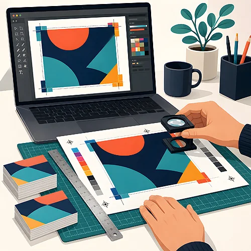
Canva is a great tool. Simple, free and it lets you put together a nice project fast, without knowing complex software. The trouble only shows up where design meets print. What looks great on screen can surprise you on paper - cut off text, a blurry photo or different colours. There is no need to fear it. You just need to know what to watch for. Below we gathered the most common mistakes from projects made in Canva, with a simple fix for each one.
- Add bleed - a few millimetres of background past the edge, so there are no white strips.
- Use large, sharp photos so the print is not blurry.
- Keep important content away from the edge, inside a safe margin.
- Export as a print PDF, not as a plain image.
- Watch out for free elements with a watermark and check your colours.

No bleed
Bleed is 3 mm of background that extends past the edge of the project. It sounds odd, but the reason is simple. The machine cuts large sheets into finished pieces and never hits exactly on the line. If the background ends right at the edge, a thin white strip can appear after trimming.
Luckily Canva makes this easy. When you download the file, tick the "Add bleed" option. The background will then be extended properly. Just remember to let a coloured background or photo reach all the way to the edge of the page, rather than stopping just short of it. The most common mistake is a white project background with a coloured rectangle placed inside it, a little way in from the edge. After trimming that gap turns into a thin white frame nobody planned.
If you are not sure which size with bleed to choose, write to us through the contact page. We will suggest the right dimensions for your product, so you set the project up correctly from the start.
Low photo resolution
Resolution is the density of detail in an image. On a phone screen a small photo looks sharp, because the screen is small. But when you enlarge it across a whole flyer, that same image goes blurry and grainy. Print shows every detail, including the lack of detail.
The rule is simple: use large files and do not force small ones bigger. If Canva shows a low quality warning after you enlarge a photo, take it seriously. Better to find a bigger version of the image or change the layout than to print a smudged graphic. Be especially careful with images saved off a screen or pulled from the web. They are often small and look fine only on a monitor. Phone photos are usually large and work well, as long as they were not heavily cropped beforehand. If in doubt, view the design zoomed to one hundred percent - that is roughly how it will come off the press.
RGB colours instead of CMYK
A screen glows with colours from the RGB model, while printers lay down inks in the CMYK model. These are two different worlds. That is why a very bright green or intense pink from the screen may come out a little calmer on paper. It is not a printer's error - that is simply how the move from screen to ink works.
What can you do? Do not expect colours to glow like on your monitor, especially the loudest ones. If a colour is crucial for you, such as a brand colour, let us know. It is also worth knowing that paper affects how colours read. The same design on glossy stock looks livelier than on matt, and a slightly cream paper gently warms every colour. That is normal and, with a little planning, easy to predict. You will find more about colours and papers in our guide to materials and papers.
Text and key elements too close to the edge
This is the other side of the bleed coin. Since cutting is not perfectly precise, keep everything important away from the edge. A caption or logo right at the edge may get trimmed or end up unpleasantly close to the end of the page.
Leave a safe margin - at least 5 mm of free space from the cut line all around. Slide texts, logos and contact details inwards. That way, even if the machine cuts a touch differently, nothing important suffers. This rule applies to every product, including small ones like promotional flyers.
A print project is not the same as an image for the screen. A few millimetres of margin and a good final file make the difference between "nice" and "professional".
Free elements with limits and the wrong file format
Canva has thousands of graphics and photos. Some are free, some paid. If you use a premium element in your project without buying it, a watermark will appear in print - a semi transparent pattern across the whole image. Before you download, check that nothing is marked with a crown or a premium tag.
The second trap is the export format. For print, choose PDF, ideally the "PDF for print" option. A plain JPG or PNG image is often lower quality and will not handle bleed as well as a PDF. A few seconds spent choosing the format saves disappointment after printing.
Before downloading, do a quick zoomed in review of the whole page. Look for watermarks, cropped captions and blurry photos. Fixing at this stage takes a moment, but after printing it is often too late.
A short checklist before you send
Before you send the project to print, go through a few points. It takes a minute and saves plenty of nerves.
- Bleed on, and the background reaches the very edge.
- Photos sharp, with no low quality warnings.
- Important content away from the edge, inside a safe margin.
- No watermarks on paid elements.
- File saved as a PDF for print.
If anything is unclear, do not guess - write to us. We will gladly point out what to watch for, and a check by our designer with a preview for approval is an option in the calculator on the product page. You will find more practical tips in our file preparation guide.
Canva can do the job, you just need to know how
None of these mistakes rule Canva out. It is a good tool that, with a little care, gives you print ready files. The secret lies in a few habits: bleed, sharp photos, a margin and export to PDF. Once they become second nature, designing will be fast and safe.
Want to do it exactly, step by step? Read our post on how to prepare a Canva project for professional print, and if you are just starting, check how to design a flyer in Canva step by step. And when the file is ready, we will take care of the rest.