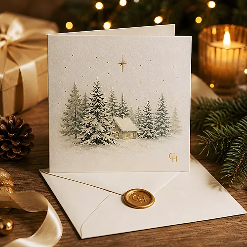
A first impression at a business meeting forms in seconds - often before a single word is spoken. The client looks at what you place on the table: the folder with your offer, the printed document, the business card. If these elements look like a coordinated team, the company comes across as organised and trustworthy. If each one is from a different world, even the best offer loses weight.
- A presentation folder organises documents and gives them status - it is the frame for your offer.
- Letterhead carries your identity onto every page: letters, offers, invoices.
- Consistent logo, colours and typography across the set build a professional image.
- Paper weight, decorative stock and finish (matte film, soft-touch) shape how it feels in the hand.
Why a company needs a presentation folder
A folder is more than a cover for papers. It is the way your offer reaches the client - organised, protected and served with class. Instead of loose sheets that are easy to mix up or lose, the client gets one coherent set with your logo on the front.
Folders prove useful in a few typical situations. When submitting a commercial offer, they give it a physical form that is harder to set aside than an email. At meetings and trade fairs they organise materials and build the first impression. When handing over documents - contracts, specifications, printouts - they protect the content and show that the company cares about detail.
There is one more, less obvious effect. The folder stays with the client longer than the meeting itself. It ends up on a desk, in a drawer, in a binder - and every time someone reaches for it, it reminds them of your company. It is a quiet but persistent brand carrier that works for weeks without any extra effort on your part.
A folder does not sell on its own, but it makes what is inside taken more seriously.
Types of folders - what to choose
There is no single universal folder. The choice depends on what goes inside and how often it will be used. It is worth knowing a few options to match the model to a real need.
Folder with a pocket
The most popular variant. An inner pocket holds documents so they do not slip out, while letting you quickly add another sheet. It works well as the standard frame for an offer or a set of meeting materials.
Folder with creasing
Creasing is a pressed line along which paper or board folds evenly and without cracking. Thanks to it, the spine and flaps fold cleanly and the whole thing keeps its shape longer. It is the detail that tells a folder made properly from one that looks tired after a week.
Folder with a business card slot
A slot for a business card is a simple but effective addition. The client gets the offer and contact details in one place - no need to search for them. It is also a natural bridge to consistency: a card tucked into the folder should belong to the same graphic family as the whole. If you want that card to truly work on the client's memory, it is worth reading our post on business cards that stay in the memory - the same rules of colour and texture apply to the whole folder. The folder pocket comfortably holds classic business cards in the 90×50 mm format - on 350 gsm coated board the card is stiff enough not to bend a corner.
Before you order folders, check how thick the typical document sets you place in them are. A pocket that is too shallow for a thicker stack of pages opens up quickly and spoils the effect.
Letterhead - identity on every page
Letterhead is the element that works every day and quietly. Every letter, offer, confirmation or note on official paper carries your brand further - even when no one is thinking about it. It is the cheapest way to make company paperwork look consistent and serious.
Header and footer
The top of the sheet usually holds the logo and company name, the bottom - contact and company details: address, phone, website, tax number. It is worth keeping this information concise and legible, without cluttering the middle of the page, which is meant for the actual content. The header builds the first impression, the footer closes the page and gives the recipient a full set of details.
Paper weight and decorative stock
Weight is the mass of paper measured in grams per square metre - the higher it is, the thicker and stiffer the sheet. For letterhead you usually reach for something a little heavier than a regular printer page, because it sits better in the hand and feels more solid. If you want to go further, a heavier Offset 120 gsm or DCP Satin 120 gsm adds character without being loud. You will find more on choosing the substrate in our corporate materials section.
One practical detail is worth remembering: letterhead often still passes through an ordinary office printer that adds the body of the letter. So it helps if the substrate is friendly to toner and ink - paper that is too thick or heavily coated can misbehave in home equipment. It is a rarely considered detail that can save a lot of frustration in the daily work of an office.
Consistency - logo, colours, typography
The heart of the whole set is consistency. The folder, letterhead and business card should look like pieces of one puzzle, not three separate projects. Three things keep this unity in check.
- Logo - the same version and the same proportions everywhere. No random scaling or colour changes.
- Colours - a fixed brand palette. If it is navy on the card, then the same navy on the folder and in the letterhead header.
- Typography - one, at most two typefaces. Company name and text in the same style on every carrier.
When these three layers agree, the client does not have to analyse anything - they simply feel they are dealing with a company that knows what it is doing.
The easiest way to keep this consistency is to write down a few basic brand rules in one place: the exact colour values, the permitted logo versions, the chosen typefaces. Such a short set of guidelines means that later materials - even ordered six months from now - keep the same character rather than drifting off in their own direction. It does not have to be an elaborate document; a clear cheat sheet you can always return to is enough.
Order the whole corporate set together rather than piece by piece at different times. One well-thought-out project saves you later adjustments and colour mismatches.
The finish that makes a difference
The finish decides how the folder and paper feel in the hand. It is the final touch that turns a plain print into something you want to touch.
Matte film gives an elegant, muted effect and pleasantly cools the surface. A soft-touch finish feels like velvet - the surface is soft and slightly warm, which instantly raises the sense of quality. Both options additionally protect the print from scuffing, so the folder looks new for longer. It is worth following the character of the brand here: soft-touch suits premium, matte suits classic gravity.
The finish is also a chance for an accent. The accent here comes from the film itself: velvet Soft Touch across the whole folder, or the contrast of matte against gloss. You pick all three variants in the calculator for presentation folders. The rule is simple: one strong accent works, three start fighting for attention. If you go for such an addition, let it appear in the same spot on the folder and on the letterhead - then even a small detail reinforces the sense of consistency.
Preparing for print - what to remember
Even the best design will suffer if the print file is prepared carelessly. A few rules make sure the result on paper matches the one on screen.
- Bleed - graphics extended beyond the cutting line so no white strip is left at the edge after trimming.
- CMYK colours - the project in print mode, not screen RGB, so the colours do not shift after printing.
- Resolution - graphics in print-ready quality, not a low preview version from the internet.
- Margins - important text kept away from cutting and creasing lines so nothing gets trimmed.
If you want to be sure everything is buttoned up, simply get in touch - we will advise how to prepare files for folders and letterhead. And if you would rather have a designer look at the file and send a preview for approval, add file verification in the calculator. A consistent corporate set is an investment that works for your image at every meeting.