"The best quality", "a premium product", "world-class level" - these words run through so many advertising materials that they have stopped meaning anything. The client reads them and scrolls on, because they know anyone can write them about themselves. The real problem is that declaring quality in words is the weakest way to show it. Quality is proven, not announced.
The good news is that you have far more powerful tools at your disposal than adjectives. A specific instead of a generality, good material instead of a description of material, a refined detail instead of assurances about refinement. In print this is especially rewarding, because the recipient literally takes your message in hand. Below we show how to communicate high quality so that the client believes in it before reading a single word.
- The words "best" and "premium" prove nothing - anyone can write them, so the client ignores them.
- You show quality with a specific: a number, a fact, a process, a concrete effect.
- In print the material itself speaks loudest - paper, finishing, texture, precision of execution.
- A refined detail builds credibility more strongly than a declaration about refinement.
- Consistency across all materials is a signal of quality that cannot be faked with a slogan.
- Show, do not tell - a photo of the process and a sample work better than an adjective.

Why words about quality do not work
"The best" is a claim nobody checks, because everyone uses it. When every firm in the industry writes "premium" about itself, the word stops standing out - it becomes background that the recipient's brain filters out automatically. Worse still, the stronger the declaration, the greater the scepticism. "The highest quality in town" more often raises suspicion than trust.
Quality is a trait the recipient wants to judge for themselves, not take on faith. That is why advertising that declares it effectively asks the client: "trust me". And advertising that shows it says: "see for yourself". The difference is huge - one shifts the burden of proof onto the recipient, the other takes it on itself.
Swap the adjective for a specific
The simplest swap is dropping the generality in favour of a fact. Instead of "the best materials", write which material exactly was used. Instead of "premium workmanship", show what that workmanship consists of. A specific is verifiable, and therefore credible. A specific sounds like this: Prestige business cards in the 85×55 mm format, on decorative paper, with no film - a description like that is checked with the fingers, not taken on trust.
- Instead of "high paper quality" - give the paper type, its weight or texture. A specific sounds like quality on its own.
- Instead of "we care about details" - show the detail: a rounded corner, soft-touch film, thick board, an even spine.
- Instead of "an experienced team" - say how many projects you have delivered or how long you have been running.
- Instead of "careful finishing" - name the finish: velvety Soft Touch film, matte film, die-cutting.
The same principle works on printed materials. Thoughtfully chosen colours do more than the words "professional design"; if you want to deliberately build brand character with colour, read our post on how to match warm or cool colours to a company's character. It is also worth telling a product's story rather than praising it - product tags are great for telling a brand's story, and a story builds value more effectively than a slogan.
Go through your material and mark every evaluative word: "best", "premium", "exceptional", "professional", "world-class". Next to each, ask: "What can I replace this with - what fact, number or image?". If you cannot, it means the declaration is empty and better removed.
Let the material speak for itself
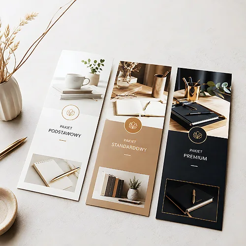
In print you have an advantage that on-screen advertising lacks: the recipient touches your message. Thicker, well-chosen paper, a distinct texture, precise finishing - all of this is taken in by the senses before the mind reads the content. A business card on solid board with soft-touch film communicates quality by its very presence in the hand. It does not need to write it.
That is why, for materials meant to build an impression of class, it is worth investing in the carrier. An elegant company folder for documents or a refined business card say more about a firm than a paragraph of self-praise. Enhancement works similarly: velvety Soft Touch film or matte film - details the recipient associates with care for the product. You will find more on the role of packaging as a carrier of quality in our post on why a product's packaging can be more important than the advertising itself.
Details the reader perceives as quality
The recipient can rarely name what makes a material "look expensive", but senses it unerringly. Usually it comes down to several things at once.
- Paper choice - weight, texture and finish set the impression before you even look at the content.
- Precision of execution - clean cutting, crisp print, matched colours. Poor quality shows immediately.
- Considered typography - proper spacing, calm hierarchy, no clutter. Breathing space is a luxury.
- Finishing - soft-touch film, die-cutting, rounded corners. A detail signalling that someone made an effort.
Consistency as proof of quality
There is one more signal of quality that cannot be faked with a slogan: consistency. When the business card, leaflet, folder and letterhead speak one language - the same colours, the same typography, the same character - the recipient subconsciously reads it as maturity and order. A firm that controls its image in every detail inspires trust in itself.
Inconsistency does the opposite. A business card in one style, a leaflet in another, a logo in a third version - that is a signal the firm does things "in a hurry". No "premium" will fix it. So instead of spending energy on adjectives, it is worth making sure all materials hold a common standard. The client rarely analyses this consciously, but when every element falls into one whole, they simply feel they are dealing with a firm that knows what it is doing - and that impression stays.
Show, do not tell - in practice
The rule "show, do not tell" sounds like advice for writers, but it works beautifully in advertising. Below is a simple way to translate it into concrete materials.
- List what really sets your product apart - materials, process, effect. Just facts, no judgements.
- Turn each fact into an image or a specific - a photo of the process, a sample, a number, a material name.
- Choose a carrier worthy of the message - good paper and finishing will do part of the job for the text.
- Remove all empty adjectives - if the material still stands on facts after deleting them, it is ready.
High quality is best communicated by showing it, not announcing it. A specific instead of a generality, material instead of description, consistency instead of assurances - this is a language the client will believe, because they can check it themselves. If you want to match paper, finishing and carriers so they speak of quality without a single "premium", take a look at our offer or the guide on materials and papers. The best compliment is the one the client did not hear from you, but thought up themselves while taking the material in hand.