A client picks up your offer leaflet, sees a dense grid full of tick marks and small type, moves their eyes to the right, then back to the left, loses the row - and sets the sheet aside. Not because the offer is weak. Because comparing it required an effort they did not feel like making at that particular moment.
A detailed comparison grid has something tempting about it. It looks solid, it shows the company has a well thought out offer, and it gives the feeling that nothing has been left out. The trouble is that it works well on a screen, where you can zoom in and scroll calmly. On paper, different rules apply: there is one glance, one reading distance and one moment in which the client decides whether it is worth reading on.
The good news is that differences between packages can be shown in a simpler and, at the same time, more effective way. Below we have gathered the approaches that work in printed materials - from layout, through naming, to where you place the next step.
- Three options instead of five - that is how many a client takes in at a glance and compares without fatigue.
- Instead of a grid: three short blocks side by side, each built to the same pattern.
- First list what is shared by all packages, and only then show the differences.
- Instead of a feature list, add one sentence about "who the package is for" - that is what really helps people choose.
- One highlighted recommendation and one clear next step complete the whole thing.
Why a big grid loses on paper
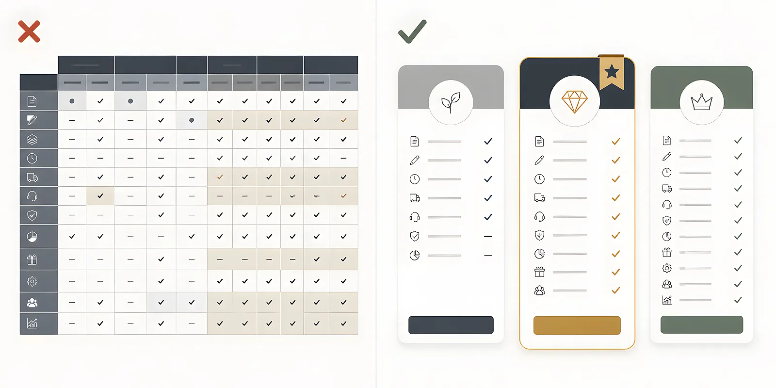
A comparison grid forces reading in two directions at once. The client has to find the row with a given service, move across to the right column, remember the result, return to the beginning of the row and repeat this a dozen or more times. On a screen the cursor and zoom help with that. In print, every one of those moves happens in the head.
Then there is the arithmetic of space. The more rows you want to fit, the smaller the type has to be and the tighter the spacing. A material meant to look professional starts to look like a user manual. And tick marks on their own say very little - the client sees that there is more of something, but does not know what it means for them.
It is also worth remembering the conditions in which printed materials are read. Rarely at a desk in full concentration, more often on the move, in a waiting room, at a trade fair stand, in poorer light. The layout has to forgive those conditions.
The rule of three options
Three packages is a number that works. They fit in a single row on a leaflet format, they can be taken in without turning the sheet over, and they do not require the client to build a complicated map in their head. With five variants the familiar paralysis sets in - the choice looks hard, so the decision gets postponed.
If you really do have more variants, you do not have to hide them. It is enough to show the three main ones and close the rest with a single sentence: that the scope can be adjusted and that it only takes a conversation. A printed material is meant to invite a conversation, not to replace it entirely.
Names that explain the scope on their own
You gain most when the package name carries at least a little meaning. Labels such as basic, medium and top only speak about size, not about what is going on inside. Names that refer to the client's situation work better - for example a package for a company launch, a package for an event, or a package for a whole campaign. The client reads the name and immediately has a rough idea whether it is about them.
Stick to one convention while you are at it. If you name the first package after a situation, the next two should work the same way - a mixture of descriptive and marketing names makes the whole thing look accidental.
Three blocks instead of a grid
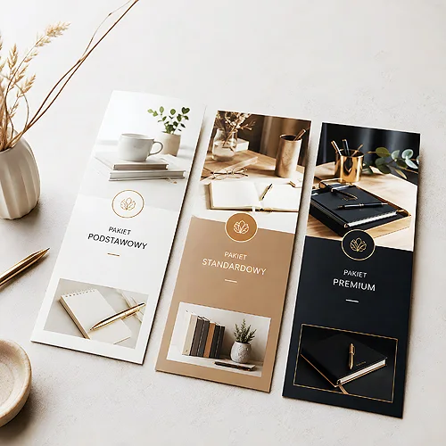
Instead of one table, place three independent blocks side by side. Each of them reads from top to bottom, like a small business card for the package. The comparison then happens by itself - the eye jumps between blocks and sees that they differ in the length of the list and in a few specific points.
What to repeat in every block
- The package name - in the same place and the same type size in every block.
- One sentence about who it is for - a short description of the reader, not of the service.
- Four to six points - the same number in every block, in the same thematic order.
- The same language - if one block is written with nouns, the others should be too.
- The next step - the same invitation under each block, or one shared invitation under the whole set.
Consistency matters more here than beauty. When every block has the same structure, the client learns the layout on the first one and reads the next two in a flash. It also makes it easier to keep the blocks short - and short means more effective in this case, which we write about in our post on how to shorten advertising copy so that it convinces.
What to list only in the wider variant
Do not repeat in the second and third block everything that was already in the first. Use a simple connector instead: everything from the basic package, plus. Thanks to this the list in the wider variant stays short and shows only what is new - and that is exactly what interests a client who is considering a broader scope.
This move has one more advantage. The block for the widest package does not grow to thirty points, so all three columns keep a similar height and the whole layout looks calm.
Before you start designing, write down on a sheet of paper all the points from the three packages and mark those that appear everywhere. Move the recurring ones into a shared paragraph above the blocks. What is left is the real difference - and only that has to appear in the blocks.
First what is shared, then the differences
Above the three blocks it is worth placing a short section titled, for example, "in every package". It can hold everything each client receives: the way you work, contact with one person, a consultation before the start, support after delivery. It is a very practical move, because it does three things at once.
- It builds trust before the client starts comparing - they see that even the simplest variant has sensible content.
- It slims down the blocks, because the recurring points disappear from the lists.
- It sets the right order of thinking: first do I want to work with them, then in what scope.
Without such an introduction, the first package reads like a stripped down version rather than a full proposal for a smaller need. The order here has a real effect on how the whole offer is received.
"Who it is for", instead of a feature list
A feature list answers the question of what I will get. A sentence about "who it is for" answers the question of whether this is for me - and that is what decides the choice. Instead of writing that the package covers three kinds of materials and two consultation meetings, write that it is a proposal for a company opening its first venue and needing a complete set for the launch.
Such a sentence works like a filter. The client reads three short descriptions of the reader, recognises themselves in one of them and only then moves down to the points. The order is the opposite of a grid, where they first get the data and have to assemble the meaning themselves. If you struggle to squeeze one sentence out of a package, our post on how to find one strong message instead of saying everything will help.
Hierarchy, recommendation and typography
In a material with packages the eye needs a clear route. First the main heading, then the shared section, then the three package names, then the sentences about the reader, and the points at the end. Each of those levels should differ from its neighbour in something obvious: type size, weight or the space above it. You will find more about building such a route in our post on how to create a hierarchy of text.
The recommendation is a separate matter. It is worth highlighting one of the three packages - with a frame, a different background shade or a small label saying it is "the most frequently chosen one". This shortens the decision considerably, because a client without a firm opinion will gladly use the hint. Highlight exactly one block. Two highlights cancel each other out.
In typography itself, a few things make the biggest difference:
- One typeface, two styles - headings heavier, body text regular. A third typeface usually only muddles things.
- Space instead of lines - separate the blocks with white space, not with rules. Rules add weight.
- Short points - ideally one line each. A point that wraps onto three lines stops being a point.
- A sensible type size - if you have to go very small to fit something in, that is a sign there is too much content, not that the type is too big.
- Contrast - dark text on a light background reads best in unpredictable conditions.
The next step and two versions of the material
A material with packages has one job: to lead to a conversation. That is why the next step has to be visible without searching - preferably at the bottom, in a fixed place, clearly separated from the blocks. One sentence of invitation and your contact details are quite enough. If you like, add a short explanation of what happens after getting in touch, because that lowers the threshold. It is also convenient to point people to the contact page, where the client will find every way of reaching you.
It is worth preparing two variants of the same material, because a leaflet handed out at a trade fair and an offer for a meeting work in completely different ways.
A version for a folded leaflet
Here the order of the panels rules. Put the heading and the shared section on the first page, the three blocks side by side inside, and the next step on the final panel. The client unfolds the material and receives the content in the same order in which they should be thinking about it. Our post on how to divide content on a leaflet comes in handy when planning that split. Folded leaflets work well here, in a format that fits three columns without crowding.
A version for a presentation folder
For a meeting, a layout on separate sheets works better: one page with the introduction and the shared section, one with the packages, possibly one with examples of past work. You slip the sheets into a presentation folder and can swap them freely whenever the scope of a package changes. That is a real convenience, because you update one page instead of the whole material. A folder also gives you an advantage in conversation - you can take out exactly the sheet you are talking about and leave it in front of the client.
A package comparison does not have to look like a spreadsheet to be reliable. Three well named options, a shared introduction, blocks built the same way, one highlighted recommendation and a clear invitation to talk are enough. A client who understands the difference in a few seconds is far more willing to take the next step - and that is what this material is really about.