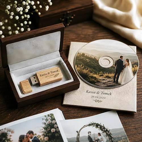
A disc with communion photos is one of those keepsakes you pull out of a drawer years later - while tidying up, on an anniversary, or when the child, now a teenager, wants to see how they looked that day. And that is exactly why it is worth thinking about it a little further ahead than the coming week. A print that seems fashionable today may, a few years on, look like a relic of a bygone season. A well-designed one will age gracefully.
In this post we show how to design a print for a communion disc so that it does not lose its charm. The point is not to make it dull or overly safe - it is to make choices that hold up regardless of passing fashion. A timeless motif, a calm palette, elegant typography and a few lasting details do more here than the most striking trend.
- Choose a timeless motif over a fashionable one - the classic holds up for years, a trend ages quickly.
- A muted palette and one elegant typeface are the foundation of a print that will not age badly.
- The child's name and the date are a lasting element that gives the disc keepsake value regardless of style.
- Put quality of print and legibility first - the detail should stay sharp and clear even after years of viewing.
- Keep it consistent with the stationery and packaging, but do not overload the design - less is more.
- Leave room for a short description of the contents, so that years later it is clear what is on the disc.
A timeless motif instead of a passing trend
The first decision is also the most important: what to base the whole design on. It is tempting to reach for whatever is fashionable at the moment - a specific illustration style, a popular pattern, an effect straight out of social media. The trouble is that a trend has a short shelf life. What looks fresh today can, a few years later, simply look old - and not in a particularly charming way.
The safer choice is a timeless motif - one that is not tied to a single season. A delicate communion symbol, a calm ornament, a subtle paper-textured background, a simple layout built around one accent. Classic does not mean boring. It means that in ten years the disc will still look as if it was made with an idea, not on the wave of a passing fashion.
How to recognise a motif that will hold up
A simple test: imagine this disc in ten years. If the motif still fits the memory of that day and does not shout out its date of creation - it is a good one. If it instantly gives away the year it was made, it is worth looking for something calmer. You recognise timelessness by the fact that the design rests on form and proportion, not on one fashionable effect.
A muted palette and elegant typography
Colour and lettering decide the first impression, and with a keepsake the last one matters too - how it looks years later. A muted palette ages far better than strong, saturated colours. Delicate white, ivory, a calm blue, warm beige, a touch of gold as an accent - these are combinations that neither tire the eye nor jar over time.
Typography works the same way. One elegant typeface, legible and classic, will do more good than several ornamental fonts at once. It is worth choosing one type for the name and date, and perhaps a second, calmer one for a short description. Overly decorative, fashionable fonts are one of the first things that give away a design's age.
- Two, at most three colours - calm and well matched, without loud contrasts.
- One typeface for the accent - the name and date in an elegant, legible script.
- A touch of gold in moderation - as a subtle detail, not as the background of the whole disc.
- Contrast for legibility - a light print on a darker background or the other way round, so the lettering stays clear.
Before you approve the design, look at it from arm's length - the way you hold a disc while looking at photos. If the name and date are legible at first glance and the whole thing looks calm, the design is ready. If your eye tires while searching for where to settle - that is a sign it is worth taking something away.
The name and date as a lasting element
There is one detail that will never go out of fashion: the child's name and the date of the celebration. They are what turn an ordinary print into a keepsake. A few years on, no one will remember which pattern happened to be trendy, but the name and date will instantly bring back a specific day and a specific person.
That is why it is worth treating these two elements as the heart of the design. Place them in a visible spot, in an elegant script, with a little space around them. They do not need to be large - they need to be legible. The rest of the print should support them.
Quality of print and legibility
Even the best design loses its charm if the execution falls short. With a keepsake you look at for years, print quality matters twice over - what is sharp and clear today should stay that way. It is worth taking care of the right file resolution and making sure that fine details, thin lines and lettering do not blur once printed.
Printing directly onto the disc gives a clean, uniform effect that withstands the passage of time well. If you want the whole thing to be even more refined, it is worth getting to know the various print and packaging options on the CD and DVD print page. A well-prepared file is the foundation - on how to set resolution, bleeds and colours, we write in our guide to preparing files for print.
- High resolution - so that lettering and details are sharp, not ragged.
- Legible lettering - the right type size, sufficient contrast with the background.
- Tested colours - a muted palette handles the conversion to print better and holds no surprises once printed.
- A safety margin - important elements away from the edges and the disc hole.
Consistency with stationery and packaging
A disc rarely stands alone. It usually comes with packaging, and often a whole communion stationery set - invitations, thank-you notes, place cards. When the print on the disc speaks the same language as the rest, the whole thing looks considered and complete. The same motif, the same palette, the same lettering - and the keepsake becomes part of a larger story about that day.
An elegant home for the disc is a digipack printed in the same style - a cardboard case protects the disc and lifts the sense of a gift. You will find packaging and set options in the discs and packaging section. If you are looking for ideas on how to use the surface of the packaging as an aesthetic element, take a look at our post on how a disc cover serves an aesthetic and communicative role.
Less is more - and room for a description
The greatest temptation with a keepsake is the urge to fit everything in at once: a symbol, an ornament, several lines of text, a background, a frame. The effect is often the opposite of what was intended - the design becomes crowded and quickly tires the eye. With a print meant to hold up for years, the less-is-more principle works exceptionally well. One strong accent, a little space and a legible name with a date are enough.
Leave room, too, for a short description of the contents. It is a detail easy to forget, yet very useful - years later no one has to guess what is on the disc. A discreet caption is enough, for example the type of material and the year. Such a description does not spoil the aesthetics if you keep it in the same calm style as the rest.
- Start with the motif - choose one timeless idea and reject passing trends.
- Set the constants - two colours, one typeface for the accent, one recurring detail.
- Add the name and date - as the heart of the design, legibly and with space around them.
- Add a description of the contents - discreetly, in the same style, so that years later it is clear what is on the disc.
- Check the file quality - resolution, contrast, margins, before you send it to print.
A print on a communion disc that does not lose its charm is not a matter of the trendiest pattern, but of a few calm, deliberate choices. A timeless motif, a muted palette, elegant typography, a clear name and date, and a touch of restraint - that is all it takes for this disc to still look, ten years on, as warm and dignified as on the day it was made.