
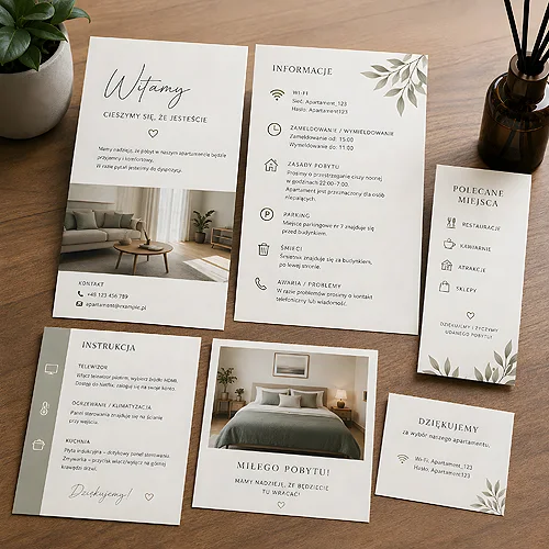
Short-term rentals have one feature that can catch you off guard: the guest usually never sees a live person. They receive a door code, walk into an empty flat, and from that moment they are on their own. How their stay unfolds depends largely on what you leave on the table and beside the appliances. Well-prepared prints replace the reception desk - they answer questions before anyone has a chance to ask them.
An apartment without staff does not mean an apartment without care. Quite the opposite - the less human contact there is, the more work the cards, guides and labels do for you. Below we show which information is worth printing, how to arrange it, and how to make the whole thing look consistent with the interior rather than like a pile of loose notes on the fridge.
- A welcome guide answers the most common questions: wi-fi, check-in and check-out, appliance use, heating.
- A card with house rules and an emergency contact gives the guest the sense that they know what to do if anything happens.
- An area map with recommended places is a gesture guests remember and gladly mention in their reviews.
- Instructions placed beside specific appliances cut down the number of calls at the hour you would rather not answer.
- A "before you leave" card organises check-out and saves misunderstandings.
- A QR code to an online guide lets you keep information current without reprinting the whole set.
The welcome guide - the heart of the set
If you were to leave only one print in the apartment, let it be the welcome guide. It greets the guest, sets the tone of the stay and answers the questions that come up most often. It is worth starting with a short, warm welcome - a few sentences that make the flat feel friendly from the doorstep.
Then come the specifics. The most important information is usually the same set of things a guest asks about in the first hour:
- Wi-fi - the network name and password, ideally in a large, legible font, because this is question number one.
- Check-in and check-out - times, how to collect and return keys or the code.
- Heating and air conditioning - how to set the temperature, where the thermostat is, how the controls work.
- Appliances - a brief note on the washing machine, dishwasher, induction hob or coffee maker if their use is not obvious.
- House rules - quiet hours, smoking, pets, waste sorting - calmly and matter-of-factly.
The guide need not be long. It is better for it to be specific and well laid out - with headings your eye can jump across easily. A guest looking for the wi-fi password does not want to read an essay. They want to find one line in three seconds.
Arrange the guide in the order in which the guest gets to know the flat: first the entrance and wi-fi, then the bedroom and bathroom, and finally the kitchen and the exit. This "walk through the flat" logic means information turns up on its own, exactly when it is needed.
Information cards and rules beside appliances
Not everything has to sit in a single guide. Some information works better where it is needed - beside a specific device. A small card by the coffee maker, a label by the thermostat, a short instruction by the washing machine. The guest then does not have to go back to the guide and hunt for the right page.
Such point-of-use cards work brilliantly beside appliances that are not obvious to operate or tend to prompt the most questions. If you want them to look neat and resist splashes in the kitchen or bathroom, it is worth printing them on stiffer paper or as durable information cards that will last a whole season. When designing them, the knowledge from our post on how to design information cards for hotel rooms comes in handy - the same legibility rules apply in an apartment.
An emergency contact that reassures
A separate, clearly visible card with an emergency contact is an element that gives guests a sense of security. It is not about making them call more often - quite the opposite. Knowing there is someone to call in case of a fault means small problems do not grow into disasters. Put your number or the manager's on it, along with basic emergency numbers and a note on what to do about typical faults - a flood, a power cut, a locked door.
The area map and recommended places
This is a print that is not essential, but makes a huge difference to how the place is received. A guest who gets an area map with hand-picked recommendations feels they have landed with someone who knows the area and wants to share it. It is exactly these gestures that most often come back in reviews as "the host recommended a great spot just around the corner".
It is worth including a few categories that come in useful for everyone:
- Food - two or three tried-and-tested restaurants or cafes, ideally within walking distance.
- Shopping - the nearest shop, bakery, pharmacy, cash machine.
- Attractions - what is worth seeing, with a short note on why exactly this.
- Practicalities - the stop, the car park, the station, if the guest travels by public transport or car.
The map need not be cartographically accurate. It matters more that it is legible and personal - a few pins with a short description do more than a professional city plan. You can prepare such a print as part of the welcome set or as a separate, nicely folded card the guest takes with them on a walk.
The "before you leave" card
Check-out without staff can be a source of misunderstandings - the guest does not know whether to take out the rubbish, where to leave the keys, or whether to start the dishwasher. A short "before you leave" card solves this with an elegant list of points, without creating an air of control. The goal is for departure to be as smooth as arrival. The same list works well as a door hanger, right in front of the guest at the moment they leave.
- Keys or code - where to leave them, whom to hand them to, by what time.
- Rubbish - whether to take it out, where the bins are, how to sort it.
- Appliances - whether to turn off the heating, shut off the water, close the windows.
- Dishes - whether to run the dishwasher or leave things on the counter.
- Farewell - one warm sentence and an invitation to leave a review.
That last point is a small thing that pays off. A guest who leaves feeling everything was thought through is more likely to leave a good rating - and that is exactly what short-term rentals stand on.
Consistent aesthetics and multiple languages
All these prints work best when they look like one whole. The same paper, the same pair of fonts, a recurring detail - the apartment's logo, a colour, a small symbol. A guest who sees a coherent set subconsciously reads the place as well cared for and professional, even if they met no one here. A set of notes thrown together on the fly gives the opposite impression.
It is also worth thinking about multiple languages. If you host foreign guests, it is good to have the key information - wi-fi, check-out, emergency contact - at least in English. You do not have to translate everything; a second version of the most important prints is enough. Format matters too: a card meant to sit on the table should stand or lie legibly, not hide in a drawer.
Add a QR code to the guide leading to an online version. That way, when the wi-fi password changes or a new recommendation comes up, you update the content on the web and the print stays the same. The paper stays neat and consistent, and the information is always current - without reprinting the whole set for every small change.
If you are only just planning such a set, the materials on preparing files for print will help, and when choosing products and formats it is worth looking at the range of prints for HoReCa and rentals. A good rental apartment sells convenience - and convenience begins with the guest not having to guess anything. A few thoughtful prints can replace a reception desk: reassure, advise and see the guest off. And make a stay without staff contact remembered as exceptionally well looked after.


