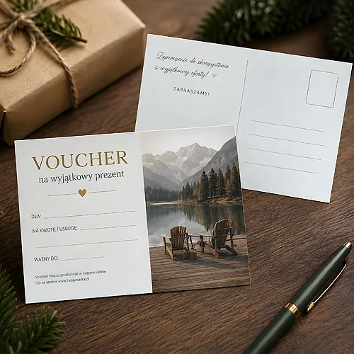
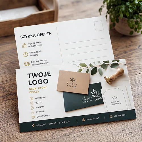
The front of a postcard takes a long time to settle: the photograph, the colour, the line of copy. The back gets added at the end, in five minutes, because it is only the other side. Yet that is where it is decided whether the card lands on a desk or in the bin.
The back is the only part of a postcard that says anything specific. The front may be beautiful and mean nothing; the second side has to say who is writing, why, and what the reader is meant to do about it. It does all that on a surface smaller than instinct suggests.
This article is a guide to writing, not to designing. In order: how much room you have, where to start, what to cross out and in what sequence to work so the layout does not overtake the words.
- The back splits into two zones - the address area and the message, so in practice you have about half of that side.
- One message per card - two messages cancel each other out and neither stays in the reader's memory.
- The opening line decides the rest - if it sounds like an advertising headline, nobody reads on.
- A signature changes the tone - a named person achieves more than a logo repeated a second time.
- Order: words, layout, graphics - the reverse order ends with text forced into gaps.
The back holds less than you think
Advertising postcards are always printed on both sides and that is their strength, but the second side is not a blank sheet. The traditional layout divides it into two zones: the right, which usually carries the address and a space for the stamp, and the left, reserved for the message. Even if you send the cards in envelopes or hand them over in person, that division is worth keeping, because the reader has known it since childhood and reads the card accordingly.
The conclusion is simple and rarely drawn in time: you have to write your text on roughly half of that side, not on all of it. To that you must add a margin at the edges, because letters set too close to the trim look like an accident rather than a decision.
That is why the words come before the design. If a handsome layout appears first, the text has to be trimmed to fit it, and trimming usually kills the very sentence that mattered most.
The rule of one message
The most common mistake on the back is three things at once: a new offer, a new address and an invitation to an event. Each of them would work on its own. Together none of them works, because the reader spends a few seconds with the card and will not build your hierarchy for you in that time.
Choose one thing. If two feel equally important, you need two mailings or two separate designs, each ordered on its own. The same rule governs every short piece of print, and we wrote about it when explaining why good advertising starts with the customer's problem rather than with a description of the company.
The opening line decides the rest
The reader turns the card over and sees a single line. That line answers the question of whether this is addressed to them or to everybody. If it sounds like a leaflet headline, the rest will go unread, however good it is.
What works: speaking to the reader directly, referring to something you share, a specific detail instead of a generality. "Thank you for Tuesday's conversation about the warehouse in Ruda" reads differently from "Thank you for the trust you have placed in us". The first sentence could only have been written by somebody who was at that meeting; the second could have been written by anyone.
Tone is a decision too. A light, playful opening works well in hospitality and retail, and less well in services where the client expects gravity - we discussed that line in our piece on whether humour in advertising helps you sell. One rule holds: the tone of the opening line should match the tone of the conversations you have with that client anyway. A card written in a borrowed voice reads as if somebody else sent it.
A signature that looks like a signature
End the message with a first name and a surname, not with the company name alone. The logo is already on the front and repeating it adds nothing. A handwritten signature, or a typeface that resembles handwriting, makes a small but real difference: it signals that a person stands on the other side. With larger runs nobody signs cards by hand and nobody expects it - it is enough that it looks that way.
What to leave off the back
The list of things to cross out is shorter than the list of things to write, but more important.
- A price list - the card should invite a conversation, not replace a quotation. A price needs context that a few dozen characters cannot build, and without it a figure reads either as too high or as suspiciously cheap.
- Terms and conditions with asterisks - small print on a postcard is illegible and suspicious at the same time.
- Three calls to action - call us, visit the website and drop into the showroom are three different requests. Keep one.
- A full list of services - a catalogue of everything says "we do it all", which means nothing in particular.
- Type that is too small - on legibility at a distance we wrote in our piece on designing material readable from further away.
A QR code and a date - two elements that must earn their place
A QR code on the back makes sense only when it leads somewhere specific: a booking form, a single page with a collection, a map of how to get there. A code pointing at the home page takes up room and helps nobody, because the reader still has to search. Add one sentence beside it saying what will appear after scanning; without that, few people reach for a phone.
The second element that earns its place is the closing date of an offer or the date of an event. It is the only sales detail that does not spoil the tone, because it does not persuade, it informs. A date also organises the reader's decision: either the card goes somewhere visible, or they know at once that it does not concern them.
Write the text for the back in a plain editor and count the characters. If it runs to more than a few hundred, the text is not too long for a card - it is too long full stop. Keep cutting until one opening sentence, one specific sentence and one request remain. Only then hand it over to the design.
The order of work on a card
The sequence looks obvious, and yet almost everybody begins at the wrong end.
- Write the words - the opening line, the message, the request, the signature. Cleanly, without thinking about layout.
- Cut them by a third - it is almost always possible and almost always helps.
- Plan the back - the address zone, the message zone, room for contact details and a code if you need one.
- Only now choose the picture for the front - so that it suits what you have written, rather than the other way round.
- Check margins and file preparation - the rules are gathered in our file preparation section.
When ordering you also choose whether we print straight from your file or whether our designer looks at it and sends back a preview for approval. That second route is worth taking when the design was put together in a hurry.
The back of a postcard is a few dozen words that somebody will read once. That is why they deserve more time than the photograph on the front: the picture holds the eye for a moment, while the text decides whether the card stays. If you are looking for a ready form for a thank you, see our thank you cards as well, and the full range is waiting in the postcard section.