
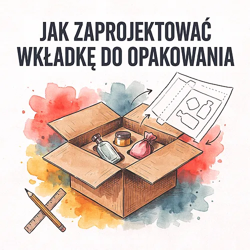
A customer unpacks your parcel and for a moment all their attention belongs to you. It is a brief moment, but an exceptionally valuable one - that is exactly when a small insert can do more than many an email campaign. A well-designed card thanks the customer for the purchase, helps them start using the product and warmly invites them back. A badly designed one lands in the bin along with the bubble wrap.
An insert is one of the cheapest and most underrated ways to build a relationship with a customer. It does not shout, does not get in the way, does not require opening an email - it is simply in the parcel, when the customer is already holding your product in their hands. Below we show how to design such a card so that it explains the product and gently encourages the next purchase, without a trace of pushiness.
- An insert in a parcel plays several roles at once: it thanks, explains the product, offers a discount code, asks for a review and suggests what to add.
- The best cards have a human tone and one main call to action - the rest is background, not equal-weight messages.
- Do not overload the content - a few clear sentences work better than a dense leaflet packed with everything.
- A QR code brilliantly links the paper with your website, guide or social profile.
- Brand consistency - the same colours, paper and style as the rest of the packaging - builds a sense of polish.
- Match the format to the box: sometimes one card is enough, sometimes a small folded folder is better.
Why have an insert in the parcel at all
Before you start designing, it is worth knowing what this card is meant to do. An insert rarely does just one thing - it usually combines several functions that together build a good first impression after purchase. Here are the most common roles it can play.
- Thank-you - a short, sincere sentence saying you value the purchase. It is the simplest way to make the parcel feel more personal.
- Instruction or tip - how to start using the product, how to care for it, what to watch out for. Fewer questions to support, fewer returns.
- Discount code - a small incentive for the next order, handed over exactly when the customer is happy with the first.
- Request for a review - a gentle invitation to leave a review, ideally with a simple QR code leading straight to the form.
- Cross-sell - a hint about what pairs with the purchased product or what others add most often.
You do not have to cram everything in at once - more on that shortly. But simply being aware of these roles helps you decide what is most important on your card and what to build the whole message around.
Message structure: a human tone, one call to action
The most common mistake with inserts is treating them like an advertising flyer - lots of slogans, lots of arrows, lots of everything. Yet a card in a parcel works best when it sounds like a short, warm message from a person, not like a banner. The customer has just trusted you and paid for it - respond to that with tone, not another advert.
One main call to action
Decide what is most important on this card. Do you want the customer to scan a code and leave a review? Or perhaps to come back with a discount? Choose one and build the whole card around it. The rest - the thank-you, a small tip - can stay, but as background, not as five equal-weight messages fighting for attention. A card with one clear goal simply works.
What not to overload
The more you cram onto the card, the less of it stays in the memory. Leave some air, one legible heading and a few short sentences. If you feel you have to write a great deal, that is a signal the card format is too small and a little folded folder would be better. The rule is simple: less content, more attention. It is worth remembering here what we describe in the post on promotional material that grabs attention without photos - often it is typography and space that do the work.
Read the insert text out loud. If it sounds like something you would say to a customer face to face, handing them the parcel - it is good. If it sounds like an advertising slogan, shorten it and soften it. A human tone is the cheapest improvement you can make, and it costs nothing but a moment of attention.
The QR code and the link to what is online
A paper card has one natural limit - it ends with what is written on it. A QR code removes that limit, because it leads the customer straight from the parcel to what you have online: a guide, an instructional video, a review form, a social profile or a page with complementary products.
Used well, a QR code makes the insert far more capacious, even though the card itself stays small and legible. Instead of explaining how to use the product in ten points, you give one sentence and a code to a short guide. Instead of asking for a review and giving a long address, you give a code that leads straight to the form. It is just worth making sure you clearly state what the customer will find after scanning - a code without a caption often gets ignored. A prompt like "Scan to see the guide" works much better than the little square alone.
Brand consistency and format
An insert does not work in a vacuum - the customer sees it together with the box, the filling and the label. If the card looks as if it came from a completely different company, the whole impression falls apart. That is why it is worth treating it as part of the packaging, not a separate print.
- Colours and logo - the same as on the rest of the packaging. The card should look like an element of your brand, not a random extra.
- Paper - matched to the character of the brand. Thick, textured paper builds a premium impression, light and smooth feels clean and modern.
- Format - matched to the box, so the card sits nicely on the product rather than curling up in a corner of the parcel.
- Finish - if the rest of the packaging has a recurring detail, it is worth echoing it here, so the whole thing looks planned.
We write more about how the very arrangement of items in the box affects brand perception in the post on arranging the product in the box and perceived value - the insert is part of the same puzzle. If you are looking for a stock for the card, take a look at the materials and papers section, and you will find ready formats in the product offer.
One card or a mini-folder
Finally there is the decision about format. There is no single right answer - it all depends on how much you really have to convey and what your product is. This simple path will help you choose.
- Start with the content, not the format - list everything the card is meant to do, and only then judge how much room you genuinely need.
- One card - when you have a thank-you, one call to action and a QR code. For most shops this is entirely enough and looks elegant.
- A folded mini-folder - when the product needs a short instruction, and on top of that you want to fit a discount and a cross-sell. Folding organises the content and does not overwhelm.
- Match it to the box - check that the chosen format sits nicely in the packaging and suits the size of the product.
If you want to prepare a file for printing such a card, our guide on preparing files will come in handy - you will find tips there on bleeds, margins and legibility. And when the concept is ready, head to the offer - a single card prints as an advertising postcard, and a mini-folder as a folded leaflet.
A good insert does not sell by force - it builds a sense that on the other side of the parcel there is someone who cares. Thank sincerely, explain the product in a few sentences, give one clear call to action and link the paper with what you have online. A customer who feels well treated on the first purchase comes back for a second far more willingly than one to whom you have sent yet another email with a discount.


