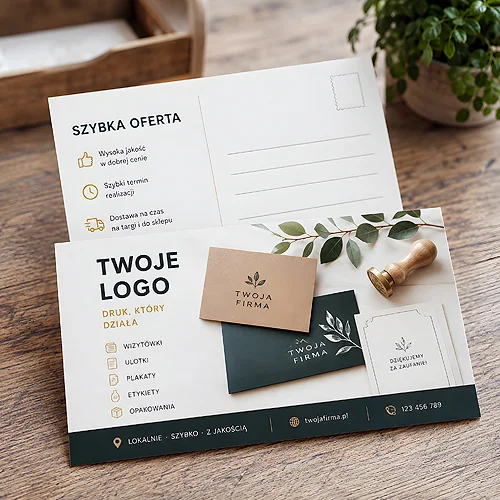
You know that feeling when you have a lot to say? A new offer, a few services, a promotion, an event and the company history too - and it all lands on a single sheet. The result is often the opposite of what you wanted: instead of rich content you get a dense thicket in which the reader gets lost within seconds. The solution is simpler than it seems. It is not about saying less, but about saying it in order - in a series of a few flyers, each carrying one thought. We will show you how to plan such a series so it works better than one overloaded print.
- One overloaded flyer loses the reader, because it has no single direction.
- The rule "one message = one flyer" brings order to the whole message.
- You split a series by product, audience, campaign stage or season.
- A shared layout, logo, colour code and markings tie the pieces into a recognisable family.
- A shared template means it is easier and cheaper to add more editions.
Why one overloaded flyer does not work
When you try to say everything at once, in practice you say nothing. The reader's eye scans the sheet for a point to latch onto, and when every element shouts equally loudly, it simply gives up. Instead of a clear message it gets chaos - several headlines, several offers and several calls to action that cancel each other out.
The biggest problem is the lack of a single direction. A good flyer leads to one decision: call, visit, check. When there are five invitations, none stays in the mind. On top of that comes the plain physics of space - the more content, the smaller the font, the tighter the layout and the less room to breathe. Material that was meant to look professional starts to resemble a manual.
Splitting the message solves this at the source. Instead of fighting for room on one sheet, you give each topic its own space and its own goal. If you want to recall how to build a single piece so it truly guides the eye, take a look at the post on how to design a readable flyer that encourages action.
The rule: one message, one flyer
This is the foundation of the whole series. Before you split the content, ask a simple question about each flyer: what one thing should the person who picks it up remember? If the answer is "a few things", it is a sign you have material for several pieces, not one.
One message does not mean thin content. It means a clear goal with everything else serving it. A flyer about a new service can include a description, benefits and a call to get in touch - as long as it all serves that one topic. The next piece will handle the next thread, calmly, with full attention.
Write down everything you want to convey, then group the points into threads. Each clearly separate thread is a candidate for its own flyer in the series.
How to split a series
There is no single right cut - you match it to what you sell and who you speak to. A few schemes usually work best, and they can be combined.
By product or service
The most natural split. Have five services? Instead of squeezing them into one table, give each its own flyer with its own headline, benefits and example. The recipient then gets exactly what interests them, and you can hand out a specific piece where it makes sense. This model works great with promotional flyers, where one strong message per sheet counts.
By audience
The same offer, but a different language for different people. You speak one way to an individual customer, another to a company, and yet another to a business partner. Instead of chasing a compromise that reaches no one, prepare versions tailored to a specific group. Each then sounds as if it was written just for that reader.
By campaign stage
Here the series becomes a story spread over time. The classic rhythm is a teaser, then the offer, and finally a reminder. The first flyer sparks curiosity and hints that something is coming. The second presents the specifics and encourages action. The third reminds those who have not decided yet. Each piece has a different job, and together they lead the recipient step by step.
By season
If your offer changes through the year, a seasonal series gives it a natural rhythm. Spring, summer, autumn, winter - or specific occasions. The shared skeleton stays, the subject and accent change. This keeps the brand present all year, while each edition looks fresh even though it rests on the same idea.
A coherent visual system, or a family
A series works only when it is clear the pieces belong together. Without that, it is simply a few loose flyers. The key is a shared visual system - a handful of constant elements that repeat on every edition.
- Shared layout and logo - the same header structure, the same position of the logo and contact details. The recipient knows at once who is speaking.
- Colour code - one colour assigned to one topic. Service A in blue, service B in green. The eye sorts the content before it even reads it.
- Numbering and markings - "1 of 3", a stage name or a small series icon. They give a sense of a collection and hint that there is more.
The same mechanism works with folded flyers, where a shared visual system ties the successive pages and the whole series into one recognisable set.
A series of flyers is not several separate prints, but one conversation split into pieces. Each piece says one thing, and a shared style holds them together.
What you gain
Splitting the message is not just tidiness on the sheet - it brings real benefits across the whole campaign.
- Better targeting - you hand the right flyer to the right person, without needless ballast.
- Testing messages - you can check which topic or which angle works better, and develop what brings results.
- The collection effect - a series builds curiosity. Whoever has one piece is more likely to reach for the next.
- Flexible distribution - you hand it out in stages, in different places and moments, instead of betting everything on one print.
On top of that comes peace of mind on your side. Instead of one flyer that has to carry all communication, you have a set of tools - each for a specific task.
Production in practice: a shared template
The greatest advantage of a series shows up in production. Once you build one good template - with a set layout, a place for the logo, colours and typography - the next pieces come together like building blocks. You change the content and the colour accent, and the skeleton stays. That is faster, simpler and more predictable than designing each flyer from scratch.
A shared format also brings order in print. The same size, the same paper and the same technical spec for the whole series mean one consistent standard that is easy to repeat. When after a season you want to add another edition, you return to a ready base instead of starting from a blank sheet.
Design the template with expansion in mind. Leave room in the layout for a series number and a swappable topic block, so adding another piece is a matter of swapping content, not redesigning the whole thing.
Less on the sheet, more in the campaign
A series of a few flyers instead of one overloaded sheet is a change in how you think. Instead of asking "how do I fit all this in", you ask "how do I lay it out wisely". One message per piece, a shared visual system and a split matched to the product, audience, stage or season - that is enough to make the message readable and flexible.
If you want to see how this logic translates into the effectiveness of a single flyer, check the post on promotional flyers that truly work. And once you have an idea for a series and want to choose the format, paper and way to mark the pieces, simply get in touch - we will help plan the set so it looks like a family and works like a team.