
A client receives your price list and sees a sheet packed from top to bottom: dozens of items one under another, small type, numbers set unevenly. Before they manage to choose anything, they already feel the matter is complicated - and that is the easiest moment to postpone a decision.
A price list is rarely treated as a material to be designed. More often it is created in a spreadsheet, exported and sent to print in exactly the form in which it was convenient to type it. Yet it is one of the few documents a client really does read carefully - and one in which the layout decides whether a choice happens at all.
A good price list does not have to show less. It has to be arranged so that within a few seconds the client knows which part to look in, and in the chosen section has a handful of genuine options in front of them. Below we gather the approaches that achieve this - from structure, through typography, to planning updates.
- Group items the way the client thinks, not the way the company divides its work internally.
- Every section gains from a short introduction - two sentences are quite enough.
- Highlight a few of the most frequently chosen items to give people a foothold.
- Close rare variants with an invitation to talk instead of listing every one of them.
- Plan the layout so it can be updated without reworking the whole document.
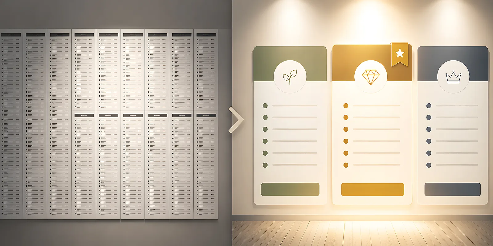
Why a long list puts people off
When every item looks the same, none of them is a foothold. The eye runs down the list, finds nothing to stop it, and returns to the top. The client experiences this as effort, even if they could not name it - they simply feel they would have to think about it for longer.
The second thing is uncertainty. With a very long listing, the client cannot be sure their own case appears there at all. Checking item by item is tedious, so more often they send a message with a question or set the topic aside. They do not always come back.
The third is reading pace. A dense block of numbers reads slowly, and a price list is usually looked at on the run - at a reception desk, at the counter, during a phone call. If in such conditions it is hard to land quickly in the right place, the document is not doing its job, even if it holds every piece of information.
Grouping by the client's logic
The most common mistake in price lists is that they mirror the internal division of the company: by department, by technology, or by the order in which services joined the offer. The client does not know that map and has no reason to. They arrive with their own situation and look for its equivalent.
Sections from the reader's perspective
Instead of dividing the offer by how something is made, divide it by what it is for. A restaurant is not looking for a printing technology, but for menu cards, table materials and something for the window. A company that has moved premises is not looking for a type of machine, but for a complete set of materials with the new address. Section names should sound like an answer to a need.
The optimal number of sections is usually between four and eight. Fewer means each one will get crowded inside anyway. More means the list of sections itself becomes another long list. Section headings should be visible from arm's length - so that they can be scanned without close reading.
A short introduction to each section
Above every section it is worth placing two sentences: who these items are for and what is worth knowing before choosing. It is a small thing that changes the character of the document - a dry listing becomes something closer to a guide. The client reads the introduction, realises they have landed in the right place, and only then moves down to the items.
The introduction has one more function: it provides space. Two sentences of ordinary text between the heading and the list break the monotony and let the eye rest. That move alone can make a document with identical content look far more approachable.
Footholds: most frequently chosen items and individual quotes
In every section it is worth gently highlighting two or three items that clients reach for most often. A subtle background, a small marker with a legend or a short note next to the name is enough. A client without a firm opinion then gets a hint, and usually takes it.
One condition: the highlight has to be honest. If you mark the items you want to sell rather than the ones people actually choose, it will come out in conversation sooner or later and undermine trust in the whole document.
The other side of the same rule concerns rare variants. Unusual formats, very large runs, uncommon finishes - all of this can double the length of a price list while covering only a small share of orders. Instead of listing every case, close them with one line: that unusual orders are quoted individually and it is enough to ask. The document becomes half as long and nothing is hidden.
Before you start setting the price list, look through the orders from recent months and mark the items that recur most often. Those are the ones that should sit high in their sections and those are the ones worth highlighting. The rest can move down or fall under a shared invitation to talk.
Typography and space
A price list is a material in which the eye does very specific work: it runs from the item name to the right, to the number that belongs to it. All the typography should support that work. You will find more about guiding the eye across a material in our post on how to guide the reader's eye across a poster, leaflet and catalogue.
How to set the numbers
- Align to the right - the column of numbers should form a straight vertical edge. Comparing then happens with a single glance downwards.
- One way of writing them - the same number of decimal places, the same thousands separator, the same form of currency marking throughout the document.
- A short distance - if empty space yawns between the name and the number, narrow the column instead of leaving a void. The eye gets lost precisely over long distances.
- Leader dots sparingly - delicate dots between name and number help only when the distance cannot be shortened. In a tight layout they add noise.
- Do not bold everything - if every number is highlighted, none is. Save the heavier weight for the items you genuinely want to suggest.
Readability in poorer conditions
A price list is often read in weaker light, at an angle or from a greater distance than a book. It is worth assuming that from the start. Space between lines works better than a rule under every item - a subtle separation every few lines is quite enough to stop the eye slipping to the neighbouring row. Dark text on a light, matt surface reads more confidently than on a glossy one, because it does not reflect light.
If older people are among your clients, it is worth going a step further and treating the price list as a material that has to be readable without effort. We gathered specific tips in our post on how to design materials friendly to seniors and people with low vision. Most of them improve readability for everyone, not only for that group.
Item names without internal jargon
In many price lists the item names come straight from the stock system or from team conversations. Abbreviations, codes, weight symbols with no explanation - obvious to the company, a cipher to the client. And a name that is not understood works exactly like a missing item: the client simply will not choose it.
A good name says two things: what it is and what the key parameter is that sets this item apart from its neighbour. The rest can stay in a smaller note under the name. If a section holds several variants of the same thing, arrange them in a natural order - from the simplest to the most elaborate, rather than alphabetically or by code.
It is also worth watching the hierarchy inside each row: the name matters more than the technical note, and the note more than a remark in brackets. Three levels of importance have to differ in something visible. We write more about building that reading order in our post on how to create a hierarchy of text.
The printed version and the version to send
The same price list works differently on paper and on screen, so it is worth preparing two variants of the same content.
In print, the format and the split into pages decide. It is best when a section starts on a new page or with a clearly marked block - the client turns the sheet and knows they are entering a new topic. If the price list is short, a folded form works beautifully; when planning the split into panels, our post on how to divide content on a leaflet comes in handy. For handing over at the counter, ordinary classic leaflets work well, and in hospitality the role of the price list is played simply by menu cards - the same rules of grouping and space apply there in full.
If the offer is meant to be visible to everyone who walks in, an enlarged version on the wall does the job. A poster with a price list is read from a distance, so leave only the most frequently chosen items on it - keep the full listing in the handheld version.
The version sent by email follows different rules. It is often opened on a phone, so a single column layout reads far better than a wide document squeezed to screen width. On the first page it is worth giving a short list of sections, so the reader knows straight away what is ahead. It is also good practice to note in the footer when the document was last updated - it saves questions and shows the offer is being looked after.
A price list you can update
The greatest advantage of a well designed price list is that changing a few items does not mean setting it again from scratch. A few decisions taken at the start are enough.
- One item is one row of fixed height. When every row looks the same, adding or removing an item does not throw the layout off.
- Numbers must not be part of a graphic. If they end up inside an image file, every update means going back to the design. Keep them as text.
- Leave a margin in every section. Two or three free rows at the bottom of a section mean a new item slots in without shifting the rest.
- One section per page. Then a change in one section touches one page rather than the whole document.
- The update date in the footer. A simple way to stop an old version circulating among clients from causing confusion.
A price list is not a formality to tick off but a sales tool - often the last one a client has in front of them before deciding. A few sections arranged in human terms, short introductions, aligned numbers, a few hints and room for a conversation about unusual orders do more here than the most complete listing. A client who finds their part of the offer within a few seconds usually just chooses.