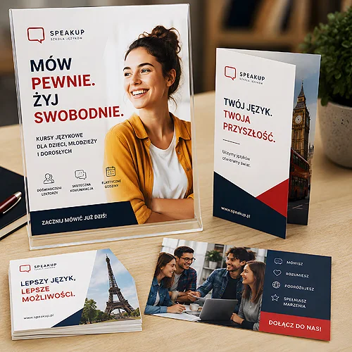
Imagine your offer landing on a client's desk on Monday morning, between two meetings, without you in the room. No one explains it, no one answers questions, no one adds the thing that matters most. The client opens the folder alone, runs their eyes over the first page and decides within seconds whether to read on or set it aside. A well-designed printed offer handles this situation on its own - it leads the reader by the hand from the first sentence all the way to a decision, as if the best salesperson were standing right beside it.
A piece that sells without a person does not happen by accident. It is not a matter of pretty graphics or thicker paper alone, though both help. It is a matter of order: what the client sees first, what they think about, which benefit they remember and what they should do next. An offer without a salesperson has to anticipate questions and dispel doubts before anyone gets to say them out loud.
In this post we show how to arrange a printed offer - a folder, a catalogue or a single-card leaflet - so that it leads the reader to a decision on its own. In order: where to start, how to choose the message, how to build credibility and how to make sure the whole thing looks as good as it sounds.
- An offer without a salesperson has to answer the client's questions before they even get to ask them.
- Start with the reader's problem, not your company's history - it is their attention you want to catch in the first second.
- One strong message in the foreground works better than a list of everything you have on offer.
- Proof - case studies, concrete numbers, client reviews - turns a promise into credibility.
- A clear hierarchy and a plain call to action tell the reader exactly what to do next.
Start with a problem your client already knows
The most common mistake in printed offers is opening with yourself. "We are a company with many years of experience..." - and we lose attention in the very first sentence, because we talk about ourselves to someone who is thinking about their own problem. A client who picks up your offer has a specific question or trouble in mind. If the first page hits exactly that spot, the reader feels the piece is about them, not about you.
Instead of starting with your company name and a list of awards, open with a sentence that describes the client's situation in their own language. Show that you understand what they are dealing with, and only then show how you can help. This simple change of order - problem first, solution second - decides whether anyone reads on. We write more about this rule in our post on why good advertising starts with the client's problem.
One strong message instead of a list of everything
The temptation to say everything at once is enormous. After all, you offer a lot, every service matters, and the piece seems the perfect chance to leave nothing out. The trouble is that an offer shouting about ten things at once sticks in the memory through none of them. A client without a salesperson at their side has no one to ask to sort it out for them - they have to do it themselves, and they have neither the time nor the desire.
Choose one main idea that should stay in the head after the piece is put down. That is what goes in the foreground - in large type, in a visible spot, with no competition. The rest of the information arranges itself around it, supporting rather than shouting over it. How to find that one message we break down in our post on how to find one strong advertising message instead of talking about everything.
Before you start designing, write one sentence on a piece of paper: "After reading this offer, the client should think that...". If you cannot finish it in a few words, the piece is not ready for print yet - first pin down what it is really about.
Benefits and proof instead of promises alone
In conversation a salesperson can give an example, refer to another client, show a result on their phone. A printed offer has to do the same thing, only up front. So after the main message comes the time for two pillars: benefits and proof.
A benefit is not a feature. "We print in high resolution" is a feature - it leaves the client cold. "Your catalogue looks so good you would not be ashamed to place it next to the big brands" is a benefit, because it speaks about their world. Translate every feature into what the client really gains.
Proof, in turn, turns your words into credibility. What works well:
- Case studies - photos or samples of what you have already done, ideally with visible quality.
- Client reviews - a short, concrete quote with a name or a company weighs more than a paragraph of self-praise.
- Numbers - years on the market, the number of completed projects, returning clients.
- Logos of known brands - if you have worked for them, show it; someone else's trust rubs off on new readers.
If you sell a product the client wants to see and touch, a catalogue with real samples works brilliantly. How to arrange it so it genuinely helps with the decision we describe in our post on how to design a sample catalogue that helps with the buying decision.
Information hierarchy and a clear call to action
Once you have the problem, the message, the benefits and the proof, the question of order remains. The eye reads a piece in a certain sequence, and your job is to plan that sequence. The most important things higher and larger, the details lower and smaller. Headings lead through the content so that even their run alone tells a story - a client who only flips through the folder will still catch the gist.
In a folded offer the natural drama of unfolding works well: a hook on the cover, the expansion and proof once opened, a call to action at the end. Folded leaflets have an edge here, because they lead the reader step by step, reveal by reveal.
And the thing most offers forget: the call to action. The client reaches the end convinced, and then... does not know what to do. Write it plainly. One, at most two ways to get in touch, a concrete encouragement, a visible spot. Without it, even the best-arranged offer fizzles out on the last metre.
Paper and finishing build a sense of quality
A printed offer has one great advantage over a screen: you can pick it up. The client feels the thickness of the paper, the smoothness or texture of the surface, the weight of the folder. That sense of touch tells them, before they read a single word, what kind of company they are dealing with. A thin, flimsy sheet says something different from solid, stiff board.
A few decisions that genuinely lift the impression:
- Paper weight - thicker board on the cover or folder signals solidity right away.
- Lamination on the cover - matte gives an elegant, understated touch, gloss brings colours to life, and velvety Soft Touch softens pleasantly in the hand.
- Lamination on both sides - a cover and a folder protected front and back stay looking new for longer and do not catch creases at the corners.
- Consistency across the whole set - the same paper and finishing on the offer, folder and business card build the impression of one considered brand.
It is worth thinking here about the whole set that stays with the client. A solid folder holds the offer together as one whole and makes sure nothing gets lost, while an enclosed business card stays at hand when the client comes back to the topic a week later. How loose ideas become a coherent, refined piece we describe in our post from sketch to print - how a professional advertising piece comes to be.
An offer that sells without a salesperson is neither magic nor a matter of budget. It is a well-arranged order: start with the client's problem, lead with one strong message, back it with benefits and proof, guide the eye with a clear hierarchy and close with a plain call to action. Add paper and finishing to match what you have to say - and your piece will start working even when you are not in the room.