Imagine walking into a boutique. Before anyone says a word, you already feel something - a faint scent in the air, quiet music in the background, and as you reach for a catalogue, your fingers sink into thick, soft paper. Nothing has been said, yet the brand has already told you its story. That is sensory marketing - communication that speaks to several senses at once.
- More senses in a single experience = a stronger memory and deeper emotion - the brand sticks around far longer than an image alone.
- Touch (paper texture, finishes, weight) signals quality before the customer reads a single word.
- Sight is the base (consistent identity, colour, composition), sound sets the mood, and scent triggers memory and associations.
- The secret is consistency - one theme and one mood carried across every sense.
- Start with print and touch (the easiest part), then add layers. Restraint and quality matter more than quantity.
Why the senses work on a brand
Our brain remembers experiences, not posters. When touch, sound or scent join a memory, more connections form - and the brand simply has more hooks to catch onto in the customer's mind.
An image alone is easy to scroll past and forget. But an experience you felt with your hand and heard with your ears comes back to you later - sometimes unexpectedly, when a similar scent or a familiar tune surfaces. That is why a well-designed experience stays with a person longer than the prettiest graphic.
Important: this is not about hitting the customer with everything at once. It is about each sense telling the same story, in the same tone.
Touch - paper that speaks before you read it
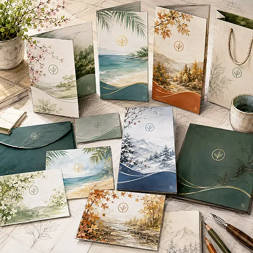
Touch is the most underrated sense in print, and at the same time the one that acts fastest. Before the customer reads the headline, their fingers have already judged your brand. Thin, slippery paper says "cheap", while thick, textured stock says "this is worth your attention".
The feel of touch comes down to a few things: weight (how thick and stiff the stock is), the type of surface (smooth, rough, linen, cotton) and the finishes you add on top. This is exactly where the material starts to communicate quality without a single word.
Finishes you can feel with your fingers
- Soft touch lamination - a velvety, warm surface that suddenly makes a small paper item feel luxurious.
- Textured paper - felt-marked MODIGLIANI 260 g or fine-ribbed DALI 285 g from the Prestige line. Your finger finds the structure on its own, and the paper does it without anything added on top.
- Matte film with spot varnish - a glossy field on a matte background, a contrast you can both see and feel under your fingertips. With us only on 4P and 6P digipack packaging.
- Higher paper weight - a stiff business card or invitation instantly feels solid and considered.
If you want to calmly choose the right stock for your project, take a look at our guide to materials and papers - we explain there how texture and weight change the way a finished print is perceived. And if you are starting from scratch, our post on how to choose paper for a flyer, business card, invitation and catalogue will help too.
Before you order a large run, order a proof print on the stock you have chosen and hold it in your hand with your eyes closed. If the touch alone reminds you of your brand's quality, you have a good starting point. If you feel nothing special, look for a heavier weight or a finish.
Sight - the base the rest stands on
Sight is the foundation, because contact with a brand usually begins there. Colours, composition and a consistent identity are the first thing a customer registers - and they set the tone for every other sense.
The key word here is consistency. The same palette on the business card, the packaging, the letterhead and the disc with materials makes the brand look like one considered world, rather than a set of random prints. Colour can carry emotion: warm hues invite and calm, deep blacks and gold speak of elegance, fresh pastels of lightness.
Sight works beautifully with touch. Matte paper in a calm palette plus a felt-marked texture is a duo that together works more strongly than either element on its own.
Sound - the music that builds the mood
Music does something remarkable to a space - in a few seconds it can set the pace and the emotion. Calm jazz in a cafe, an energetic beat in a sports shop, gentle acoustic tones in a treatment room - all of it is part of the image, even if the customer is not aware of it.
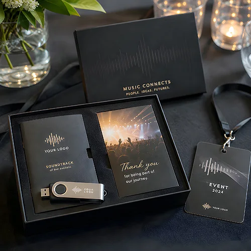
Sound can also be taken beyond the venue. A brand can prepare its own soundtrack and hand it to the customer on a physical carrier - as part of a gift, an invitation or a welcome pack. A printed CD with the brand's music is a gesture that surprises and stays in memory, because these days few people expect it.
Choosing the music is not random - it should suit the character of the industry and the mood you want to build. We explored this in more detail in our post on how to choose music for a promotional disc matched to your industry - with concrete examples.
Scent - the shortest path to a memory
Scent works differently from the other senses - it goes straight to the part of the brain responsible for emotion and memory. That is why one distinctive aroma can carry us through time more powerfully than a photograph. Brands well designed in this respect stay with us for a long time precisely because of scent.
In practice, scent most often lives in the venue - in a salon, a hotel, a restaurant - as a gentle, repeatable backdrop the customer starts to associate with a specific place. It can also appear on special materials, as a subtle accent.
Here, though, you need a feel for it. Scent is the most personal sense and the easiest to overdo - an aroma that is too intense becomes intrusive rather than inviting. So the rule is: gently, in tune with the rest, and always with restraint.
How to tie it all into one message
The whole strength of sensory marketing lies not in the number of senses, but in their agreement. Every element - paper, colour, sound, scent - should tell the same story and hold the same mood. When one sense says "elegant" and another "cheap and loud", the whole thing falls apart.
Picture an elegant venue: thick, textured paper in the menu and on the invitations, calm jazz in the background and a subtle, warm scent in the air. Three different senses, one mood - and the customer feels the coherence, even without being able to name it. It is exactly this invisible agreement that builds trust in a brand.
Where it works best
- Boutique and salon - a textured bag, a business card that is soft to the touch, quiet music and a light scent create the feeling of a place you want to return to.
- Hotel - a welcome note on good paper, a consistent scent at reception and music in the lobby build the mood from the doorstep.
- Restaurant - a menu on solid, pleasant-to-touch stock plus music matched to the cuisine become part of the taste before anything is served.
- Premium gift and event - packaging with a finish, a disc with the brand's music and a small scented accent turn an ordinary gift into an experience.
Do not try to activate every sense at once. Start with print and touch - the easiest and the most within your control. Once that layer is working, add sound, and finally, carefully, scent. It is better to do two things brilliantly than four things halfway.
Where to start in practice
If you are thinking about multi-sensory marketing, the best first step is tangible. Choose one carrier the customer touches most often - a business card, an invitation or packaging - and refine it so that its texture and quality tell the story of your brand on their own. That is the foundation you will build the rest on.
Then add layers slowly. Add sound where you have contact with the customer. Consider scent if you have your own space. And keep watching one thing all along: that every sense speaks in the consistent, warm voice of your brand. If you would like us to help choose paper, finishes or prepare a carrier with materials - write to us through our contact page. We would be glad to sit down with your project.